Grout color is the cheapest decision in a tile job and one of the most consequential. The honest answer to "what grout color should I choose?" is this: match the grout to the tile for a calm, seamless look, or contrast it to make a pattern pop, and pick a mid-tone gray if you mostly want it to stay looking clean. That single choice changes whether your tile reads as a quiet surface or a graphic statement.
I have watched a beautiful tile get flattened by the wrong grout and a plain tile get a whole personality from the right one. It is worth ten minutes of real thought before the installer mixes the bag.
Match, contrast, or split the difference
The first decision is whether you want the grid to disappear or to show. Matching grout, within one or two shades of the tile, hides the joints and lets the surface read as one continuous plane. That is the move for a small bathroom you want to feel bigger, or for a large-format floor where busy grout lines would chop up the space. The trade-off is that you lose the crisp geometry that gives subway and hex tile their charm.
Contrasting grout does the opposite. White tile with charcoal grout turns an ordinary subway backsplash into a strong graphic pattern, and it is the classic look for a reason. The rule I follow: the more you contrast, the more your tile setting needs to be perfect, because dark grout against light tile broadcasts every crooked joint and uneven spacer. If your installer is not meticulous, dial the contrast down.
The split-the-difference option is a grout one or two shades different from the tile, enough to define the joints without shouting. This is often the most forgiving choice for a small rental space where you want some character but cannot afford a fussy install or a look that fights the existing fixtures.
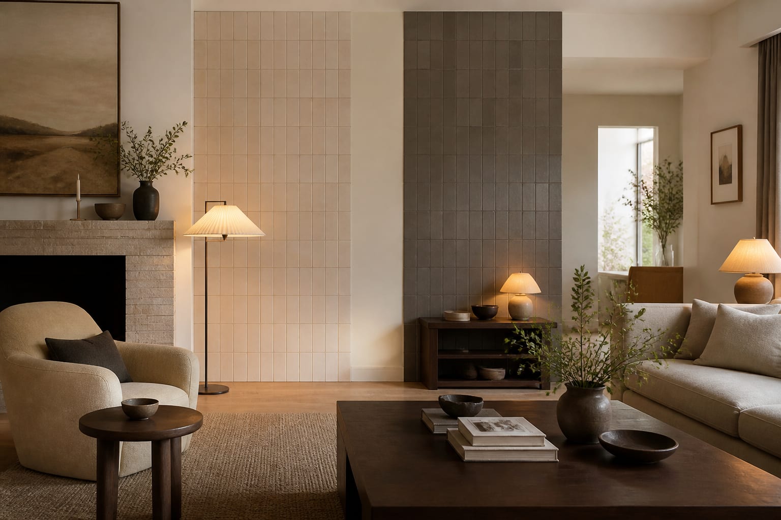
Scale changes the math here. On a large-format 12 by 24 inch floor tile, even matched grout creates long lines, so a close-match shade keeps the floor calm and continuous. On a tiny 1-inch mosaic or penny round, there is so much grout relative to tile that the grout color basically becomes the dominant color of the surface. People forget this and pick a dark grout for a mosaic, then wonder why their pretty white penny tile reads as a gray field. Look at the ratio of grout to tile before you decide how bold to go.
Sanded grout suits joints wider than 1/8 inch while unsanded is meant for tighter lines, and a single 25 lb bag typically covers around 200 square feet of small wall tile.
Which colors actually stay clean
The practical question most people forget is maintenance. Bright white grout looks pristine on day one and grimy by month six, especially on floors and in showers where mildew and foot traffic settle into the joints. Pure black grout has the opposite problem: it shows soap scum, hard-water deposits, and efflorescence as a chalky film. Both extremes demand more scrubbing.
The sweet spot for low-maintenance grout is a mid-tone gray or greige. It camouflages the inevitable dirt, reads as neutral against almost any tile, and ages gracefully. I default to it for floor tile and for any household with kids or pets. In a tight space where every surface shows, a forgiving grout color is the difference between a backsplash that looks intentional and one that looks tired.
Material matters too. Cement grout is porous and needs sealing every year or two to resist stains. Epoxy grout costs more and is harder to install, but it is essentially waterproof and stain-resistant, which is why I push for it in shower floors, around 4 to 6 inches of curb, and behind a stove. The upfront premium of roughly 30% over cement grout pays back in a surface that stays clean.
If you do go with cement grout, the sealer is not optional in wet or high-traffic areas. An unsealed cement joint is a sponge for cooking grease, mop water, and bathroom soap, and once those soak in, the stain is in the joint for good. A penetrating sealer applied after the grout cures, then refreshed every year or two, is cheap insurance. For floors especially, I treat a mid-tone gray plus a good sealer as the realistic, low-regret default for a household that actually gets used.
Sample placement matters more than people expect. Tape your cured grout sample directly onto the wall or floor where the tile will go, beside the actual tile, rather than judging it on a benchtop under store lighting. Grout that looks like a soft greige in your hand can flash distinctly pink or green next to a particular tile, because the two surfaces bounce color onto each other. Seeing them touching, in the room's own light, is the only reliable way to catch that before the installer commits a whole wall to it.
Reading grout against your specific tile
Never pick grout from a fan deck alone. Grout dries roughly two to three shades lighter than the wet sample, so the chip you approve and the joint you get rarely match. Get the actual sanded or unsanded grout, mix a small batch, let it cure, and hold it against your tile in the room's real light.
A few things to check before you commit:
- Joint width: sanded grout for joints 1/8 inch and wider, unsanded for joints under 1/8 inch.
- Lighting: warm bulbs push gray grout warmer and white grout creamier than daylight does.
- Tile finish: glossy tile makes grout look slightly darker than the same grout beside a matte tile.
- Sheen of the room: a grout that looks crisp in a staged photo can look stark on a full wall.
The same evaluate-in-context discipline that pros use when staging a home for sale applies here. What sells the look is how the whole surface reads, not how a single sample chip looks in your hand.
Common mistakes to avoid
The most common mistake is choosing maximum-contrast grout for a high-traffic floor and then resenting the cleaning. Crisp black-on-white is gorgeous on a feature wall and exhausting on a kitchen floor. A second common mistake is picking bright white grout for a shower, where it will gray with mildew within a year unless you seal and scrub it relentlessly. Match the grout's demands to your tolerance for upkeep.
Other mistakes to avoid: approving grout from the dry fan deck instead of a cured sample, skipping the sealer on cement grout, and forgetting that grout makes the tile look more uniform when matched and more patterned when contrasted. Decide which effect you actually want before you stand at the counter guessing.
One habit saves a lot of grief: order a small bag of your top two grout candidates and grout a few spare tiles into a sample board, then live with it taped to the wall for a couple of days. Grout reads differently at breakfast than it does under evening kitchen lights, and a shade that looked perfect in the store can turn cold or muddy in your room. Watching the same joint across changing light is the cheapest insurance against a permanent regret, and it costs you a weekend and the price of two small bags.
Use AI design to preview grout color before you commit
Grout is permanent enough that getting it wrong means living with it or paying to regrout. Before you lock a shade, it helps to see the full surface, not a chip. With Re-Design you upload a photo of your bathroom, kitchen, or laundry and re-render the same tile with matched gray, crisp white-on-charcoal, or a soft greige joint so you can judge the effect at wall scale.
That lets you settle the match-versus-contrast debate by looking instead of imagining. Upload your space, compare the seamless version against the graphic version in your own lighting, and you will know which grout makes the tile sing and which one quietly flattens it. It is a five-minute preview that saves a permanent regret.