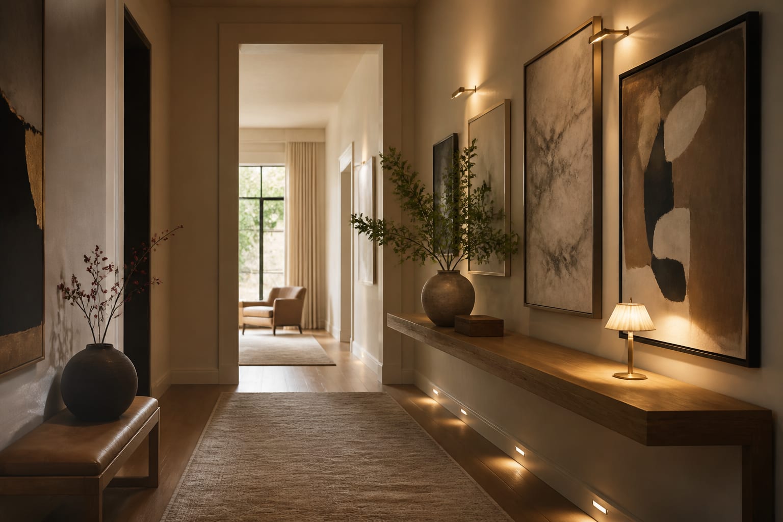
A hallway is the most wasted wall space in most homes. People treat it as a passage to somewhere better and leave it blank, or they hang a couple of frames at random heights and call it done. That is a missed opportunity, because a hallway is actually the easiest place in the house to build a gallery. The viewing distance is short, the lighting is controllable, and there is no furniture to work around. The only thing standing between a dead corridor and a real gallery is a center line, consistent spacing, and light aimed at the art instead of the floor.
Hang everything off a 57-inch center line
The fastest way to make a hallway look intentional is to commit to a single horizontal center line and hang everything to it. Galleries and museums center art on a line about 57 to 60 inches off the floor, which lands the middle of each piece at average standing eye level. In a hallway, where everyone is upright and moving, that line is exactly right. Measure to the center of the artwork, not the top or the frame edge, so pieces of different sizes still feel like they belong to the same row.
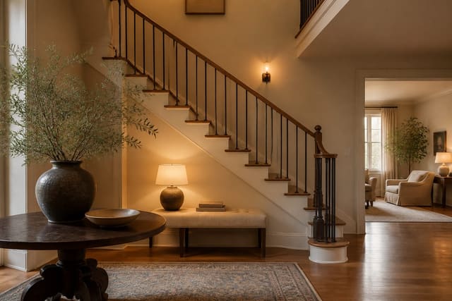
This one rule fixes the most common hallway mistake, which is art hung too high. People tend to drift the frames up toward the ceiling, leaving a sea of blank wall at eye level and a lonely picture floating above it. Anchor the center on 57 inches and the whole corridor snaps into place. For a salon-style cluster, treat the arrangement as one big rectangle and center that rectangle on the line, letting individual frames rise and fall around it. If your hall connects to a stairwell, step the center line up along the rise so the art climbs with the treads instead of fighting the slope.
Space and arrange the frames with intention
Spacing is what separates a gallery wall from a jumble. For a clean grid of same-size frames, hold the gap between them to a consistent 2 to 3 inches on every side. Tighter than 2 inches and the pieces read as one crowded mass; wider than 4 inches and the group loses its sense of being a single composition. Use a paper template taped to the wall to test the layout before you put a nail in plaster, since a hallway shows every misaligned frame as you walk past it.
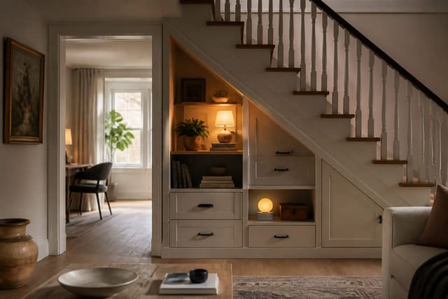
A mixed collection needs a unifying thread to keep it from looking like leftovers. Pick one element to repeat: identical black frames around varied art, the same wide mat on every piece, or a single subject like botanical prints or black-and-white photography. That repeated element is the discipline that lets you mix sizes and styles without chaos. For long halls, a continuous picture ledge is a flexible alternative to fixed nails; mount a 4-inch-deep ledge at the same 57-inch center and lean framed pieces along it, overlapping slightly, so you can swap the display whenever you like. A run of under-stair storage at the end of a hall can carry the same frame style on its doors, so the storage disappears into the gallery instead of interrupting it.
Light the art so the hall stops being a tunnel
Most hallways are lit by a single ceiling fixture that flattens everything and leaves the art in shadow. Aimed light is what makes a gallery feel like a gallery. The cleanest fix is a small picture light mounted above individual pieces, or a low-profile track run down the length of the hall with heads angled at about 30 degrees from vertical, which grazes the art without throwing glare back at anyone walking through.
Keep the bulbs at 2700K to 3000K so the light stays warm and the colors in the art read true; cooler 4000K light makes a corridor feel like an office. If hardwiring is not an option, battery-powered LED picture lights with a remote give you the same focused glow with no electrician and no patching. Put whatever you install on a dimmer if you can, so the hall can glow softly at night without lighting the art like an interrogation. Even a single well-aimed fixture transforms how the corridor feels, turning a dark pass-through into a sequence of lit moments. Just keep every frame and any picture ledge shallow enough that the walkway stays a clear 36 inches wide, since a gallery you have to turn sideways to pass is a failed one.
Hallway art ideas worth trying
If you are ready to fill the wall but stuck on format, start with one of these: - Build a tight grid of nine identical black frames, three across and three down, centered on the 57-inch line for instant order. - Mount a long picture ledge and lean a rotating mix of framed prints and photos, overlapping them slightly for depth. - Run a single horizontal row of matching frames at eye level down the entire length of a long, narrow hall. - Cluster a salon-style arrangement of mixed sizes around one oversized anchor piece, keeping 2 to 3 inch gaps throughout. - Hang a series of botanical or architectural prints in identical wide white mats so varied images still feel like a set. - Display a collection of woven baskets, plates, or hats as three-dimensional art for texture a flat frame cannot give. - Frame children's artwork or family photos in uniform frames so a personal collection reads as a curated gallery, not a fridge door.
See your hallway gallery in Re-Design first
Gallery walls are easy to get wrong on the first try, and a hallway leaves no room to step back and judge the spacing before the nails are in. Test it digitally instead. Upload a photo of your hallway into Re-Design and preview a nine-frame grid, a salon cluster, or a long picture ledge on the actual wall before you commit to a single hole. You can try black frames against white, see how a tight grid reads versus an overlapping ledge, and judge whether the arrangement balances the length of your specific hall. Watching the gallery land on your own walls, lit and to scale, tells you fast whether the layout works, so you hang the version you have already seen come together.
Frequently Asked Questions
How high should you hang art in a hallway?
Hang art on a center line 57 to 60 inches off the floor, measured to the middle of each piece, which is the standard gallery and museum height. Because everyone in a hallway is standing and moving, that line puts the work at average eye level the whole way down. Measuring to the center, rather than the top, keeps pieces of different sizes feeling like one cohesive row.
How much space should be between frames on a gallery wall?
For a clean grid of same-size frames, keep a consistent 2 to 3 inches between them on every side. Less than 2 inches reads as a crowded mass, while more than 4 inches breaks the group into separate pieces instead of one composition. Tape a paper template to the wall first to test the spacing, since a hallway reveals every misaligned frame as you walk past.
How do you make a mixed art collection look cohesive?
Pick one element to repeat across the whole collection. Use identical frames around varied art, the same wide mat on every piece, or a single subject such as botanical prints or black-and-white photography. That repeated thread is what lets you mix sizes and styles without the wall looking like leftover frames. Treat a scattered cluster as one big rectangle centered on your hang line.
How should I light hallway art?
Aim light at the art rather than relying on a single overhead fixture. Use picture lights above individual pieces or a low-profile track with heads angled about 30 degrees from vertical to graze the work without glare. Keep bulbs at 2700K to 3000K so colors read true and the hall feels warm. Battery-powered LED picture lights work if hardwiring is not an option.