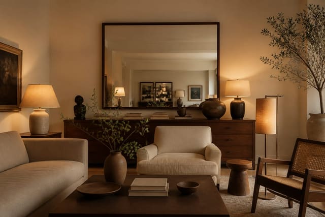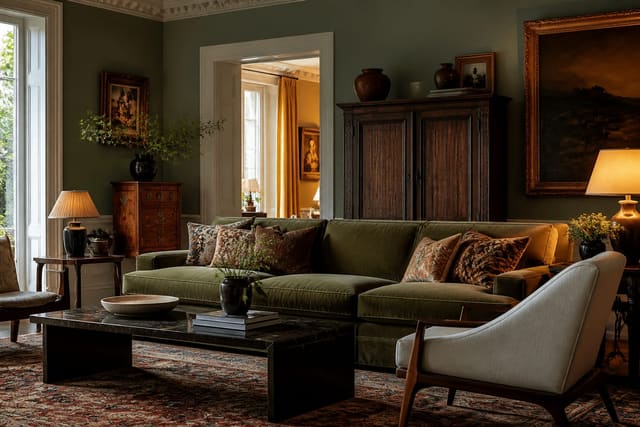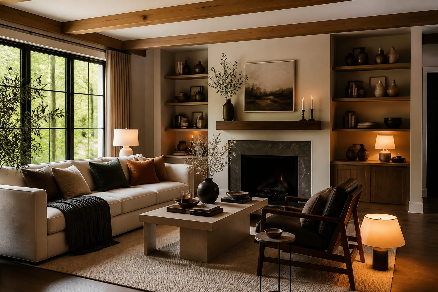
You add texture to a room by layering different materials in the same view: something rough against something smooth, something matte against something with sheen, something soft against something hard. Color and layout get the attention, but texture is what makes a room feel rich instead of flat. My read is that a beige room people call boring is almost never about the beige; it is about every surface having the exact same smoothness, so the eye has nothing to grab onto.
Texture is what a photograph cannot fully capture and a real room rewards: the nubbiness of a wool throw, the grain of raw wood, the cool of a stone tray, the give of a linen pillow. When you stack several of those contrasts into one space, the room reads as layered and intentional, even if the palette is quiet. This is the lever to pull when a room feels finished on paper but lifeless in person.
Why texture beats color for depth
Color sets a mood, but texture creates the sense of depth that makes a room feel three-dimensional and worth touching. A monochrome room, all white or all greige, lives or dies on texture, because without it every surface blends into one flat plane. Add a chunky knit, a jute rug, and a rough-plaster lamp, and suddenly that same neutral room has shadows, contrast, and warmth.
The mechanism is light. Rough and matte surfaces absorb and scatter light, reading as soft and deep; smooth and glossy surfaces reflect it, reading as crisp and bright. When you put those next to each other, the contrast registers as richness. That is why a velvet pillow looks so good on a linen sofa, or a polished brass lamp pops against a raw wood table. In rooms that get little daylight, texture matters even more, because varied surfaces catch what light there is from different angles; the reflective-surface tactics in my dark room solutions guide lean on exactly this idea.
The practical takeaway: the quieter your color scheme, the harder your textures have to work. A bold, colorful room can carry simpler surfaces. A calm, neutral room needs the layering to do all the talking.
The five channels for layering texture
There are five reliable places to build texture into a room, and stacking a few of them is what creates real depth:
- Textiles: rugs, throw pillows, blankets, curtains, upholstery. Mix a chunky wool throw with smooth linen and a bit of velvet.
- Natural materials: wood grain, rattan, jute, stone, leather, dried branches. These bring instant organic texture.
- Wall treatments: a textured plaster finish, grasscloth wallpaper, exposed brick, or wood paneling change a wall from flat to tactile.
- Plants: living greenery adds organic, irregular texture that no manufactured material matches.
- Varied finishes: matte ceramics next to polished metal, a glossy vase beside a rough basket.
The goal is contrast within and across these channels. Three textiles that all feel the same do not count as layering; a wool rug, a linen curtain, and a leather chair do. Natural materials are the easiest win because they carry texture inherently, and they mix beautifully with each other. When you blend several styles or eras in one room, texture is often the thread that ties them together, which is something I dig into in the mixing design styles guide.
Watch the soft-to-hard balance too. A room piled with upholstery, rugs, and cushions and nothing hard feels muffled and heavy. A room of all wood, metal, and glass feels cold and echoey. The rooms that feel right hold both: soft textiles softening hard surfaces, hard materials grounding the soft ones.
Rugs are the highest-impact texture decision because they cover so much area. A high-pile or shag rug reads as warm and soft underfoot, while a flat-weave jute or wool rug reads as crisp and structured, and the difference is obvious the moment you walk in. Size matters as much as pile: a rug that lets at least the front legs of your seating sit on it, usually 8 by 10 feet in a living room, anchors the texture instead of leaving it stranded. Layering a smaller 4 by 6 foot textured rug over a larger flat one is a designer move that doubles the tactile interest in one spot.
Pillows and throws let you dial texture up cheaply and seasonally. On a sofa, mix at least 2 pillow textures, say a chunky knit against a smooth velvet, in sizes from a 22-inch square down to a 12-inch lumbar, so the grouping has variety rather than a matched set. A throw in a contrasting weave folded over the arm adds a third texture for under $50 in most cases. Because these are easy to swap, they are the lowest-risk place to experiment before you commit to a textured wall or a new rug.
Common mistakes to avoid
The most common mistake is matching everything to the same finish, where every surface is smooth and slightly glossy, so the room photographs fine but feels flat in person. Introduce one rough or matte element and the whole space gains depth.
A second frequent mistake is relying on texture only in textiles, a few pillows, and ignoring walls, wood, metal, and plants entirely. Spread texture across at least 3 of the five channels. A third is over-layering soft goods until a room feels stuffy and cluttered, with five throws and a dozen pillows and no hard surface to balance them. People also forget that a neutral room needs more texture, not less, and then wonder why their all-white space feels cold. The last common mistake is using a single statement texture, one chunky rug, and calling it done; texture works through repetition and contrast, so one bold piece with nothing to play against just sits there alone.
Use AI design to test textures before you buy
The frustrating thing about texture is that you cannot feel a room until everything is in it, and swatches in your hand never tell you how a jute rug will read against your sofa or whether grasscloth will warm up your walls. Re-Design helps you see it first. Upload a photo of your room and the AI design re-renders it with layered textures, a chunky rug, a textured wall, natural-material accents, so you can judge the depth in your actual space.
Because you upload your real room, the preview keeps your existing colors, light, and furniture intact, which is exactly what texture has to work with. Test a grasscloth wall against your current paint, swap a smooth rug for a high-pile one, and see which combination finally gives the room the depth it is missing before you spend on materials you cannot return.