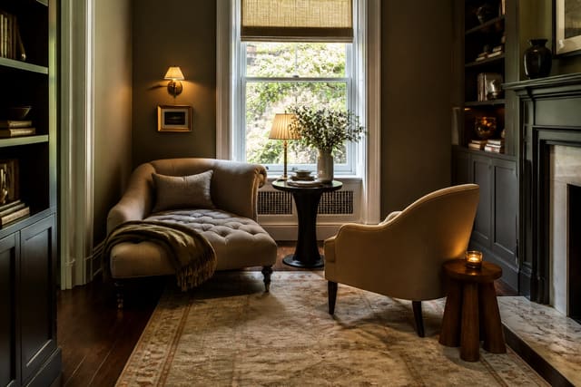
The honest answer to decorating an empty corner is to give it a single clear job instead of treating it as leftover space to fill. A corner reads as awkward when it holds three random things at three random heights; it reads as intentional the moment one purpose takes over, whether that's a chair you actually sit in, a plant tall enough to matter, or a slim cabinet that earns its footprint.
I think the reason corners defeat people is that they're triangular in use even when they're square in plan: two walls meet, and most furniture is built for one. So you either lean into the angle with something diagonal, or you hug one wall and let the corner frame it. Both work. Drifting between them is what leaves the corner looking unfinished.
Match the idea to the corner you actually have
Before picking an idea, read the corner. A corner near a window wants something that doesn't block light, so a low plant stand or a glass-shelf etagere beats a tall solid cabinet. A corner in a dim interior angle wants its own lamp and something with presence, since no daylight is coming to help. A corner in a high-traffic path wants a rounded or shallow piece so nobody clips a hip on it.
The second read is height. Most failed corners are failed because everything sits too low, leaving a tall empty triangle of wall above a short object. Fix the vertical first: a 5-6 foot plant, a leaning ladder shelf, a tall mirror, or stacked art that climbs toward the ceiling. If you want a hands-on weekend version of any of these, my DIY home decor ideas cover building simple corner shelving and stands without buying anything custom.
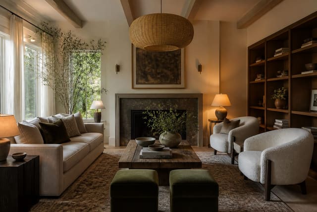
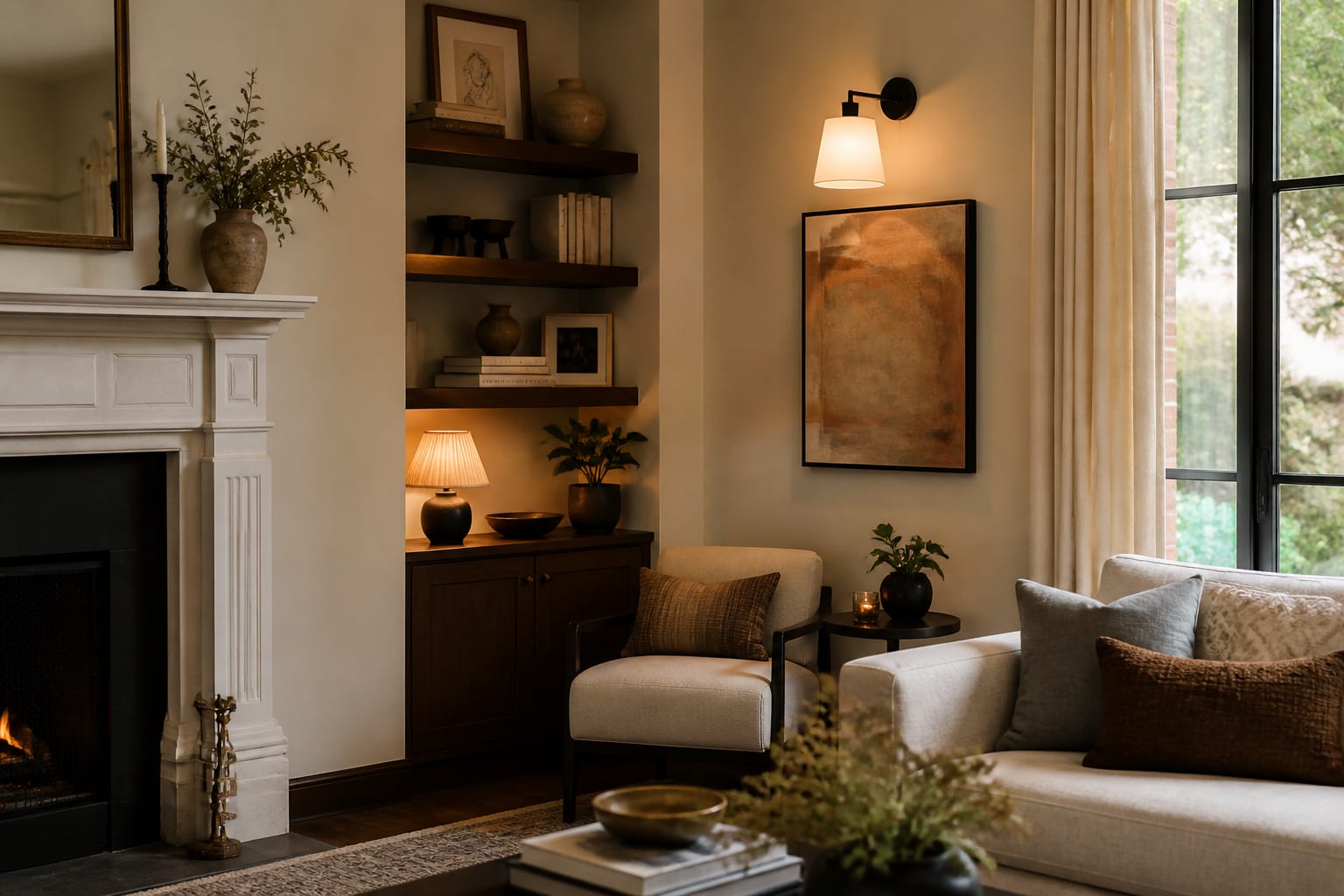
The third read is the corner's relationship to the rest of the room. A corner directly across from the main seating becomes a focal point whether you want it to or not, so it deserves your strongest idea: the tall plant, the gallery wrap, or the statement chair. A corner behind a door or tucked beside a sofa is a supporting player, and it does its best work holding a lamp and a small surface rather than competing for attention. Decide which kind of corner you have before you spend, because the same shelf tower that anchors a focal corner looks like overkill in a hidden one.
A run of corner ideas worth stealing
Here are the corner treatments I come back to most, roughly cheapest to most involved. Pick one, commit to it, and let it own the space:
- A reading nook: a single comfortable chair angled at 45 degrees, a slim floor lamp, and a 12-inch side table for a mug. About 4x4 feet does it. For the full version, see my reading nook ideas.
- A tall statement plant: a fiddle-leaf fig, bird of paradise, or olive tree at 5-6 feet in a planter wide enough to look stable, not tippy.
- A corner shelf tower: a 5-tier etagere or floating shelves that climb the wall, styled with books, a small lamp, and two or three objects, not twelve.
- A compact workstation: a small corner desk, a single shelf above, and a wall sconce so you reclaim a work zone without a whole office.
- A bar or drinks corner: a narrow cabinet, a tray of bottles and glasses, and a mirror or a bit of art behind it.
- A gallery corner: art wrapped around both walls of the angle so the corner becomes the focal point instead of the gap.
- A bench-and-hooks landing zone near an entry corner, with a 16-18 inch deep bench and hooks set at 60-66 inches.
The one rule across all of them: the corner gets a deliberate light source. A floor lamp, a sconce, or a small table lamp around 2700K turns the corner from a shadow into a destination.
Style it so the corner looks composed, not stuffed
Once the main piece is chosen, styling is about restraint and a little height variation. Group objects in odd numbers, vary their heights so your eye moves up and across, and leave real negative space; a packed corner reads as clutter no matter how nice the objects are. If the corner is anchored by a chair or shelf, one piece of wall art behind it, centered near 57-60 inches, ties the floor and wall together.
The corner is also a natural place to push a little texture or color you wouldn't commit to across a whole wall. A small accent treatment in the angle reads as intentional rather than risky, and it's a low-stakes spot to test a bolder finish, the same logic behind a DIY accent wall but at one-tenth the surface area. Keep the palette tied to the rest of the room by repeating one color already present so the corner belongs to the space instead of looking bolted on.
Scale the objects to the corner, not to the shelf they sit on. A common error is filling every inch of a shelf tower so the corner looks busier than the rest of the room; leave one tier mostly empty and the whole arrangement breathes. If the corner holds a chair, resist surrounding it with three small tables and a basket and a floor lamp and a throw; pick the two pieces the chair actually needs and stop. Restraint is what separates a corner that looks styled from one that looks like a holding pen for homeless objects, and it costs nothing to apply.
Use AI design to preview your corner before you commit
The tricky thing about corners is scale: a plant that looks huge at the nursery can vanish in the angle of a tall room, and a chair that looks cozy in a catalog can crowd a path you forgot was there. Before you haul anything home, upload a photo of your actual empty corner to Re-Design and let the AI design tool re-render it as a reading nook, a tall-plant moment, or a slim shelving tower so you can judge the proportions against your real walls and ceiling height.
Because you upload the genuine corner, with its real window, its real baseboard, its real distance from the doorway, the AI design respects the constraints a generic mood board ignores. Test a 6-foot plant against a 5-tier shelf, swap a 45-degree chair for a square cabinet, and see which one finally makes the corner feel like a decision rather than an afterthought, all before anything ships.