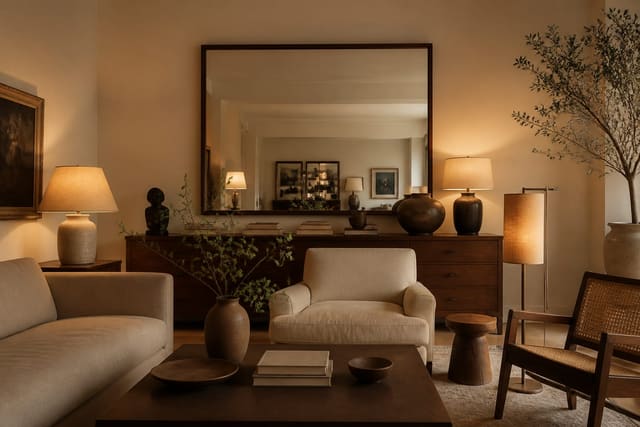
Yes, you can absolutely mix different wood tones in one room, and honestly you should. A space where the floor, the table, the shelf, and the chairs all match the exact same factory finish looks like a showroom box, not a home. My read is that matchy wood reads as cheaper than mixed wood, because nobody collects a real room all at once. The trick is that mixing has rules, and once you know them the chaos disappears.
The rule I lean on hardest: pick one wood tone to dominate, usually the largest surface like the floor, then let two or three other tones play supporting roles. When every tone fights for the lead, the room feels nervous. When one clearly wins, everything else reads as a deliberate accent.
Start with undertone, not color
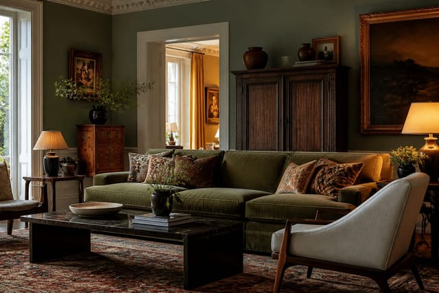
The single biggest reason mixed woods look wrong is undertone clash, not the light-versus-dark difference everyone worries about. Every wood leans warm (red, orange, yellow), cool (gray, ashy), or neutral. A honey oak floor and a rich walnut table look great together because both run warm. That same honey floor next to a gray-washed cool console looks like a mistake, even though the contrast in darkness is identical.
So before anything else, sort your pieces by undertone. Pull a plain white sheet of paper, hold it within about 6 inches of each wood surface, and the undertone jumps out against true white. Do this in daylight near a window, because a warm 2700K bulb pushes every wood toward orange and lies to you about the real undertone. Group your warm woods and your cool woods into two piles. You can mix within a group freely. Crossing groups is the advanced move, and it only works when you add a deliberate bridge, which I will get to. If your room already fights you on lighting, the undertone read gets harder, and the fixes I cover in my dark room solutions guide make those undertones far easier to judge.
A quick gut check before you commit: if you hold two woods 12 inches apart and your eye keeps darting between them trying to decide whether they match, they do not, and that uncertainty is exactly the clash undertone causes. Two woods that clearly belong together let your eye settle in under a second.
Set a dominant tone and a clear hierarchy
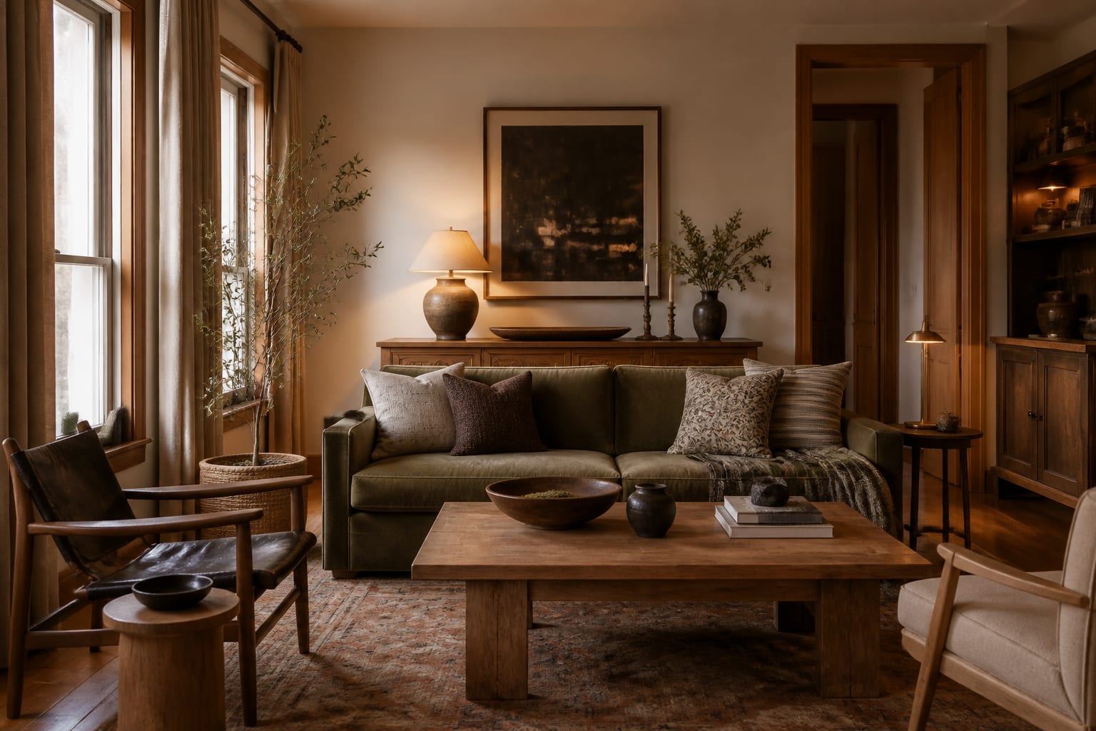
Rooms need a wood leader. In most spaces the floor is the largest wood surface, so it sets the dominant tone by default, often 60% or more of the visible wood. Let it lead. Your dining table, bed frame, or media console becomes the secondary tone, and small pieces like frames, stools, and shelves carry the accent tones.
Here is the hierarchy I build to almost every time:
- Dominant (around 60%): the floor or the single largest wood element.
- Secondary (around 25%): one major furniture piece in a clearly different tone.
- Accent (around 15%): two or three small pieces that repeat one of the other tones.
- Bridge: a non-wood element, like a jute rug or brass lamp, that ties the warm and cool sides together.
The percentages are not precise math, they are a gut check. If you squint and one tone clearly owns the room, you are fine. If three tones each grab about a third, the eye has nowhere to rest and the room feels busy. A rough target I aim for: the dominant tone should read across at least 60% of the wood you can see from the doorway, and no single accent tone should cover more than about 20%.
The bridge piece deserves its own note, because it is what lets you break the warm-with-warm rule on purpose. A jute or wool rug roughly 8 by 10 feet under the seating zone, or a brass lamp and a few metal frames, gives your eye a neutral resting place between a warm floor and a cool console. Without that bridge, the two undertones argue across the room; with it, they read as a curated contrast.
Use contrast and repetition on purpose
Two woods that are almost the same tone but not quite are the worst-looking combination there is, worse than a bold contrast. A medium oak chair next to a slightly-more-orange medium oak table reads as a failed match rather than a choice. So give adjacent woods real separation: aim for roughly a 3-shade gap in value so they clearly differ, or keep them genuinely close enough to pass as the same family.
Repetition is what sells the whole thing as intentional. Any secondary or accent tone should show up at least twice. One lonely black-walnut stool in a room of pale ash looks like an orphan; two walnut pieces on opposite sides of the room look like a plan. The same principle of repeating an element to make it read as deliberate runs through my approach to mixing design styles more broadly: repeat, balance, and let one thing lead.
Keep woods from touching edge to edge. When a wood table sits directly on a wood floor, a rug underneath gives the eye at least 8 inches of visual buffer so the two tones do not blur into a muddy near-match. Textiles, metal table legs, and stone tops all do the same buffering job. Even a 24-inch runner between a wood bench and a wood console is enough to stop two finishes from fighting where they meet.
Common mistakes to avoid
The most common mistake is trying to match wood tones perfectly, then ending up with several near-misses that look like a sourcing error. Aim for clear contrast or a true match, never the awkward middle.
A second mistake is ignoring undertone and shopping by darkness alone, which is how a warm walnut ends up clashing with a cool gray oak even though both are dark. A third is the single-orphan piece: one accent wood used exactly once, with nothing to echo it. Repeat it or cut it. People also overload the room, cramming in 5 or 6 distinct wood tones until nothing leads. Cap it at 3 to 4. The last common mistake is forgetting the bridge, expecting wood to tie to wood directly when a rug, a metal, or a textile would carry the eye across the gap far more gracefully.
Use AI design to test wood combinations before you buy
The genuinely hard part of mixing wood tones is that you cannot see the combination until everything is in the room, and by then the walnut table is paid for and the rug is unrolled. This is exactly where Re-Design pays off. Upload a photo of your actual room, with your real floor already in frame, and the AI design re-renders it with different table, shelf, and chair finishes so you can judge the undertone match against the floor you already own.
Because you upload your real space, the previews respect your actual light, your floor's true undertone, and the surfaces the new wood will sit beside. Test a warm walnut against your oak floor, then swap in a cool ash and see which one fights and which one sings, all before you spend a dollar on furniture you cannot return.