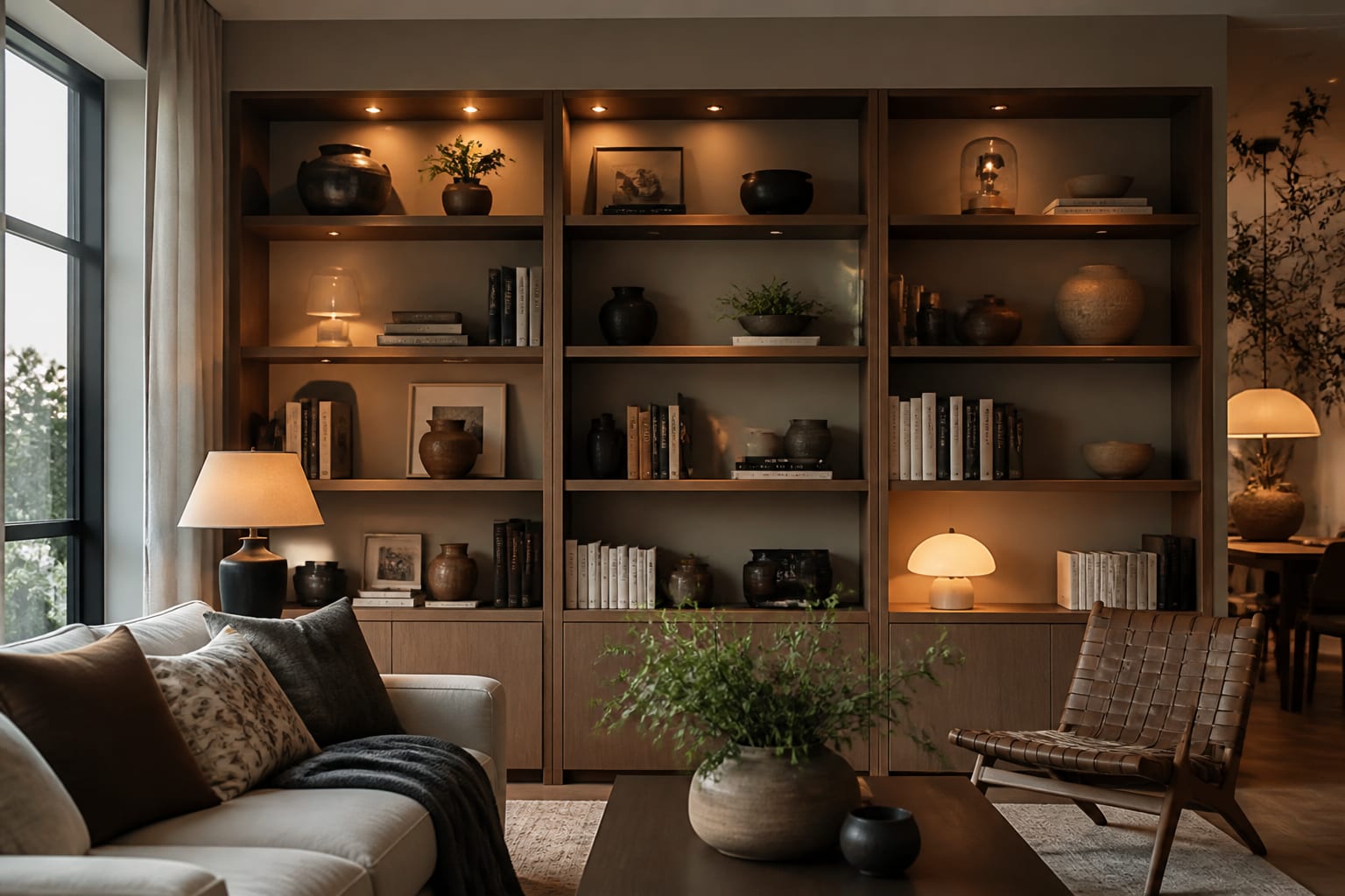
The fastest way to style a bookshelf like a designer is to stop filling it. The shelves that look professionally done are about 70% full, not 100%, and that empty 30% is doing more work than any single object on them. My honest take is that an overstuffed shelf always reads as storage, while a slightly under-filled one reads as styled, even when the objects are identical.
The method I use on every shelf is layering: a back layer, a front layer, and a base of stacked books, repeated shelf by shelf. Once you see a bookcase as a grid of small compositions rather than one big wall to fill, the whole thing gets easy.
Build the bones with books first
Books are the foundation, not the leftover. Before a single object goes on, arrange your books in two ways on every shelf: a vertical run held by bookends, and a horizontal stack of 3 to 5 books lying flat. That horizontal stack does double duty, because it also becomes a riser to lift a small object up off the shelf surface.
A 60/40 ratio of vertical to horizontal across the whole unit keeps things rhythmic without looking like a pattern. Keep each horizontal stack short, around 4 to 6 inches tall, so it lifts a small object without dominating the shelf. If your books are a loud mix of spines, turn a few stacks spine-in or wrap them in paper so color does not run the show. The goal is a calm base layer that the objects sit against. Color-grouping the spines, even loosely from light to dark, instantly reads as more intentional, the same restraint that makes a living room layout feel composed rather than accidental.
Give the books room to breathe vertically too. If your shelves are adjustable, leave roughly 2 to 3 inches of clearance above the tallest books on a shelf so the row does not look jammed against the shelf above it. That sliver of air at the top of each shelf does the same quiet work as the negative space you leave at the sides.
Layer in three dimensions
The word styled really means layered. On each shelf or vignette, build front to back: a tall object at the back (framed art, a large vase, a leaning print), a medium object overlapping in front of it, and a small object at the base. That overlap is the whole trick. When objects touch and overlap rather than sitting in a tidy row, the eye reads depth instead of a line of soldiers.
Vary height aggressively. Nothing kills a shelf faster than three objects all the same 8 inches tall standing in a row. I want a tall piece around 10 to 12 inches, a medium around 6 inches, and a short one under 4 inches in close range, then a gap. That spread of heights is what makes the eye climb and descend instead of skating flat across a row. Here is the object mix I reach for on a styled unit:
- One sculptural object per zone: a vase, a bowl, a small sculpture, or a bust.
- One piece of leaning art at the back of at least one shelf, propped not hung.
- One organic element, like a trailing plant or dried stems, to soften hard edges.
- One personal object with a story so the shelf does not look bought in a single trip.
- One stack of books as a riser under a smaller piece.
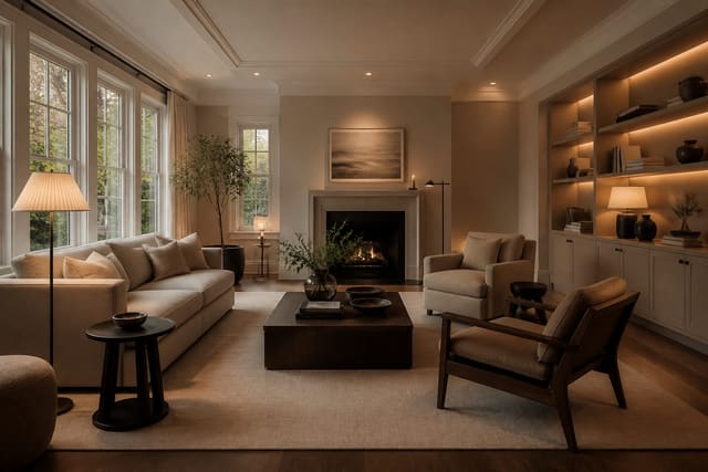
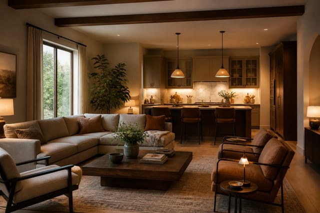
The same logic of mixing scale and texture so a space feels collected rather than catalog-ordered runs through my take on open-plan living zones too.
Edit for negative space and color
Once everything is on, take a third of it off. This is the step most people skip, and it is the one that separates styled from stuffed. Leave roughly 30% of each shelf as open air. Negative space frames the objects you kept and gives the eye somewhere to rest between clusters.
Then control color. Pick 2 or 3 colors that repeat across the whole bookcase, plus a metal or wood you echo a few times. A brass object on the top shelf wants a brass echo two shelves down so the eye travels. Keep at least 2 inches of breathing room around each grouping; objects crammed shoulder to shoulder lose their individual shapes and turn into visual noise. As a rough budget, I let color fill maybe 30% of the visible surface and keep the other 70% in quiet neutrals, because a bookcase that is 60% bright color reads as loud no matter how well the shapes are arranged.
Step back 6 feet and look at the whole unit, not one shelf. Styling shelf by shelf at close range fools you into balancing each row in isolation, when what actually matters is whether the heavy objects and the open gaps spread evenly across the full grid. Heavy clusters all stacked on the left with empty air on the right will tip the whole bookcase visually, even if every single shelf looks fine on its own.
Common mistakes to avoid
The most common mistake is filling every shelf completely, which is the single thing that makes a bookcase read as storage instead of decor. Pull pieces until each shelf breathes.
A close second is lining objects up in a flat row at equal heights, with no overlap and no depth, so the shelf looks like inventory. Layer front to back instead. Another mistake is symmetry overload: perfectly mirrored shelves feel stiff and showroom-like, so let the two sides balance by weight rather than match piece for piece. People also scatter color randomly, with one red here and one blue there and no repetition, which fragments the whole unit. And the last common mistake is forgetting risers, leaving every object flat on the shelf so nothing varies in height. A simple 3-book stack under a small bowl fixes that in seconds.
Use AI design to preview your shelf styling before you shop
The frustrating thing about styling a bookshelf is that you usually discover what is missing only after you have already arranged everything you own. Re-Design shortcuts that. Upload a photo of your actual bookcase, full or empty, and the AI design re-renders it with balanced layering, varied heights, and breathing room so you can see the target composition before you move a single object.
Because you upload your real shelf, the previews work with your actual proportions, your wall color, and the light the unit sits in. Test a version heavy on books against one heavy on objects, see how much negative space you actually want, and build a shopping list of the few pieces that would finish the look, all before you buy another vase you do not need.