Most room photos fail for the same boring reasons: the camera is too high, the light is wrong, and the walls lean like a funhouse. The honest answer is that you do not need a fancy camera to fix any of that, just a few habits and a steady hand or tripod.
To photograph a room for interior design purposes, shoot from about chest height around 4 to 5 feet, turn off overhead lights and use soft natural daylight, keep your vertical lines straight, declutter the frame, and capture two walls in the shot to show depth. Those moves alone separate an amateur snapshot from a clean, usable image.
Get the camera height and angle right
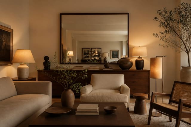
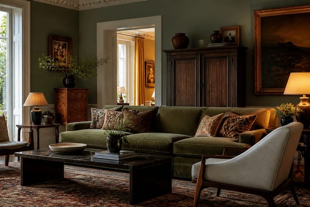
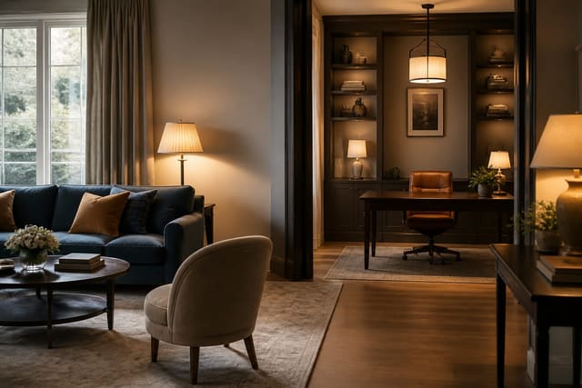
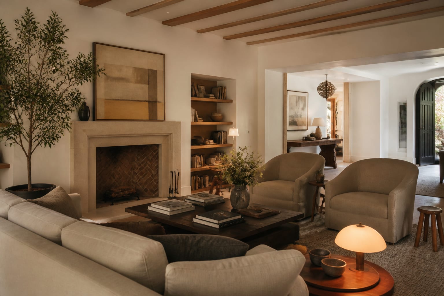
Height is the single biggest tell of an amateur room photo. Phones held at standing eye level, near 5.5 feet, tip downward and make floors balloon while ceilings shrink. Drop to chest height, about 48 to 60 inches, and keep the camera level so the back wall sits squarely in frame. The room instantly looks more like how the eye actually reads it. Professional interior shooters often go even lower, closer to 40 inches, to give furniture presence, so if a shot feels flat, try crouching a little further before you change anything else.
Angle matters as much as height. Shooting straight at one flat wall gives you a lifeless rectangle, so aim into a corner to catch two walls at once and let the room show its volume. Stand back far enough to include foreground, like the edge of a rug or a chair, which gives the photo a sense of where you are standing. A reliable approach is to position yourself in one corner of the room and shoot toward the opposite corner, which captures the most floor, the most wall, and the truest sense of how big the space really is. If the room is dim to begin with, the brightening tactics in AI design dark room solutions will help the space photograph far better.
Master the light
Light is where most interior shots quietly go wrong. Mixing daylight from a window with warm bulbs overhead produces an ugly split of orange and blue across the same frame, because the two sources have different color temperatures. The cleanest fix is to turn off all the interior lights and shoot with soft, indirect daylight, ideally on an overcast day or when the sun is not blasting straight through the glass. The best window for natural light is usually mid-morning or late afternoon, when the sun is off-axis and the room fills with even, diffuse light rather than hard noon shadows.
When the natural light is working, dial in these basics before you press the shutter:
- Shoot during the day with curtains open and lamps off for a single consistent color.
- Avoid direct, harsh sun beams that blow out one patch and shadow the rest.
- Expose for the room, not the bright window, so the walls do not fall into darkness.
- Steady the camera on a tripod or shelf so a slower shutter stays sharp in low light.
- Wipe the phone lens, since a smudge softens the whole image more than people expect.
Good light also makes materials and color read true, which matters if you are about to combine looks. When you are documenting a space to plan a redesign, the principles in how to mix design styles are easier to apply from an accurate photo than a muddy one. If your phone offers it, lock the exposure and white balance before you shoot so the color does not drift between frames; tapping to set focus and then holding to lock keeps the whole set consistent. Shooting in the brightest part of the day also lets you keep ISO low, around 100 to 200, which means cleaner images with less of the grain that creeps in when a phone fights for light.
Compose and prep the room
The best camera settings cannot rescue a cluttered frame, so prep the room before you shoot. Clear countertops, hide cords, straighten cushions, and pull anything distracting out of view. A photo flattens a space, so visual noise that you tune out in person jumps forward in the image. Fewer objects, cleaner result. A useful habit is to shoot one test frame, study it on the screen, and then remove the three things your eye snags on, because the camera always finds clutter you stopped noticing weeks ago.
Keep your verticals vertical, the door frames, window edges, and wall corners running straight up and down rather than leaning. Even a small 2 to 3 degree tilt makes a room feel like it is sliding off the page, and it is the first thing a trained eye catches. Use your phone's grid overlay to line up edges, and correct any minor lean in editing. If the space serves more than one function and you want to show that, dual-purpose room ideas covers staging a room so both of its jobs read clearly in a single frame.
Composition rewards patience over gear. Take five or six frames from slightly different spots rather than settling for the first, because a step left or a foot lower can change a photo from cramped to balanced. Leave a little breathing room at the edges so nothing important gets clipped, and resist the urge to zoom with your fingers, which crops resolution away; move your feet instead. The strongest interior shots usually come from a tripod and a two-second timer, since that combination removes camera shake and lets you step out of the frame to study the scene before the shutter fires.
Common mistakes to avoid
The most common mistake is shooting from a standing position and angling the phone down at the floor. It distorts the proportions and shrinks the ceiling; crouch to chest height instead and keep the camera level. This one change fixes more bad photos than any filter.
Another common mistake is leaving every light on and assuming brighter is better, which gives you that orange-and-blue color clash across the room. Turn the bulbs off and let one daylight source rule. The third mistake to avoid is over-editing, cranking saturation and contrast until the wall color no longer matches reality; if you plan to use the shot to judge a redesign, an honest, lightly corrected image serves you far better than a punchy fake one.
Use AI design to preview room changes before you commit
Once you have a clean, well-lit photo, it becomes the raw material for testing ideas. With Re-Design you can upload that room photo and re-render it in new styles, colors, and layouts, so the effort you put into a good shot pays off as accurate design previews instead of just a nice picture.
A sharp, true-to-color image is exactly what the AI needs to do its best work. Upload a straight, decluttered photo with even daylight, and the re-rendered versions will track your real walls, floors, and proportions closely. The better your input photo, the more believable the preview, which is why these shooting habits matter even if you never post the picture anywhere.