Color enters a neutral room safely through small reversible additions — throw pillows, a rug, art, one accent chair, or a single accent wall — each previewable in AI before purchase so the color decision is tested at room scale, not at paint-chip scale. Grey is not a personality; it is often fear wearing a very tasteful coat. If every room in your home has become a fog of charcoal, oatmeal, and “safe” beige, the problem is not that you dislike color. My opinion is direct: color confidence comes from repetition, not bravery. You need a method that lets one color prove itself before it gets anywhere near a wall.
What is the safest way to start adding color?
You start adding color to a room if you are afraid of color by choosing one movable color, repeating it in three small places, and testing it in the room's real light before you touch paint. The safest first color is not the trendiest shade; it is the color that already has a reason to belong in your room.
Look at what you are keeping: flooring, sofa fabric, wood tone, stone, tile, art, and the view outside the window. Pull one color from that evidence. A moss green from a landscape print, a muted blue from a rug stripe, or a rust note from a brick fireplace will feel less random than a color chosen from a perfect online room with different light.
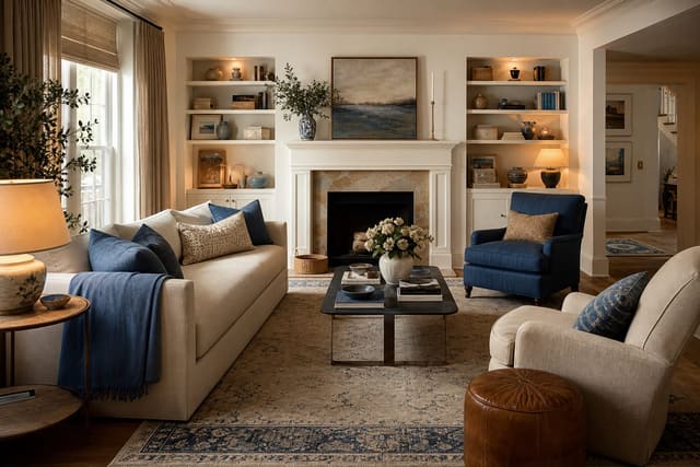
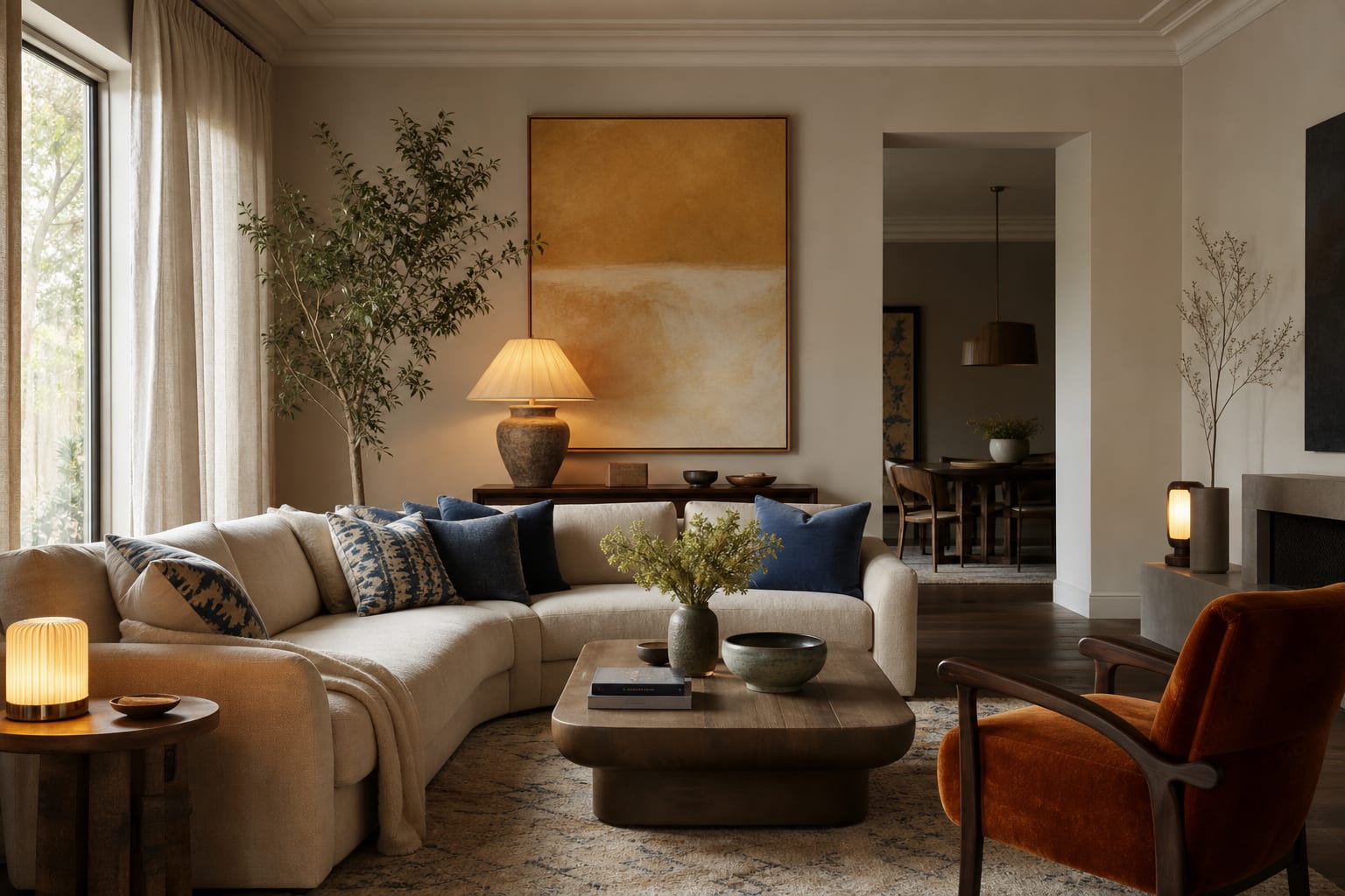
Start with a 70-20-10 comfort ratio. Keep about 70% of the room neutral or existing, let 20% become softened color, and reserve 10% for the bolder accent. In a living room, that might mean a grey sofa and cream curtains remain, while two 20-inch blue pillows, a 5-by-7-foot art print, and a glazed lamp introduce the new direction.
Do not judge color under weak light. A timid blue can turn dull in a north-facing room, while a warm terracotta may go muddy under a cheap cool bulb. If the whole space looks flat before color enters, fix the light first with ideas from creating fake natural light in any room, then choose the accent. Color is hard enough; do not make it audition in bad lighting.
Which low-commitment color moves build confidence fastest?
The best first moves are the ones you can return, move, or hide in a closet. Paint is not forbidden, but it should not be the first place a nervous decorator proves courage.
- Choose pillows with one clear job, not five competing colors. Use two matching 20-inch covers on a sofa, then add one smaller patterned pillow that includes the same color plus one neutral from the room. This gives the color a rhythm instead of making it look like a stranded purchase.
- Try art larger than your instinct. A tiny colorful print on a large grey wall looks apologetic. Over a sofa, aim for art around two-thirds of the sofa width, or group two frames with 2 to 3 inches between them so the color reads as a deliberate block.
- Use lampshades as a test zone. A pleated shade in olive, clay, denim, or saffron changes the mood without changing the furniture. Keep the shade diameter roughly 2 inches wider than the lamp base on each side, and use warm bulbs around 2700K to 3000K so the color feels flattering at night.
- Let textiles carry the first serious dose. A throw at the foot of a bed, a runner in an entry, or curtain panels in a muted color can cover enough surface area to matter. Hang curtains 6 to 8 inches above the casing and extend the rod 8 to 12 inches beyond the trim so the color frames the window rather than shrinking it.
Mirrors can make color feel safer when they reflect light, pale walls, or a controlled accent. They make fear worse when they double a messy shelf or a loud corner. Before adding a colored object opposite a mirror, use the same discipline behind using mirrors to amplify light: check what the reflection will repeat.
Test this on your own room photo with ReDesign before you choose the final direction; keep the doorway, walls, windows, main furniture, lighting, and awkward fixed features visible so the preview solves the room you actually have.
Common mistakes that keep color feeling risky
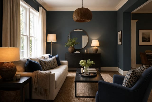
- Buying the boldest version first usually creates regret. If you love emerald, begin with eucalyptus, moss, or deep olive before choosing the jewel-tone sofa. A muted version lets your eye adjust while still moving the room away from default grey.
- Adding one colorful object and stopping makes the color look accidental. Repeat the hue three times at different heights: low in a rug or ottoman, middle in a pillow or chair, high in art or a shade. The repetition is what turns a color from a dare into a scheme.
- Testing color only on your phone is a trap. Screens brighten, cool, and smooth everything. Order a fabric swatch, tape up a 12-by-18-inch paint sample board, or bring home the actual pillow cover before deciding the color is too much.
- Choosing color without naming the neutral undertone causes quiet clashes. Warm grey, cool grey, beige, cream, white, black, wood, metal, and greenery all count as visual ingredients. A dusty rose pillow may be charming beside mushroom walls and terrible beside blue-grey upholstery.
- Spreading tiny accents everywhere makes the room feel busy instead of brave. Put more color in fewer places. One 24-by-36-inch artwork, two substantial pillows, and one colored lamp will usually feel calmer than twelve small objects scattered across shelves.
Use AI design to preview color before you commit
AI design is especially useful when you are afraid of color because it lets you test the degree of color, not just the hue. Upload a straight photo of the actual room and ask for versions that keep your major furniture, flooring, windows, and layout intact. The value is seeing whether blue pillows, a green rug, or clay curtains work with the room you own.
Take the photo from the doorway or the back corner so the preview includes at least two walls, the floor, ceiling line, windows, and the largest furniture. Open curtains for a daylight version, then take a second photo with the lamps you actually use after sunset. Color that looks charming at noon can feel theatrical at 9 p.m.
Run focused tests instead of asking for a total makeover. Try one version with the accent only in pillows and art, one with the same accent in curtains, and one with a bolder painted niche or cabinet. Keep the sofa, rug, and main storage pieces the same in every version, or you will not know whether the color worked or the fantasy furniture carried the image.
If your room has several openings, color may be arriving from the hallway, kitchen, or entry before you add anything new. In that case, borrow the sightline logic from fixing a room with too many doorways: make the visible neighboring spaces quieter, then let one room hold the stronger accent.
How do you know when the room is colorful enough?
A room has enough color when your eye can name the palette in one sentence. “Cream, warm grey, olive, and black” sounds controlled. “Grey, beige, teal, pink, yellow, brass, navy, white, and some wood” sounds like shopping happened without editing.
Use the doorway test. Stand where you first enter the room and give yourself three seconds. If the color appears in one strong place and two supporting places, keep going only if the room still feels flat. If your eye jumps to five unrelated colored objects, remove one accent before adding another.
For renters, stop before the change requires permission. Colored lampshades, art, bedding, curtains, peel-and-stick panels inside a bookcase, and removable wallpaper behind open shelves can build confidence without risking a deposit. For owners, let the movable version win first. If you love the color for a month in textiles and art, then consider a painted door, powder room, built-in, or 3-foot-wide accent strip.
The real goal is not a colorful room. The goal is a room where color feels intentional enough that you stop second-guessing every object you bring through the door.
Frequently Asked Questions
Where should I add color first in a neutral room?
Start with throw pillows and a rug — both reversible, both visible from the doorway, and both shift the room read more than wall paint at the same dollar cost. Use the room photo to compare the visible layout and fixed constraints before committing, because door swings, windows, outlets, storage reach, circulation, and existing furniture decide whether the idea survives daily use.
Will an accent wall feel dated?
Single accent walls are back in style as deep moody zones (forest green, navy, terracotta) rather than the 2010 grey accent wall; pick a deep color in a different family than the existing wall. Keep the preview honest by leaving the problem area visible in the frame, then compare one conservative version against one bolder version before you buy lighting, paint, furniture, or storage.
What is the safest bold color to start with?
Deep green and warm terracotta work in almost any neutral room; both pair with oak, walnut, and white-oak wood tones without requiring a palette overhaul. Check the result against ordinary movement first: drawer clearance, chair pullout, walkway width, glare, switch access, and sightlines matter more than a perfect catalog angle.
How much color is too much for a neutral room?
Three bold accent items is the sweet spot — a rug, one piece of art, and pillows or a chair; more than that turns the room into a color story rather than a calm room with accent. Use the image to narrow priorities and measurements before ordering anything custom; final purchases still need real dimensions, outlet locations, installation limits, and product clearances.
Does AI preview color additions before I commit?
Yes — upload the neutral room photo and AI previews rug, pillow, accent wall, and chair color additions before any purchase or paint job. If the preview invents architecture or hides the awkward feature you need solved, rerun it with stricter instructions so the result remains tied to your actual room.
Three transformations to try
- Terracotta rug + green pillows in neutral room
- Navy accent wall behind neutral sofa
- Forest green accent chair in neutral room