Most living room color advice is too vague to be useful, and the result is that people either play it safe with greige or swing wildly at a trendy saturated tone without a strategy for pulling it off. The best living room color decisions are made relative to the room's light source, the existing furniture undertones, and a clear hierarchy of which surface carries the color and which surfaces support it.
A strong color choice backed by a weak execution — wrong finish, wrong lighting temperature, wrong adjacent tones — fails every time. The ideas below are specific enough to act on directly.
Warm Color Palette Ideas for Living Rooms
Warm living room palettes built on cream, terracotta, warm sage, and burnt orange are having a sustained moment for good reason — they photograph beautifully, they age well as trends shift, and they make the actual experience of being in the room feel more comfortable than cool palettes typically do. The key to executing a warm palette is establishing the wall color as either very light (LRV above 65) or deliberately saturated (LRV below 45), and avoiding the mid-range warm tones that read as unintentional tan.
Terracotta is the most requested warm living room color right now and the most misunderstood. True terracotta is a mid-to-high-saturation orange-red that requires strong, warm artificial light to avoid looking muddy in the evening. Pair it with natural linen, raw wood, and jute for the full effect. A diluted terracotta — more of a salmon or dusty blush — is far more versatile and works in rooms with limited natural light.
Warm sage green is distinct from both grey-sage and bright olive: it reads as a muted yellow-green with a warm undertone that bridges the gap between neutral and color. It pairs exceptionally well with warm wood furniture and cream upholstery. In south-facing rooms, warm sage can practically glow in afternoon light.
See also our guide to Living Room Without Tv Ideas for more on living room color ideas.
Cool and Moody Color Palette Ideas
Cool living room palettes in slate blue, deep teal, charcoal green, and plum are best suited to rooms with strong natural light and confident furnishing choices. A pale, poorly lit living room painted in a cool deep tone will feel cave-like rather than moody, so assess your light honestly before committing. If the room gets direct sun for at least four hours daily, a cool dark palette is a viable and dramatic option.
Slate blue-grey is the most forgiving of the cool dark tones because it sits close to neutral on the saturation scale and cooperates with both warm wood furniture and cool steel and glass pieces. It reads as sophisticated rather than cold, particularly when paired with warm white trim and natural fibre rugs that introduce texture without warmth.
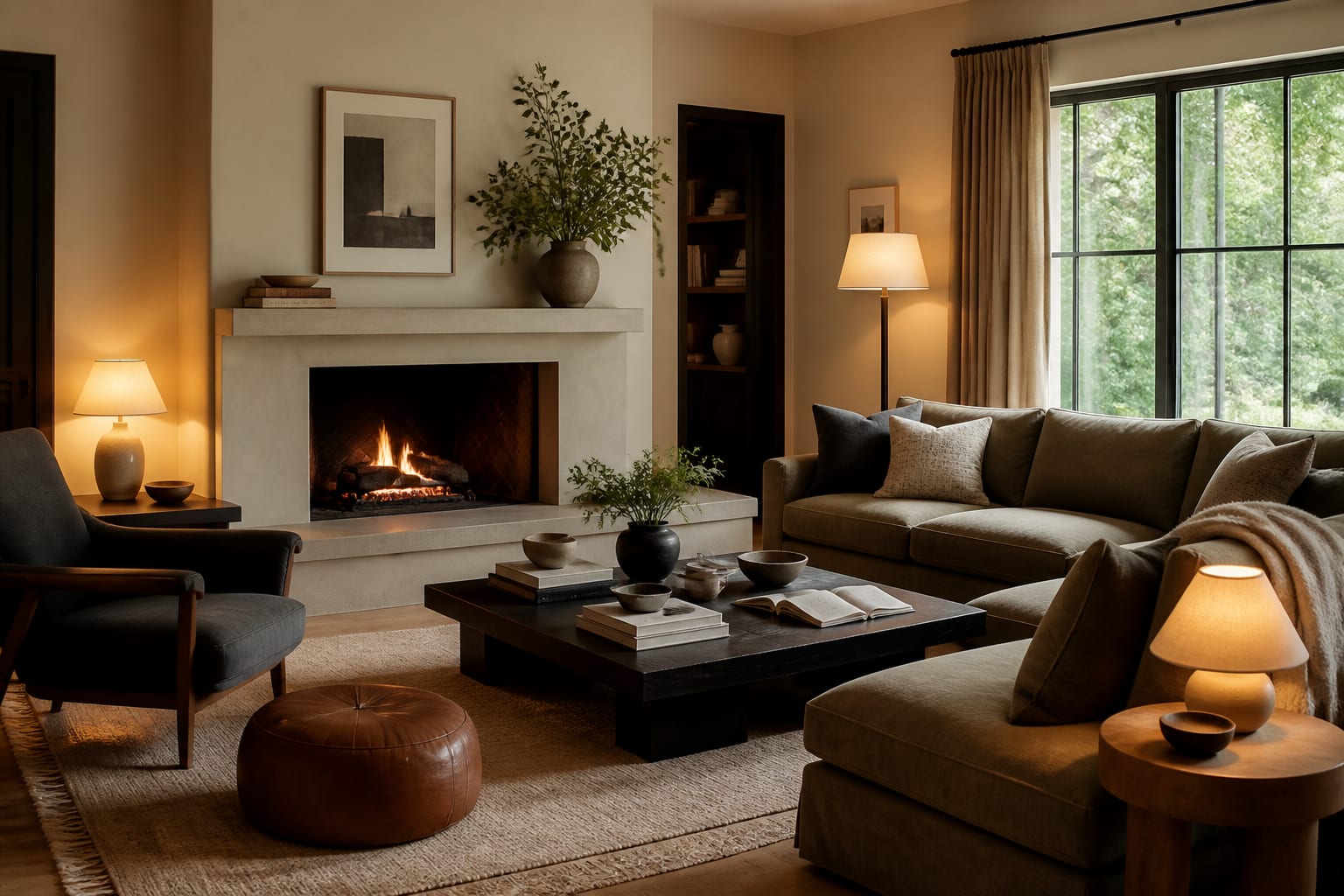
Deep forest green — a highly saturated dark green below LRV 20 — is the bolder option and creates an enveloping, library-like quality that works beautifully in living rooms used primarily in the evenings. Layer warm-temperature lighting at 2700K from multiple table and floor lamps rather than relying on overhead lighting, which will flatten the color and emphasize its darkness over its depth.
For a related angle on living room color ideas, read Neutral Living Room Ideas.
How to Use a Statement Color on One Surface
An accent wall works when the chosen wall has a reason to be featured — it frames a fireplace, anchors a television, or occupies the wall directly opposite the primary entry point so it is the first thing you see on entering the room. Painting a random side wall in a statement color with no architectural anchor looks arbitrary and rarely achieves the intended effect.
Beyond the accent wall, consider the ceiling as a color surface. Painting the ceiling the same color as the walls in a saturated tone creates a room-within-a-room effect that feels intentional and immersive. Painting the ceiling a tone two to three values deeper than the walls — while keeping walls in a lighter mid-tone — draws the eye upward and adds a sense of gravitas without committing to a full dark room.
Built-in shelving, alcoves, and recessed niches are perhaps the best accent color applications in a living room. Painting the interior of a bookcase in a deep tone while leaving the face frame in the wall color creates depth and makes the objects displayed inside read more clearly. This trick works with almost any accent color and requires less paint and less commitment than a full wall treatment.
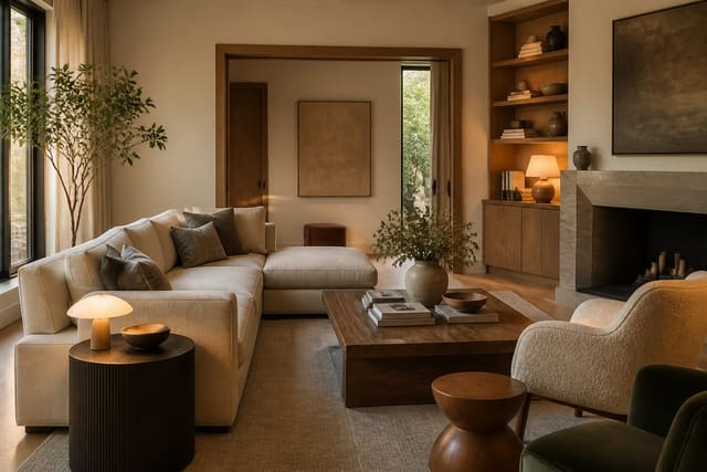
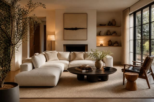
Coordinating Living Room Color With Existing Furniture
The most common color mistake in a furnished living room is choosing a wall color in isolation from the existing furniture. Every piece of furniture has a dominant undertone — warm brown wood, cool grey metal, creamy white upholstery — and the wall color needs to share that undertone bias or the room will feel subtly off without an obvious reason why.
Start by identifying whether your largest furniture piece is warm or cool. A warm brown leather sofa reads as warm-dominant, which means wall colors with yellow, orange, or green-yellow undertones will cooperate. A light grey linen sofa is cool-dominant, which opens the room to slate, blue-grey, or cool sage options. This single assessment rules out roughly half the color wheel before you even open a paint deck.
If your furniture mix is genuinely split — some warm wood pieces and some cool metal accents — lean toward warm neutrals on the walls and let the furniture carry the tonal tension. A warm greige wall unifies mixed-undertone furniture better than a strongly tinted wall color, which will inevitably favor one undertone family and clash with the other. This is also the situation where a textured or limewashed wall finish earns its money, because the visual complexity of the texture draws attention away from undertone mismatches.
- Try warm sage green on the wall opposite your main window — afternoon light turns it luminous without effort.
- Paint built-in bookcase interiors a deep navy or forest green to make displayed objects pop against a rich backdrop.
- Use the same color on walls and ceiling in a saturated tone for a full wraparound effect that feels intentional.
- Choose terracotta in its dusty, muted form rather than bright orange-red for a version that works in most lighting conditions.
- Bring in mustard yellow through a single large piece — an armchair or oversized cushion — before committing to a painted surface.
- Test a plum or deep mauve on the wall behind the sofa for an unexpected dark-warm option that flatters skin tones beautifully.
- Add a natural linen or jute rug to any bold wall color scheme as a grounding neutral that keeps the room from feeling overwhelming.
Bring the look home with Re-Design
Re-Design removes the anxiety from living room color decisions by letting you upload a photo of your space and preview any palette directly on your walls, ceiling, and furniture. The AI renders realistic lighting and material interactions so you can evaluate how a deep forest green reads at night versus midday, or whether that warm terracotta cooperates with your existing sofa, all before buying a single paint pot.
Frequently Asked Questions
What living room colors make a small room feel larger?
Light tones with high LRV values — soft whites, pale warm creams, and light greiges — reliably expand the apparent size of a small living room by reflecting more light and reducing the visual weight of the walls. The effect is amplified when the trim is painted the same color as the walls rather than white, which removes the banding effect that makes a room feel segmented and smaller.
Is an accent wall still a good living room idea?
An accent wall is a good idea when it has architectural logic — framing a fireplace, anchoring a sofa wall, or defining a recessed alcove. When applied arbitrarily to a side wall with no architectural feature, it tends to look dated. If you want a single statement surface, the ceiling or the back of a built-in are often more impactful and more considered choices than a painted accent wall.
How do I choose a living room color if I have no natural light?
In a room without meaningful natural light, avoid both very dark and very cool tones — dark tones feel oppressive without light to activate them, and cool tones read as grey or dingy under artificial light. Warm light tones in cream, warm white, or pale warm greige with consistent 2700K artificial lighting make the most of a low-light space. Mirrors positioned to amplify any ambient light source help considerably.