The reason most neutral living rooms feel flat is that people choose neutrals for safety and then stop, leaving a beige box with nothing for the eye to do. The fix is not more color but more texture and more contrast within the neutral range itself. A room built from boucle, linen, oak, jute, and a few darker anchors can stay almost entirely beige and cream and still feel rich, calm, and intentional. The discipline is matching undertones so the whites do not fight each other, then layering enough material variety that the space reads as designed rather than undecorated.
How do you pick neutral paint and undertones?
The single decision that makes or breaks a neutral room is undertone, because every off-white and beige leans warm or cool underneath. A greige with a green undertone next to a white with a pink undertone looks dirty, while two warm-leaning neutrals in the same family read as one calm field. Tape large painted samples to the wall and look at them at three times of day, since north-facing rooms pull cool and west-facing rooms throw warm afternoon light that shifts every undertone you chose.
For walls, a warm white or soft greige at a flat to matte sheen, around 2 to 5 percent, hides imperfections and reads soft and chalky. Save eggshell or satin for trim, where the slight 10 to 25 percent sheen gives crisp edges. Pick one neutral as your wall color and a slightly deeper version of the same undertone for built-ins or a feature wall, which adds dimension without introducing a competing color. If you want more on building a coordinated palette, our guide to Living Room Color Ideas walks through pairing tones room by room.
How do you layer texture so neutrals feel rich?
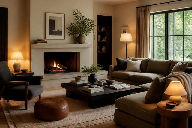
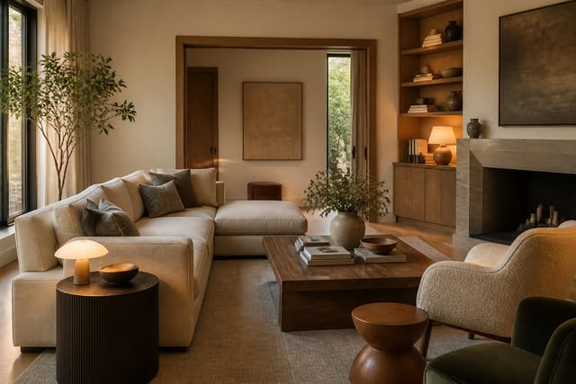
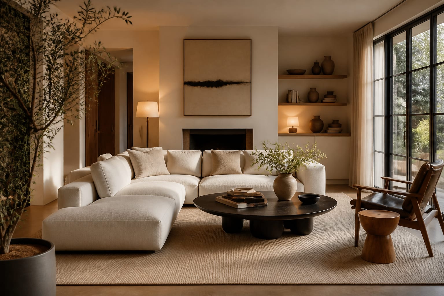
Texture does in a neutral room what color does in a brighter one: it gives the eye somewhere to land. Aim for at least four distinct materials in the seating zone alone. A linen sofa, a boucle accent chair, an oak coffee table, and a jute or wool rug already create three or four tactile contrasts that keep a cream-on-cream scheme from going flat. The variety reads as warmth and depth even when the color story barely moves.
Stack texture vertically, not just across the floor. A chunky knit throw over a smooth leather pouf, a row of woven baskets under a console, and a pair of nubby linen cushions against a flat upholstered back all build the layered look. Natural fibers carry this best because they reflect light unevenly, so jute, rattan, raw wood, and undyed wool feel alive where a smooth synthetic surface looks dead. Bring in ceramic and stone for a third dimension: a matte stoneware lamp base or a travertine side table adds a cool, hard texture that offsets all the soft goods. The trick is to keep adding material variety until the room feels full to the hand even though the palette stays quiet.
How do you add contrast to a pale room?
A neutral room without contrast washes out into a single hazy tone, so a few darker anchors are what give it backbone. The classic move is a touch of black or near-black in roughly a tenth of the room: black metal table legs, a charcoal lamp, a dark wood picture frame, or thin black window hardware. That small dose of depth makes every pale element around it read crisper and more deliberate.
Think in a rough 60-30-10 ratio. Let your dominant neutral cover about 60 percent of the visible surfaces, a secondary tone such as a warmer beige or soft taupe take 30 percent, and the darkest anchor color fill the final 10 percent across accents and accessories. Within that framework, layering tone-on-tone keeps the contrast from feeling stark: a cream sofa, oatmeal cushions, and a camel throw step gradually darker so the eye travels rather than jumps. Here are concrete ways to build a warm, layered neutral living room:
- Pair a cream linen sofa with a boucle chair and an oak coffee table for three textures in one zone.
- Anchor the seating with a low-pile wool or jute rug at least 8 by 10 feet so the furniture sits on it.
- Add black metal accents through table legs, a floor lamp, and slim picture frames for the 10 percent contrast.
- Stack a chunky knit throw and two nubby linen cushions to build vertical texture on a smooth sofa.
- Mix a matte stoneware lamp base and a travertine side table to bring hard, cool texture into the soft palette.
- Hang a large textile or a woven wall piece to add warmth and pattern without introducing a loud color.
- Step the neutrals tone-on-tone, from cream to oatmeal to camel, so the eye travels gradually across the room.
- Bring in living greenery, like an olive tree or a fiddle-leaf fig, as the one fresh accent against the neutrals.
How should you light and finish a neutral living room?
Lighting decides whether neutrals feel cozy or clinical, and the lever is color temperature. Warm bulbs around 2700K make beige, cream, and greige glow, while a cool 4000K bulb drains them to a flat gray-white that reads like an office. Put the main sources on dimmers so you can drop the room to a low evening glow, and layer at least three light levels: an ambient source, a couple of table or floor lamps for mid-height warmth, and a small accent or picture light to graze a textured wall.
Finish the room with the details that signal intention. Curtains in a heavy linen, hung high and wide so they puddle slightly at the floor, soften the windows and add another texture layer. A neutral room can carry one quiet pattern, like a subtle stripe or a tonal geometric, without breaking the calm. If you decide a room without a screen suits your layout, the principles for arranging seating around conversation rather than a television in Living Room Without TV Ideas pair well with a serene neutral palette. Keep accessories edited and grouped in odd numbers, since clutter is what actually makes a neutral room feel cheap rather than the color choice itself.
See it first in Re-Design
Neutrals are notoriously hard to judge from a swatch because undertones shift so dramatically with your room's light. Upload a photo of your living room to Re-Design and preview a warm greige scheme against a cooler oatmeal one, layering in a boucle chair, a jute rug, and black metal accents to see how the textures and contrast read in your actual space. You can compare a calm tone-on-tone version with one that adds a darker anchor wall before you commit to paint or order a sofa. Seeing the layered neutrals under your own windows takes the guesswork out of the undertone that swatches always hide.
Frequently Asked Questions
How do I keep a neutral living room from looking boring?
Lean on texture and contrast instead of color. Layer at least four materials, such as linen, boucle, oak, and jute, then add a small dose of black or dark wood across roughly a tenth of the room. The texture gives the eye somewhere to rest and the dark anchors give the pale palette backbone, so the room feels designed rather than undecorated.
What neutral undertones work together?
Stay within one undertone family. Pair warm-leaning whites, beiges, and greiges together, or keep everything cool, but do not mix a green-undertone greige with a pink-undertone white, which reads muddy. Tape large samples to the wall and check them in morning, midday, and afternoon light, since the room's exposure shifts every undertone you pick.
What is the 60-30-10 rule for neutrals?
Let a dominant neutral cover about 60 percent of the visible surfaces, a secondary tone like a warmer beige or taupe take 30 percent, and the darkest anchor fill the final 10 percent across accents. The ratio keeps a tonal room balanced, giving it a clear lead color, a supporting shade, and just enough contrast to stay interesting.
What lighting suits a neutral room?
Use warm bulbs around 2700K so the beige and cream tones glow rather than turning flat gray. Put the main fixtures on dimmers and layer at least three light levels: an ambient source, a couple of lamps for mid-height warmth, and an accent light to graze a textured wall. Cool 4000K bulbs make neutrals look clinical, so avoid them here.