Expensive rooms are not built from expensive things. They are built from contrast, scale, and the absence of visual noise, all of which cost almost nothing. Paint the trim crisp, swap the builder hardware, layer the light, and hide every cord, and a $300 budget reads like a designer was on retainer. The dirty secret of high-end interiors is that most of what registers as costly is detail work and restraint, not a single line item you could point to and price.
The contrast that reads as money
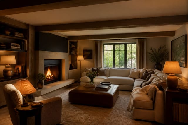
The fastest way to make a room look costly is to sharpen its edges. Trim, baseboards, and door casings in a clean semi-gloss white frame the walls and tell the eye the space was finished on purpose. A quart of trim paint covers about 100 linear feet of baseboard and runs $18 to $25, so a full room's trim costs under $30. Sharp trim against a slightly warmer wall is the single biggest visual upgrade per dollar in any room. The semi-gloss sheen also catches light along every edge, which traces the architecture of the room and makes even a plain rental feel deliberately detailed.
Hardware is the next tell. Builder homes ship with the cheapest available knobs, hinges, and pulls, and replacing them is the closest thing to a free luxury cue. Solid pulls cost $4 to $12 each, so refitting a dozen cabinet fronts lands between $48 and $144. The same logic applies to doorknobs and switch plates, where a matte black or brushed brass plate at $3 replaces the yellowed plastic that quietly cheapens a wall. Pick one metal finish and carry it through every visible piece, because mixed finishes are one of the surest signs of a room assembled on the cheap.
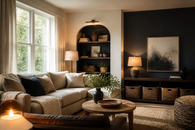
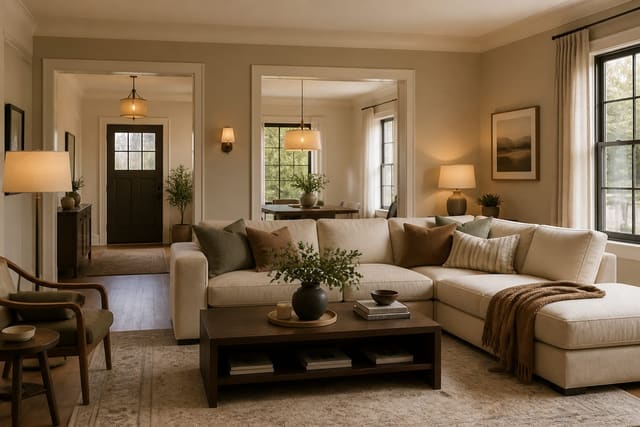
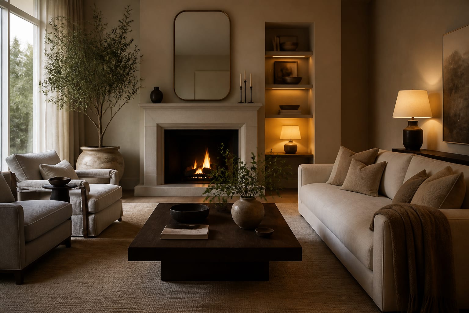
Layered light is the third signal and the one people most often miss. A single ceiling fixture flattens a room, while light from three heights, an overhead, a table lamp, and a floor lamp, creates the depth that expensive rooms always have. Stick to 2700K bulbs across all three so the color of the light matches, and put the lamps on a smart plug if you want them to come on together. The difference between one harsh source and three warm ones is the difference between a rental and a showroom. For rooms with a low ceiling, these low-ceiling design tricks stack neatly on top of crisp trim to buy back perceived height.
The cheap-luxury shopping list
Here is where I would put a $300 budget to fake an expensive room, in the order each move pays off:
- A quart of semi-gloss for trim and doors: $25
- Twelve cabinet or door pulls in a single finish: $80
- Two lamps plus 2700K bulbs for layered light: $70
- A larger 8x10 rug to anchor the seating: $90
- One oversized framed print, 30x40: $35
- Cord covers and a cable box to hide the wires: $20
That plan spends $320 and hits every signal that separates a cheap room from a considered one. Each line on that list targets a specific cheap-room tell and replaces it with a cue the eye reads as money. Scale is the part people skip. An 8x10 rug under the front furniture legs and a single 30x40 print do more than a wall of small frames, because expensive rooms use fewer, larger objects with breathing room around them. The instinct on a budget is to buy many small things to fill space, but that is exactly what makes a room read inexpensive. Spend the same $90 on one large rug instead of three small ones and the floor instantly looks intentional. A single oversized print at 30x40 commands a wall in a way that a grid of postcard-sized frames never manages, and it costs less to frame too. These weekend DIY room projects cover how to install the hardware and hang the art without hiring anyone.
Common mistakes to avoid
The biggest mistake is leaving cords visible. Nothing reads cheaper than a tangle of black cables running down a wall or pooling behind a console. A $20 cord cover painted to match the wall erases the most common budget-room giveaway in ten minutes. The same goes for the cable box and router; tuck them into a $25 woven basket or a shallow drawer so the eye never lands on a blinking stack of plastic. Cord management is invisible when done right and impossible to ignore when skipped.
The second mistake is too many colors. A room with five competing tones looks accidental; a disciplined palette of one neutral, one deep accent, and one metal finish looks deliberate. Pick your three and repeat them, and resist adding a fourth just because an item is on sale. The discipline of saying no to a color is what makes the remaining ones feel chosen rather than collected by accident over the years.
The third is ignoring the upgrade path on permanent finishes. If your builder-grade fixtures are the eyesore, learning to upgrade builder-grade finishes one swap at a time keeps the cohesive look intact while you replace the dated pieces over months rather than all at once.
A fourth mistake is hanging everything at the wrong height. Art centered at 57 to 60 inches from the floor and curtains hung within a few inches of the ceiling do more for the perceived value of a room than the objects themselves. People rarely notice correct proportions, but they always notice wrong ones, so getting the heights right is a free way to look like you hired help. Measure twice before you put a single hole in the wall.
Preview an Expensive-Looking Room in Re-Design
Frequently Asked Questions
What is the cheapest change that makes a room look expensive? Painting the trim and doors a clean semi-gloss white. A quart costs $18 to $25 and the crisp contrast against the walls instantly reads as a finished, considered space. It beats almost any furniture purchase per dollar.
Does swapping hardware really make a difference? More than people expect. New pulls and knobs at $4 to $12 each refresh cabinets and doors for a fraction of replacing them, and a matching finish across the room is a quiet signal of cost. A dozen fronts updates for under $150, and the work takes one afternoon with a single screwdriver.
How many colors should an expensive-looking room use? Three. One neutral base, one deeper accent, and one metal finish keep the room cohesive and intentional. Adding a fourth or fifth tone is what makes a budget room look scattered instead of curated, so the restraint is doing as much work as the colors themselves.