Matte black is the most forgiving hardware finish you can buy, and that is precisely why it took over kitchens and baths over the last decade. It reads as a neutral the way black ink reads on a printed page: it frames everything around it without ever competing. Does matte black go with everything? Close to it, as long as you control how much you use and choose a true flat black over a half-sheen that photographs gray.
The finish grounds warm woods, cool greys, white shaker doors, and bold patterned tile alike. The failure mode here is quantity, not compatibility, which is good news for almost any palette.
Why matte black pairs with almost everything
Black functions as a visual anchor, the darkest value in a room, so the eye reads it as structure rather than as a color choice. That is why it sits comfortably against oak, walnut, white, sage, navy, and terrazzo without clashing the way a colored metal often does. It carries none of the warm-or-cool undertone baggage that trips people up with brass and nickel.
The one variable that genuinely matters is sheen, and it is easy to overlook online. A genuine matte powder-coat absorbs light and stays inky from every viewing angle. A satin or semi-matte black reflects just enough to read dark gray near a bright window, which then fights the true-black fixtures elsewhere in the room. Confirm the finish reads dead flat in daylight before you commit to a whole kitchen of it.
- True matte: flat powder-coat, stays black from every angle.
- Satin black: slight reflectance, can read gray in bright light.
- Oil-rubbed bronze: a warmer near-black, not interchangeable with matte black.
- Avoid: mixing two different black sheens on the same cabinet plane.
Get the sheen consistent first, and the color compatibility takes care of itself. One quiet advantage of matte black is forgiveness across brands. Because true flat black has no undertone to clash, a pull from one maker and a faucet from another usually read as the same color, which almost never holds true with brass or nickel. That makes it the easiest finish to source across categories when one supplier does not carry everything you need.
There is a textural choice hiding here too. Some matte-black pieces add a fine sandy grain to the powder-coat, which hides smudges and reads softer, while others stay perfectly smooth and modern. Pick one texture and carry it through the room so the fixtures feel like a set rather than a collection.
Where matte black works best
Matte black earns its keep wherever contrast does real visual work. On white or light cabinetry it draws a crisp graphic outline; on a pale bathroom it sharpens an otherwise soft, sleepy scheme. It pairs naturally with black-framed shower glass, a black faucet, and black-framed windows for a coherent through-line that ties the whole room together.
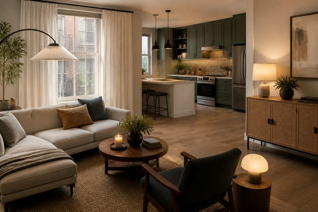
Coverage is the entire discipline with this finish. Cabinet pulls, a faucet, and one light fixture is a confident, balanced amount; piling hinges, switch plates, vents, and frames on top of that tips the room from grounded into heavy. Think in layers and stop one element earlier than you think you should. Renters can preview this contrast risk-free, much the way an AI room design for a rental apartment tests bold choices before a single screw is turned.
Sizing, durability, and concrete specs
Sizing for matte black follows the same rules as any cabinet hardware, but the dark color makes proportion mistakes far more obvious to the eye. Use a 1.25 inch knob on small doors and a 5 inch pull on standard doors, then scale up to a 10 inch pull on drawers wider than 30 inches. Budget roughly $6 to $20 per matte-black pull from common lines, with sealed powder-coat options at the higher end.
Durability is the real catch worth planning around. Powder-coated black resists daily wear well and shrugs off cleaning, but a cheaper painted finish can chip at high-touch edges within a year or two and show silver metal underneath. In a tight galley kitchen, the crisp black outline reads architectural and intentional, the same payoff that good AI interior design for small spaces chases through high-contrast detailing.
For cleaning, skip anything abrasive and wipe with a damp microfiber cloth and a drop of mild dish soap, since scouring pads dull the matte surface into uneven shiny patches. Hard-water spots near a faucet wipe away with a 50/50 vinegar-and-water mix, but rinse and dry afterward so no residue sits on the coating. Treated gently, a quality powder-coat holds its flat black look for a decade or more without fading.
Common mistakes to avoid
The first mistake is buying a satin-black faucet and matte-black pulls and expecting them to match, then living with one piece looking distinctly gray beside the other. The second is over-applying black to every single metal element until the room feels weighed down and dim rather than crisply grounded.
A third common mistake is pairing matte black against a busy, high-contrast countertop, which creates too many competing dark points and reads chaotic instead of calm. The fourth is ignoring fingerprints, since a true matte surface shows skin oils more than a brushed finish does, a detail staging pros watch closely in AI home staging design where every surface must photograph clean. The fifth is choosing matte black in a dark, north-facing room where it disappears rather than frames, leaving the hardware reading as smudges instead of clean lines. A sixth slip is mounting black pulls on dark cabinetry, where they vanish entirely and lose the crisp outline that made the finish worth choosing in the first place. Match black hardware to lighter surfaces so the contrast actually shows.
Use AI design to preview matte black hardware before you commit
Matte black looks bold and decisive in a single product photo, then often looks heavier than expected once it is multiplied across a real room. Re-Design lets you upload a photo of your kitchen or bath and preview matte-black pulls, faucets, and fixtures against your actual cabinet color and counter material.
That preview shows you whether the contrast lands crisp and architectural or dark and oppressive in your specific light, and exactly how much coverage is enough before the look tips. Dial the amount up or down across a few quick versions, then buy only the hardware that frames the room instead of weighing it down.
The coverage question is the one a render answers best, since matte black multiplies in impact as you add pieces. Try pulls alone, then pulls plus a faucet, then the full set with fixtures and frames, and watch the moment the room shifts from grounded to heavy. Finding that tipping point on screen costs nothing, while finding it after installation costs a second hardware order and an afternoon with a screwdriver.