The mid century modern color palette is more disciplined than it looks—the warmth and vibrancy of the era came from strict restraint, not abundance. Most people oversaturate, reaching for too many bold hues at once, and end up with a room that feels like a theme park version of the 1950s rather than the real thing.
The authentic approach uses a warm neutral base, one dominant wood tone, and one or two accent colors pulled from a tight historical range. Get those proportions right and the room calibrates itself. The guide below walks through each layer, gives you concrete specifications, and names the four mistakes that derail the palette most often.
The Neutral Foundation And Wall Color
The wall color in a mid century modern room is not a neutral in the bland sense—it is a precisely chosen warm tone that makes the wood furniture glow rather than fight it. A warm white with a yellow or red undertone (look for LRV values between 75 and 85 on a paint chip) reads as crisp without going cold. Soft greige, muted sage, and warm putty are equally valid if the room has strong walnut or teak furniture that can carry the contrast.
Cool grays are the single most common mistake. Anything with a blue or green-gray undertone turns walnut orange and makes the room feel unresolved. Benjamin Moore's White Dove, Farrow and Ball's Pointing, and Sherwin-Williams' Accessible Beige are commonly cited references—not because they are the only options but because they illustrate the undertone logic correctly.
Ceiling color matters more than most people admit. A ceiling at 10 to 15 percent lighter than the wall color creates a sense of height that the low-slung furniture needs. If the ceiling is the same color as the walls, the room can feel like a box. Slightly lighter above opens the architecture even in rooms with 8-foot ceilings, which is the standard in mid-century tract housing where this style originated.
See also our guide to What Is Industrial Design for more on mid century modern color palette.
Accent Colors And Their Correct Proportions
The 60/30/10 ratio is the most useful structural rule for this palette: 60 parts neutral (walls, ceiling, large rugs), 30 parts warm wood (furniture, shelving, trim), and 10 parts saturated accent (cushions, ceramics, a single painted wall). That 10 part accent is where the era's personality lives, but it only works because the 90 parts holding it are controlled.
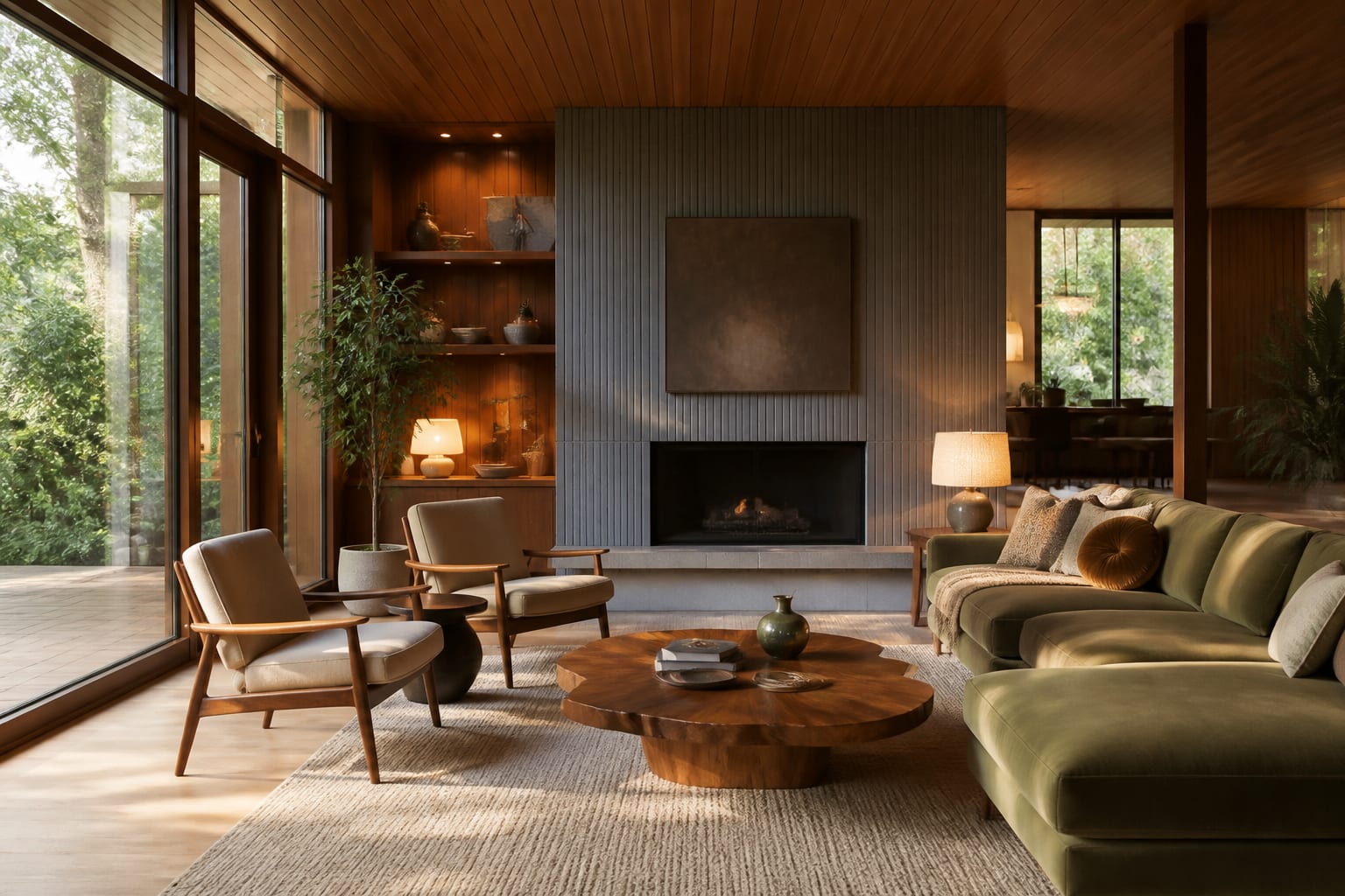
The five historically accurate accent colors are mustard yellow, olive green, burnt orange, teal, and slate blue. Each one has roots in the textile and ceramic output of designers like Alexander Girard, Marimekko, and the Knoll textile studio. Mustard and olive are the most forgiving because they share warm undertones with walnut grain. Teal and slate blue create more contrast and work best in rooms with strong natural light—north-facing rooms should avoid them.
Repeat the accent color at least 3 times in a room to make it read as intentional rather than accidental. One cushion alone looks like a styling mistake. One cushion plus a ceramic vase plus a small throw—or a single painted accent wall at roughly 120 square feet—creates pattern that the eye reads as designed. The repetition can be subtle: same hue, different saturation and scale.
For a related angle on mid century modern color palette, read What Is Dark Academia.
Wood Tones And Material Layering
Walnut, teak, and rosewood are the three wood tones that define mid century modern furniture. Of these, walnut is the most available and the most forgiving—its mid-brown base with warm red-violet undertones plays well against every accent color in the canonical set. Teak is warmer and more golden, which makes it pair especially well with mustard and olive. Rosewood is the darkest and most dramatic; use it as an accent piece rather than the dominant surface in a small room.
Mix no more than two distinct wood tones in a single room. A walnut desk alongside a teak credenza works because the tones are close enough to read as intentional family members. Walnut alongside raw pine or bleached oak creates a palette conflict that no amount of accent color can resolve. If you have existing light-wood floors, finish them with a medium-amber stain before layering in dark furniture—the floor and furniture should be within two shades of each other.
Beyond wood, the material palette should include at least one of: wool, leather, ceramic, rattan, or terrazzo. Each appears in documented mid century interiors and each contributes a tactile quality that flat painted surfaces lack. A terrazzo side table, a rattan pendant shade, or a wool throw in 18 by 54 inches draped over a chair arm are low-commitment ways to add material depth without repainting or buying new furniture.
Lighting Color Temperature And Its Role In The Palette
Light temperature changes every color in the room, and mid century modern interiors depend on warm light to hold the palette together. The target range is 2700K to 3000K for all ambient and task sources. At 2700K, warm whites read as cream, walnut grain reads as rich chocolate, and mustard yellow reads as gold. At 4000K or above, the same colors shift: the white looks stark, the walnut goes flat orange, and the mustard looks acid.
Bulb type matters as much as Kelvin rating. Incandescent or high-CRI LED bulbs at 2700K render colors most accurately against the 90-plus CRI threshold. A 90 CRI bulb at 2700K will show walnut grain with more depth than a 70 CRI bulb at the same temperature. The difference is visible in person and it photographs dramatically differently—important if you want the room to look as good in photos as it does in real life.
Dimmer switches are not optional in this scheme. The palette shifts character between morning work light and evening ambient light, and the ability to lower all sources to 30 to 40 percent output in the evening is what makes a mid century modern room feel alive rather than static. Expect to spend 45 to 60 minutes dialing in the correct dimmer levels for each fixture during setup—it is not a set-and-forget decision.
Here are the common mistakes to avoid: - Using cool-gray walls that turn walnut orange instead of warm—always check undertone against your wood first. - Adding three or more accent colors simultaneously, which splits the palette and removes the era's characteristic restraint. - Choosing raw pine or bleached oak furniture that clashes with authentic mid century tones—stay within walnut, teak, or rosewood. - Installing cool white bulbs above 3500K, which drain warmth from every surface and make the room feel decades too modern.
Bring the look home with Re-Design
Testing a color palette on a physical paint swatch rarely shows you how the whole room will read once the furniture, lighting, and textiles interact. Re-Design lets you upload a photo of your actual room and preview complete mid century modern color combinations—wall tone, wood, and accent—rendered in your real space before you buy a single can of paint. The AI makes the palette decision faster and much less reversible-by-accident.
Frequently Asked Questions
What is the best wall color for a mid century modern room?
A warm white with a yellow or red undertone—something in the LRV 75 to 85 range—is the safest starting point because it amplifies warm wood tones without competing with them. Soft sage and warm greige are strong alternatives if you want more color presence on the wall.
Can I use black in a mid century modern color palette?
Yes, but only as an accent in small doses—lamp bases, thin picture frames, furniture legs, or a single graphic print. Black used as a dominant wall color or on large furniture pieces is more associated with contemporary minimalism than mid century modern and will pull the room toward the wrong decade.
How many wood tones can I use in the same room?
Two is the maximum for a room to read as curated rather than collected. Keep the tones within the same warm family—walnut and teak work; walnut and bleached ash do not. The floor counts as one of your two tones, so if the floor is walnut-stained hardwood, all furniture should match or step one shade darker only.