A modern farmhouse color palette is far less complicated than Pinterest makes it look, and chasing a long list of trendy paint names is the fastest way to get it wrong. The whole style runs on a small, disciplined set of warm neutrals anchored by a single deep accent. Master the proportions and the undertones and almost any specific paint will land. This guide breaks the palette into its working parts, shows you how much of each color to use, and explains why bulb temperature can quietly undo your careful choices.
Start With the Right Warm White
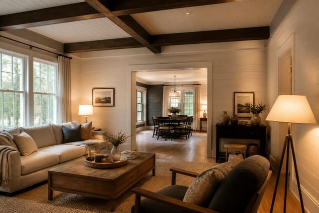
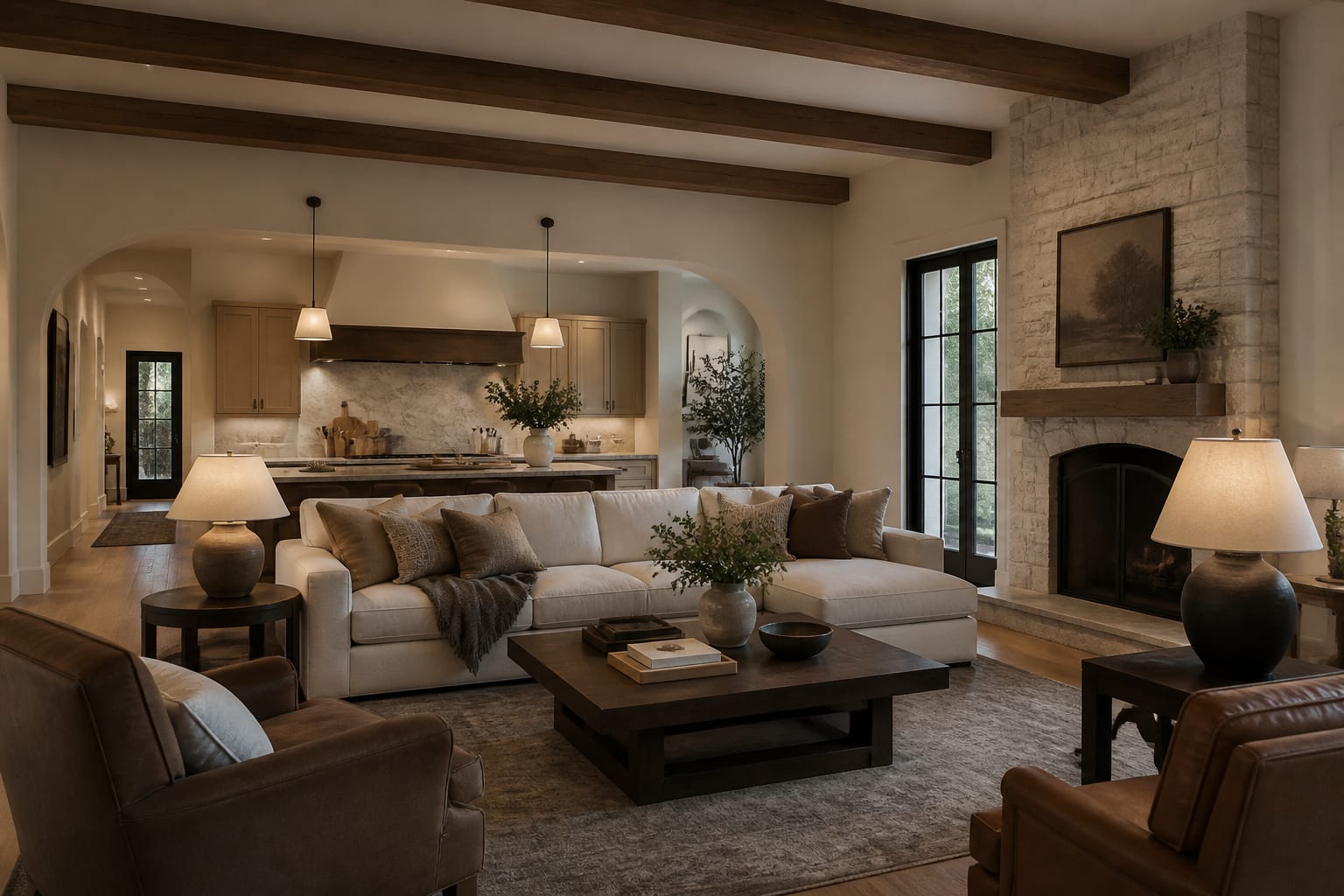
Every modern farmhouse palette begins with white, but never the bright, blue-leaning white that dominates stark minimalist spaces. You want a genuinely warm white carrying a soft cream, greige, or barely-there gray undertone. That subtle warmth is what separates a cozy farmhouse room from a cold gallery, and it reads as quietly inviting under both flat daylight and the golden cast of evening lamps.
The catch is that undertones shift dramatically depending on the light hitting them, so never trust a tiny chip held up in the store. Paint a sample patch at least 12 inches square on two different walls, then look at it carefully in the morning, at noon, and again at night. A white that looks perfectly neutral at midday can suddenly flash pink or green once the afternoon sun moves across the room, and only a large swatch observed over a full day will ever reveal that hidden behavior.
In proportion terms, this warm white is your dominant color, carrying roughly the largest share of a balanced room in a classic 60/30/10 split. It typically lives on the walls, the trim, and the ceiling, sometimes appearing in two slightly different sheens for depth. Keeping the largest surfaces in this single soft white gives the whole space a calm, unified foundation that lets the secondary tones and the sharp accents do their work without any of the colors visually fighting one another for attention.
See also our guide to Shiplap Ideas for more on modern farmhouse color palette.
Layer in Greige and Soft Neutrals
With your white firmly established, the secondary tone fills out the middle of the palette and adds the gentle depth a single white never could. Greige, that easy marriage of gray and beige, is the dependable workhorse here, though soft taupe, warm oatmeal, and muted sage all play the same quiet supporting role beautifully. This is the color of your larger furniture pieces, an upholstered sofa, full-length drapery, a wool rug, or a painted kitchen island anchoring the space.
This secondary family should occupy the middle share of the room within the 60/30/10 framework, sitting comfortably between the dominant white and the accent. Because it lives so close to your warm white, the two genuinely need compatible undertones, or the whole room will look slightly off in a way that is frustratingly hard to name out loud. If your chosen white leans cream, keep the greige warm rather than cool, so the two read clearly as relatives instead of clashing strangers in the same space.
Natural wood counts as a full part of this neutral layer even though it is technically not paint at all. A 6 foot oak dining table, exposed ceiling beams, or a wood vanity all introduce warm, grainy tone that quietly reinforces the secondary band of the palette. Treat wood as a living neutral and you gain real richness without ever adding another paint color to manage. The result is a layered middle range that feels collected and warm, giving the eye a comfortable place to settle between the bright white and the sharp final accent.
For a related angle on modern farmhouse color palette, read What Is Industrial Design.
Anchor It With a Single Deep Accent
The smallest and final share of the palette is the accent, and in modern farmhouse design that almost always means true black or a deep, moody charcoal. This is the modern half of the style talking out loud, the crisp counterpoint that keeps all those soft neutrals from quietly drifting into forgettable and bland. Black shows up in slim window frames, matte black cabinet hardware, hanging light fixtures, stair railings, and the occasional grounding piece of furniture placed with intent.
The whole discipline is keeping it to roughly that smallest tier of the 60/30/10 split. A few well-placed black moments distributed thoughtfully around a room create rhythm and pull the eye through the space, but black spread across too many surfaces tips the mood from fresh to heavy and dark. Think of it much like seasoning a dish: a measured amount sharpens absolutely everything, while too much simply overwhelms the whole plate.
If pure black feels too stark for your particular space, a deep charcoal or a near-black with a warm undertone softens the contrast while keeping all the underlying structure intact. You can also borrow a single warm metal, such as aged brass, as a secondary accent living within that final tier, used sparingly on lighting or cabinet pulls. The real goal is one clear anchor color that recurs just often enough to feel deliberate. Get those proportions right and the palette will feel cohesive in a way no single perfect paint name could ever deliver entirely on its own.
Protect the Palette With the Right Light
You can choose every single color perfectly and still completely ruin the effect with the wrong light bulbs. Light temperature, measured in kelvin, changes how paint actually appears on the wall, and a warm farmhouse palette absolutely demands warm light to read correctly. Cool bulbs around 4000K or higher push your carefully chosen warm whites toward a dull gray and make even the nicest greige look flat and lifeless, quietly undoing all that patient undertone work you did at the sample stage.
Aim for bulbs in the 2700K range throughout the main living spaces of the home. That warm output keeps the creamy whites cozy, lets the natural wood tones genuinely glow, and flatters skin, which matters enormously in kitchens and bathrooms where people gather. Consistency is the key here, so avoid mixing a 2700K table lamp with a cooler 3500K ceiling fixture in the very same room, since that subtle clash makes the paint look uneven and patchy from one corner to the next.
Placement and dimming refine the final result even further. Hanging pendants roughly 30 to 36 inches above a counter surface and putting overhead lights on simple dimmers lets you soften the room as evening arrives without sacrificing any real function. Natural daylight remains the single truest test of your palette, so always confirm your final colors near a window during the day. Treat light as the invisible fourth color in your scheme and your modern farmhouse palette will hold together beautifully from sunrise straight through to the last lamp switched off at night.
Here are the common mistakes to avoid: - Judging warm whites from a tiny store chip instead of a large wall sample - Pairing a cream-leaning white with a cool gray greige so the undertones quietly clash - Spreading black accents across too many surfaces until the room feels dark and heavy - Installing cool 4000K bulbs that drain the warmth out of your carefully chosen whites - Adding too many competing paint colors instead of trusting a disciplined neutral palette
Bring the look home with Re-Design
Paint samples lie under harsh store lighting, so it pays to test your scheme in the room itself first. With Re-Design you upload a photo of your space and preview a full modern farmhouse color palette in place, comparing warm whites, greiges, and black accents against your own walls and natural light before you buy a single can of anything.
Frequently Asked Questions
What is the 60/30/10 rule for a farmhouse palette?
It is a proportion guide: roughly 60 percent dominant warm white on walls and trim, 30 percent secondary greige or neutral on larger furniture and textiles, and 10 percent deep black accent on hardware and fixtures. The split keeps the room balanced and cohesive.
Why does my warm white look gray in my room?
Cool light is usually the culprit. Bulbs around 4000K or higher drain warmth from paint and push white toward gray. Switch to bulbs near 2700K and the same color reads creamy and cozy again, especially noticeable in the evening hours.
Can I use a color besides black as my accent?
Yes. A deep charcoal, near-black with a warm undertone, or even a muted navy can anchor the palette if pure black feels too stark. The point is one disciplined deep accent at about 10 percent, not the exact shade you choose.