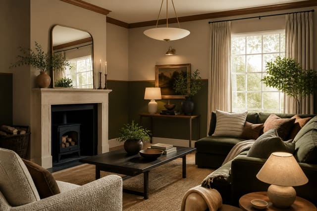
A monochromatic room done right is one of the most sophisticated looks in interior design, and it is far harder to botch than people assume. The key is understanding that single-color does not mean single-tone — a successful monochromatic scheme spans at least four distinct values of the same hue, from near-white to near-black.
Most people bail too early, stopping at three tones and ending up with a washed-out result. Commit to the full value range, mix matte and sheen finishes deliberately, and lean on texture to do the heavy lifting. The result is a room that reads as calm, considered, and deeply composed.
Choosing the Right Hue and Its Full Value Range
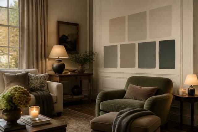
The most common mistake in monochromatic design is selecting a paint chip and calling that the scheme. A hue is only a starting point. You need to map the full lightness range from about 10 percent luminance at the darkest anchor up to 90 percent at the lightest ceiling treatment. For a greige scheme, that means moving from a deep taupe at LRV 12 to a warm off-white at LRV 78, with two or three mid-tones in between.
Undertones are the hidden trap. Every neutral carries a secondary hue — green, violet, yellow, or pink — that becomes impossible to ignore once you assemble multiple shades in the same room. Pull paint chips from the same manufacturer family line to ensure the undertone stays consistent across values. Mixing brands without verification routinely produces a clash that looks like a mistake rather than a palette.
Test your chosen values at scale before committing. Paint at least 12 in by 12 in swatches on the actual wall surface, leave them up for 48 hours, and evaluate under morning, afternoon, and artificial light. Metamerism — the shift in apparent color under different light sources — affects every painted surface, but it hits monochromatic rooms especially hard because there is no contrasting color to draw the eye away.
See also our guide to Two Tone Paint Ideas for more on monochromatic room ideas.
Layering Texture to Replace Color Contrast
When you remove color contrast from a room, texture becomes the primary tool for creating visual hierarchy. A monochromatic living room needs at minimum five distinct surface textures to avoid reading as sterile. Think matte plaster walls, a low-sheen linen sofa, a high-pile wool rug, a lacquered side table, and raw oak or stone as a grounding material.
The ratio that works reliably is roughly 60/30/10 applied to surface finish rather than color: 60 percent matte and low-sheen surfaces, 30 percent medium-sheen or woven textures, and 10 percent high-gloss or polished accents. This keeps the room from feeling dull while still reading as cohesive. Reflective surfaces at 10 percent of the visual field add depth without creating the kind of contrast that breaks the monochromatic concept.
Fabric weight and weave direction matter as much as surface category. A heavy basketweave and a fine twill in the exact same color photograph differently and read differently in person. Deliberately contrasting weave scales — pairing a coarse jute with a fine wool — is one of the most effective ways to give a monochromatic room a sense of richness that a multi-color room achieves through hue variety.
For a related angle on monochromatic room ideas, read How To Choose Paint Colors.
Lighting Strategy for Monochromatic Spaces
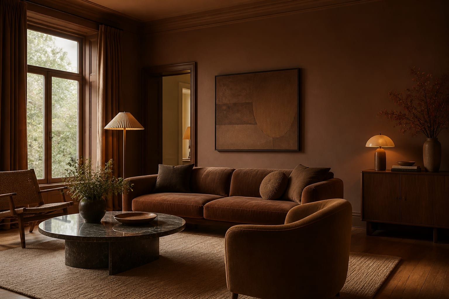
Lighting in a monochromatic room functions as a stealth color tool. Light sources with a color temperature above 4000K cast a blue-white tone that fights warm neutrals and makes them look dirty or cold. For any palette built on warm hues — cream, sand, blush, or terracotta — set every bulb at 2700K to 2900K. Cool palettes based on slate or sage can tolerate up to 3500K before the light starts to feel clinical.
Layer your light sources across at least three planes: ambient light from overhead fixtures set at ceiling level, task and accent light from table and floor lamps at 48 in to 60 in height, and low accent washes from 12 in to 18 in sconces or cove lighting that skim across textured walls. The low-angle light is critical — it catches the texture relief in plaster, linen, and rattan in a way that overhead-only lighting completely misses.
Dimmer control on every circuit is non-negotiable in a monochromatic room. The perceived color of your palette shifts noticeably between 100 percent brightness and 40 percent brightness, and having manual control lets you manage that shift intentionally across the day. Budget at minimum 30 minutes testing dimmer levels at dusk before you finalize the lighting plan.
Four Common Mistakes to Avoid
The first mistake is treating all-white as a monochromatic scheme. True white is not a hue — it is the absence of color — and a room of pure whites and bright whites without any tonal variation is simply a blank canvas, not a designed space. A true monochromatic white scheme requires at least one warm cream, one cool linen, and one near-grey white to create the tonal depth the concept demands.
The second mistake is using flat paint on every surface. Flat paint on walls is fine and actually desirable for its soft depth, but extending that finish to trim, furniture, and accessories removes all the reflective variation that gives monochromatic rooms their dimensionality. Use at least a satin finish on all woodwork and trim.
The third is ignoring the floor. Many designers build out a beautiful tonal wall and furniture scheme and then place a mid-tone neutral rug that neither anchors nor lightens. The floor should be the darkest or the lightest element in the room, not a middle value that competes with the furniture. The fourth mistake is over-accessorizing with metallics as a crutch — a single burnished brass or pewter accent reads as a considered touch, but five metallic pieces read as an escape from commitment to the concept.
Here are the common mistakes to avoid: - Avoid stopping at two or three tones — commit to four or more values across the same hue family. - Do not mix undertones from different brand families without testing; green-grey and violet-grey clash badly. - Skip flat paint on all surfaces — trim and furniture need at least a satin sheen to add dimension. - Never treat pure white as a monochromatic scheme; you need actual tonal variation within a real hue.
Bring the look home with Re-Design
Re-Design makes it easy to test a monochromatic palette before you buy a single paint sample. Simply upload a photo of your room and the AI renders your chosen hue across walls, soft furnishings, and floor in multiple tonal values so you can see the full value range in context. You can adjust lightness, finish, and accent placement in real time, which cuts out weeks of back-and-forth with swatches and lets you commit to the scheme with confidence.
Frequently Asked Questions
Does a monochromatic room have to use only one color?
Yes, a true monochromatic scheme uses a single hue, but that hue spans a wide range of tones, tints, and shades. The variety comes from value and texture, not from introducing additional hues. Small doses of metallic or natural materials like stone are generally considered acceptable accents that do not break the concept.
What is the best color to start with for a monochromatic room?
Warm greiges and soft sages are the most forgiving starting hues because they have broad tonal ranges available in most paint lines and they read as neutral in most lighting conditions. Saturated hues like cobalt or terracotta work beautifully but require more precise tonal control and are harder to anchor with furniture. Start with a mid-range neutral if it is your first monochromatic project.
How do I stop a monochromatic room from looking boring?
Texture is the primary solution — layer at least five distinct surface materials within the same color family. Varying finish from matte to high-gloss across different surfaces adds reflective contrast that reads as visual interest without breaking the palette. Layered lighting at multiple heights also transforms the appearance of texture, making a well-considered monochromatic room feel complex rather than sparse.