New builds have the opposite problem of old houses. The honest answer is that the issue is rarely structure, since the walls are straight and the insulation is good, but personality, because every surface arrived flat, white, and identical to the unit next door. A new build is a clean canvas, and the work is adding the character the developer left out to hit a price point.
I think this is actually the easier design problem to solve. You are not fighting damp or wonky floors; you are adding layers to a sound shell. The danger is mistaking the blank slate for a finished home and living for years with builder-grade fittings because nothing is technically wrong with them.
Add the architectural detail the builder skipped
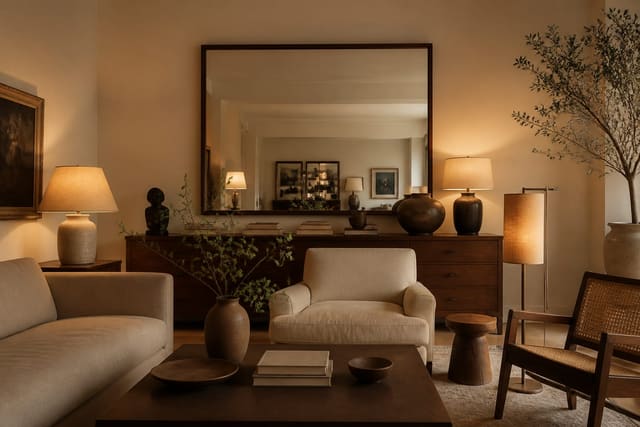
The fastest way to make a new build look bespoke is to add the trim a developer cut to save money. Flat walls with a thin builder skirting read as cheap, while a room with wall paneling, a picture rail, or a deeper baseboard reads as considered. Board-and-batten on one wall, a slim shaker panel below a chair rail, or simple square molding around a doorway all add shadow lines that flat drywall can never produce. None of this requires structural work, and most of it is paintable MDF.
Molding also gives a fresh room a sense of age and weight it otherwise lacks. A ceiling with even a modest cornice feels finished, and a chunkier 5-7 inch baseboard grounds the walls. Where a builder gave you a single huge open-plan space, dual-purpose room ideas help you define zones so the openness becomes useful instead of cavernous.
Doors and trim are an easy upgrade developers cut to the bone. The standard hollow-core door and the thin clamshell architrave around it shout builder-grade, and swapping in a paneled door or beefing up the casing changes the read of a hallway immediately. If a full door swap is too much, painting the existing doors in a contrasting color and fitting better handles closes most of the gap. The same logic applies to the staircase, often a builder's plainest element, where a painted runner or new spindles adds character for a modest spend. None of this is glamorous, but it is the difference between a space that looks finished to a budget and one that looks finished on purpose.
Fix the lighting and the flat surfaces
The builder-grade lighting in a new build is almost always a single bright fixture dead center in the ceiling, which flattens the room and casts hard shadows. Replace that one-light approach with layers: a statement pendant or flush mount for ambient light, a couple of lamps for task and corner glow, and ideally some dimmable wall lighting. Stick to 2700K bulbs for a warm domestic feel rather than the 4000K-5000K cool white developers often default to.
Texture is the other quiet fix. Flat painted drywall everywhere is what makes a new build feel like a rental, so layer in materials that catch light differently. Here is where I spend the first effort:
- A textured wallpaper or limewash on one feature wall to break the flat paint
- A wool or jute rug to warm hard new flooring underfoot
- Linen or boucle upholstery instead of the smooth synthetic show-home look
- Real or convincing wood tones in shelving and furniture to add grain
New builds also tend to have dim corners and a few rooms with small windows. If one space feels gloomy, the dark room solutions guide covers reflective surfaces and lighting tricks that genuinely help.
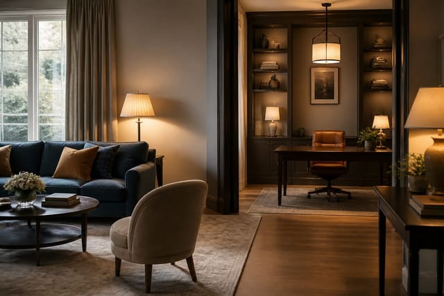
Make the open-plan space feel intentional
Developers love a big open-plan kitchen-diner-living zone because it photographs well, but lived in, it can feel like a furniture warehouse with no walls. The fix is defining zones without building any. A large rug anchors the living area, a change in lighting marks the dining zone, and the back of a sofa can act as a soft divider between cooking and lounging. Aim to leave clear circulation paths of at least 36 inches so the openness still flows.
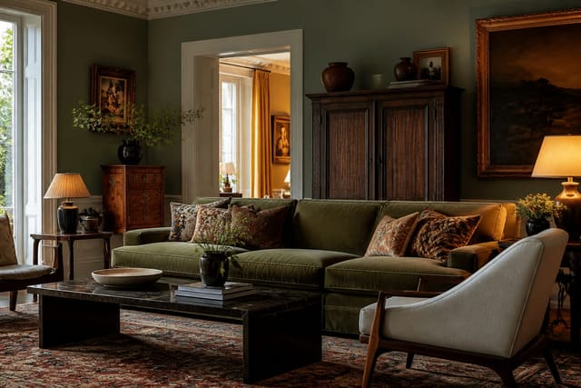
Mixing styles helps a new build shed its show-home uniformity, since a perfectly matched suite is exactly what makes the space look like a catalogue. Combining a few eras and materials reads as collected over time, and how to mix design styles walks through doing that without it turning chaotic. Keep one consistent thread, usually a color or a metal finish, running through the whole open zone so the separate areas still belong to one home.
Vertical interest pulls a tall, blank new-build wall together. Developers leave big expanses of empty drywall, especially over stairwells and in double-height entries, and a single small frame floating in that void looks lost. A gallery arrangement, a tall plant, oversized art at least 40 inches on its long side, or full-height curtains hung close to the ceiling all give the eye something to climb. Window treatments are a particular weak point, since builders rarely include any; hanging curtains a few inches below the ceiling rather than at the window frame makes the whole room feel taller and more deliberate. Small moves like these cost little and do the most to shake off the empty-box feeling.
Common mistakes to avoid
The most common mistake is treating the developer's choices as permanent. Builder-grade hardware, the standard light fixtures, and flat-finish paint are the cheapest possible options and the first things worth changing; new handles and a fixture often run under $300 a room. Living with them for years is how a new build stays generic.
Another frequent error is buying a matching furniture set in one shopping trip, which recreates the show-home look you are trying to escape. People also under-light and over-light: a single bright ceiling bulb is too harsh, while ten recessed downlights with no lamps are clinical. A final mistakes-to-avoid point is ignoring scale in big open rooms, where small furniture floats and the space feels emptier than a smaller, well-furnished room would.
Use AI design to preview new build interior design ideas before you commit
The paralysis of a blank new build is real, because with every option open it is hard to picture what any single change will do. A bare white box gives your imagination nothing to push against. Re-Design fixes that by letting you test additions against your actual room. Upload a photo of the empty or sparsely furnished space and ask to see board-and-batten on the feature wall, a warmer paint color, or a defined living zone with a large rug, and the AI renders it in place so you judge the idea before buying a single thing.
This matters most for the big open-plan decisions where mistakes are pricey. I will upload the same open kitchen-diner and run one render with a sofa-back divider and pendant over the table, then another with a fully open layout, to see which feels like a home rather than a showroom. Because the AI design uses your real proportions and window light, the preview reflects your specific box, not a generic developer photo, so you can commit to trim, lighting, and zoning with confidence.