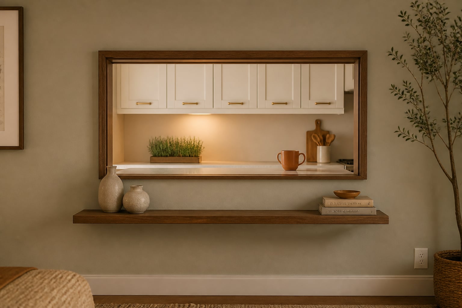
A pass-through between kitchen and living room reads intentional when the opening is sized 36 to 60 inches wide with a 12 to 16-inch counter bar on the living-room side, the kitchen ceiling matches the living-room ceiling line, and the kitchen finish carries over the pass-through frame in trim or paint. A kitchen pass-through can be useful, charming, and completely awkward in the same afternoon. My opinion is direct: an unframed opening is not “open concept”; it is a construction scar unless the surrounding rooms help it make sense. The problem usually is not the hole itself, but the missing decisions around trim, counter depth, lighting, color, and furniture placement. The goal is to make the pass-through look like an intentional open kitchen divider, not a half-finished wall between dinner and the sofa.
"A pass-through works like a frame: the trim decides whether the kitchen reads as a view or a chore."
What makes a kitchen pass-through feel intentional?
You design around a pass-through window between kitchen and living room by giving the opening a finished frame, aligning the counter and lighting with both rooms, and using furniture so the cutout reads like a planned connection instead of a leftover hole. In real homes, that means the pass-through needs a visual job: serving ledge, sightline, breakfast perch, display moment, or soft boundary between cooking and lounging.
Start with the proportions. A pass-through that is wider than 48 inches can usually handle a stronger casing, a ledge, or stools because it begins to act like architecture. A narrow opening under 36 inches often works better as a framed view, a coffee pass, or a decorative niche rather than a pretend bar. If the bottom of the opening sits around 36 inches from the floor, it can align with standard counter height; if it is closer to 42 inches, treat it more like a bar-height ledge and choose stools accordingly.
The living room side matters as much as the kitchen side. If a sofa back, television, or bookcase ignores the pass-through, the opening will look random from the room where people actually sit. Use the same planning logic behind how to zone an open plan without walls: repeat one material, preserve a clean walking path, and let furniture backs create soft edges instead of pretending the wall is gone.
The frame decision that controls the whole opening
The frame is the difference between a pass-through that looks built-in and one that looks cut out. Thin drywall returns can work in a very minimal house, but most kitchens need more structure. A casing between 2 1/2 and 3 1/2 inches wide usually gives the opening enough weight without making it look like a doorway missing a door.
Match the casing to the home before matching it to a trend. In a 1920s bungalow, painted trim, a small sill, and simple side casings may look right. In a newer apartment, a clean wood wrap or painted drywall return can be calmer. In a cottage kitchen, beadboard on the living room side can make the pass-through feel like furniture. The wrong move is using chunky rustic trim in a room with flat modern baseboards, because the opening starts speaking a different design language from both rooms.
Counter depth is the next decision. A ledge that projects only 4 inches is enough for a plant, a bowl, or a cup of coffee, but it is not enough for eating. For stools, aim for 10 to 12 inches of knee overhang and at least 24 inches of width per stool. If the living room is tight, a 6 to 8 inch ledge may be the better compromise because it gives the opening a finished edge without inviting knees into the traffic path.
Use material to connect the pass-through to both sides. If the kitchen counters are quartz and the living room has warm oak, a thin oak ledge can bridge the two better than repeating the stone. If the kitchen already feels dark, choose a lighter ledge or painted casing and pair it with the same brightness strategy used to make a dark kitchen feel brighter: reflective surfaces, warm whites, and less visual weight around the upper wall.
Test this on your own room photo with ReDesign before you choose the final direction; keep the doorway, walls, windows, main furniture, lighting, and awkward fixed features visible so the preview solves the room you actually have.
How should the living room respond to the pass-through?
The living room should acknowledge the pass-through without turning every seat toward it. Think of the opening as a sightline and a service point, not the main entertainment wall. If the sofa faces the television or fireplace, let the pass-through sit beside that composition with a console, art, or lamp that balances its shape.
Keep circulation clean on the living room side. A stool needs about 24 inches of width, but the person sitting on it also needs room behind the seat. If people walk behind the stools, protect roughly 36 inches from the stool back to the nearest sofa, wall, or table. If that clearance is impossible, skip permanent stools and use the ledge for serving during gatherings instead.
Art placement can fix a lot. If the pass-through creates a strong horizontal line, do not hang a tiny picture beside it and hope the wall feels resolved. Use one larger piece, a pair of vertical works, or a tall lamp to counter the opening’s width. A piece of art that is roughly two-thirds the width of the blank wall section often feels more deliberate than several small frames scattered around the cutout.
Lighting should serve the counter and flatter the living room. A pair of small pendants can work over a wide pass-through, but only if they do not block the view into the living area. Hang pendants about 30 to 36 inches above the ledge, and keep glass or slim shades in sightline-heavy rooms. If pendants would feel busy, use under-cabinet lighting in the kitchen and a living room lamp nearby so both sides glow at the same warm 2700K to 3000K range. For the technical side of task light, compare the pass-through with kitchen task lighting placement before adding fixtures that cast shadows on the counter.
Color needs restraint. Painting the inside of the opening a contrast color can look clever, but it also spotlights every imperfect drywall edge. In most homes, the safer choice is to carry the wall color through the return, then use the ledge, stool finish, or pendant metal for contrast.
Common pass-through kitchen mistakes to avoid
The first mistake is treating the pass-through like a bar when the room cannot support bar behavior. A ledge with stools looks inviting in a listing photo, but if the stool backs block the route from sofa to kitchen, the setup will irritate everyone. Use stools only when the living room side has a real landing zone, not a narrow strip between furniture and wall.
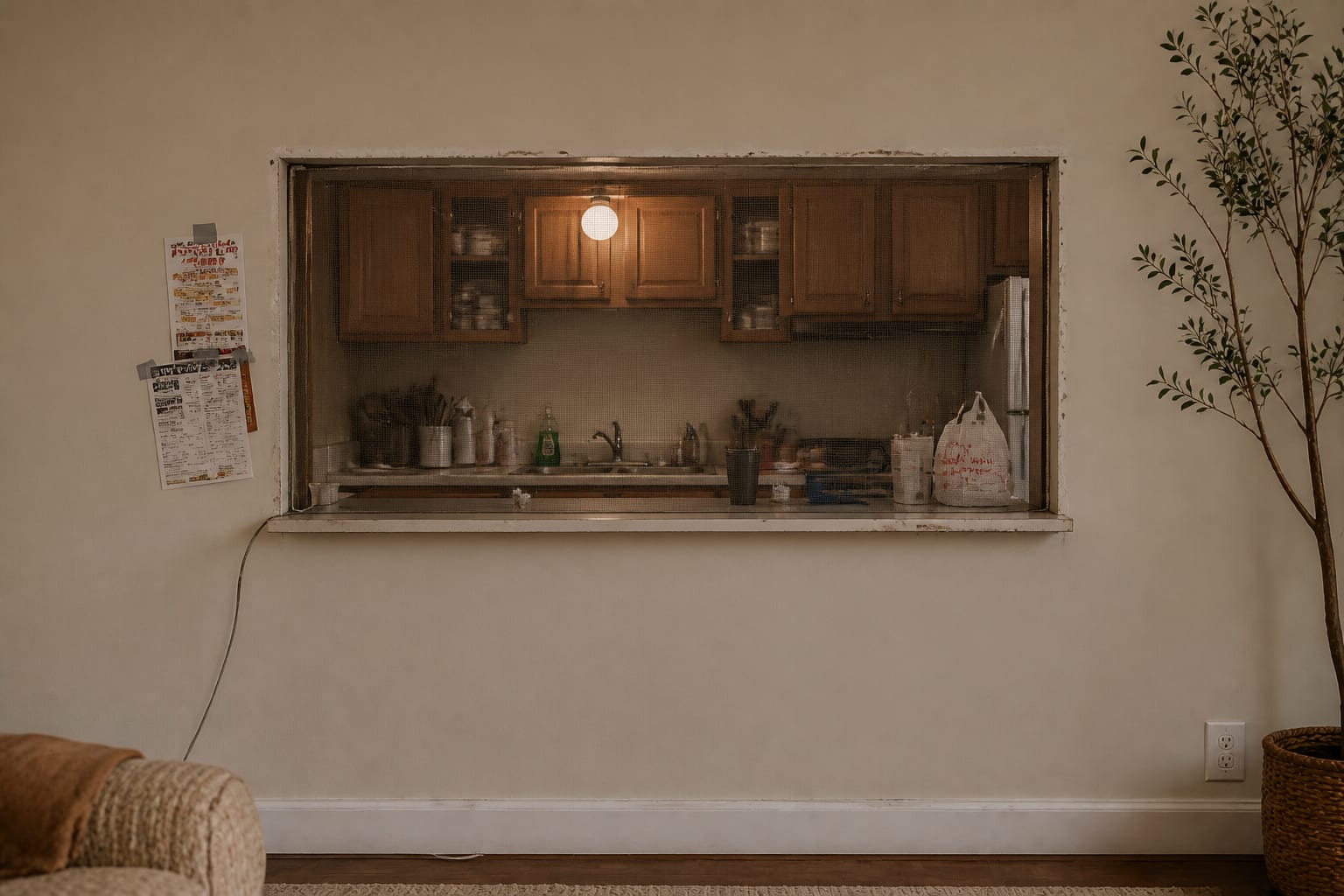
The second mistake is leaving the opening visually raw. Drywall corners, uneven paint, exposed screw heads, or a mismatched sill make the whole room feel unfinished. If the budget is small, spend it on crisp trim, caulk, paint, and one properly sized ledge before buying decorative objects for the counter.
The third mistake is making the kitchen side look busy through the opening. Open shelves, appliance cords, spice racks, and sink clutter become living room scenery once the wall is cut open. Keep the view through the pass-through edited: one clean backsplash plane, a simple faucet, closed storage where possible, and only one or two visible objects on the ledge.
The fourth mistake is ignoring sound and mess. A pass-through carries conversation, cooking noise, and visual clutter more directly than a solid wall. If the kitchen is used hard by kids, pets, or a serious cook, use a deeper sill, a partial screen, or a small plant line to soften the view without pretending the opening provides privacy.
The fifth mistake is choosing finishes that belong to only one room. Kitchen pass through window ideas often fail because the kitchen gets a glossy tile, the living room gets matte plaster, and the pass-through gets whatever was left in the garage. Repeat at least one finish across the boundary: black hardware, oak tone, brass light, creamy wall color, or a stone ledge that relates to the coffee table.
Use AI design to preview your pass-through before you commit
AI design is helpful for pass-throughs because the awkwardness is visual before it is expensive. A sketch can tell you the ledge depth, but a preview can show whether the opening feels too plain, too heavy, or oddly placed from the sofa.
Photograph both sides of the wall. Take one image straight toward the kitchen from the living room, one from inside the kitchen looking out, and one wider shot that shows the sofa, rug, television wall, or dining area near the opening. Leave the counter clear enough that the tool reads the architecture rather than the breakfast dishes.
Ask for specific variations. Try one preview with a painted 3 inch casing, 8 inch oak ledge, no stools, warm under-cabinet lighting, and a calm living room console below the opening. Then compare it with a 12 inch stone counter overhang, two backless stools, slim pendants, and matching black hardware on both sides. A third version with no stools, a framed art wall beside the pass-through, and a lighter kitchen paint color can reveal whether the opening needs function or simply better finishing.
Judge the preview from the living room first. Does the pass-through line up with anything, or does it float in the wall? Does the ledge look useful without invading the sofa path? Do pendants interrupt the view to the kitchen? Does a darker frame make the opening look tailored, or does it turn the cutout into a black rectangle?
After the preview, test the dimensions in the actual room. Tape the ledge projection on the floor, mark the proposed casing width with painter’s tape, and pull a chair or stool into the exact spot where someone would sit. Walk from the sofa to the kitchen while carrying a plate. If the taped version feels natural, the finished pass-through has a good chance of looking intentional instead of improvised.
A good pass-through does not have to disappear. It can be a serving edge, a borrowed-light moment, or a quiet divider between cooking and relaxing. The design works when the opening has enough trim to feel finished, enough clearance to be usable, and enough visual connection that the kitchen and living room finally read as one plan.
Frequently Asked Questions
How wide should a kitchen pass-through opening be?
Aim for 36 to 60 inches wide and 36 to 42 inches tall above the counter bar; narrower than 36 inches reads cramped, wider than 60 inches reads like a half-removed wall. Use the room photo to compare the visible layout and fixed constraints before committing, because door swings, windows, outlets, storage reach, circulation, and existing furniture decide whether the idea survives daily use.
Should a pass-through have a counter bar or stay open?
A 12 to 16-inch counter bar on the living-room side adds two to three bar seats and screens the kitchen sink and prep zone from the seating area; pure open passes work only when the kitchen sightline is already designed for display. Keep the preview honest by leaving the problem area visible in the frame, then compare one conservative version against one bolder version before you buy lighting, paint, furniture, or storage.
How do I treat the trim and finish at the pass-through?
Carry the kitchen wall color across the pass-through frame onto the living-room side for at least 6 inches, or run a clean shadow line so the opening reads as architecture, not as a cut-out hole. Check the result against ordinary movement first: drawer clearance, chair pullout, walkway width, glare, switch access, and sightlines matter more than a perfect catalog angle.
What lighting works at a pass-through opening?
Two small pendants over the counter bar at 2700K, plus undercabinet light on the kitchen side; pendants centered in the opening anchor the architecture and read as a feature, not a leftover. Use the image to narrow priorities and measurements before ordering anything custom; final purchases still need real dimensions, outlet locations, installation limits, and product clearances.
Can a pass-through work when the floor levels differ?
Yes — match the floor finish across the opening (or use a 2 to 3-inch wood threshold) and treat any step as a deliberate raised bar; mismatched floors with no threshold read as renovation debt. If the preview invents architecture or hides the awkward feature you need solved, rerun it with stricter instructions so the result remains tied to your actual room.
Three transformations to try
- Pass-through with counter bar and two pendants
- Open pass with trim wrap and matched floor
- Raised bar pass at a one-step floor change