Peel-and-stick backsplashes hold up only in low-moisture renter kitchens with smooth painted drywall — Smart Tiles and Daltile Stick & Go survive 18 to 36 months over a typical sink; vinyl-printed knockoffs from Amazon peel at the cooktop within 6 months, and no peel-stick belongs behind a working range. Yes, peel-and-stick backsplash tiles can work, but I would not treat them as magic wallpaper for a greasy kitchen wall. The products that hold up are the ones installed on smooth, clean, painted surfaces away from direct heat and constant steam. The ones that fail are usually asked to cover texture, bridge bad corners, or pretend plastic is handmade tile. This peel and stick backsplash review is about choosing the version that survives real cooking, not the version that looks best in a cropped product photo.
Which peel-and-stick backsplash products actually hold up?
Peel-and-stick backsplash tiles hold up best when they are thin panels or individual tiles with strong pressure-sensitive adhesive, installed on a smooth wall that has been degreased and allowed to dry fully. That answer sounds boring because durability is boring: adhesion, heat clearance, seam behavior, and wall texture matter more than the prettiest pattern.
The most reliable category for renters is the flexible vinyl or gel panel with a lightly raised tile face. It bends around tiny wall waves, cuts with a utility knife, and usually weighs less than rigid composite tile. Look for panels around 10" x 10", 12" x 12", or 12" x 24" because those sizes are easier to dry-fit around outlets than giant sheets. A grout line printed or molded at about 1/16" to 1/8" reads more believable than a wide gray line that screams sticker.
Rigid PVC or composite panels can look cleaner at the seam, but they are less forgiving on old plaster or slightly bowed drywall. If your wall has orange-peel texture, skim coat ridges, or old paint drips, a stiff panel may touch only the high spots. That leaves air pockets, and air pockets become lifted corners.
Individual peel-and-stick tiles with a real metal, glass, or stone cap look more permanent, but they are the riskiest rental choice. They are heavier, harder to remove, and more likely to damage weak paint. I would use them only on a wall you own or on a removable backing board cut to fit behind a coffee station.
Where peel-and-stick backsplash fails first
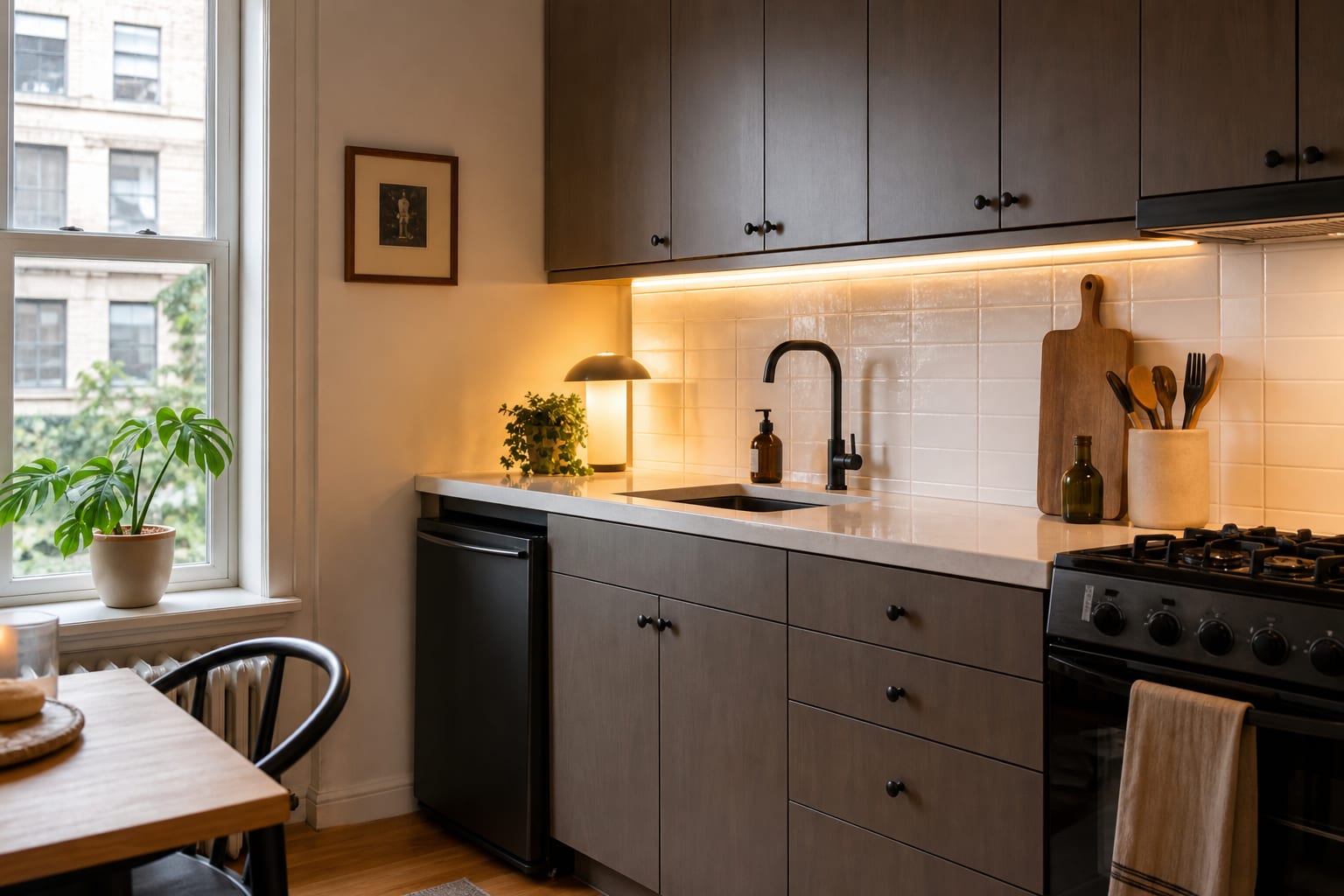
The first failure point is almost always the edge closest to heat, water, or grease. A removable backsplash behind a range needs more caution than one behind a toaster or coffee maker. Keep peel-and-stick material at least 6" from a gas flame when the manufacturer does not provide a heat rating, and avoid placing vinyl directly behind a high-output burner. Behind an electric or induction cooktop, check the product's heat limit instead of assuming all adhesive behaves the same.
Steam is the second problem. A panel behind a kettle, rice cooker, or sink can loosen if moisture keeps finding the same seam. Run seams vertically only where they land away from the faucet splash zone, press each panel with a clean roller for 30–60 seconds, and wipe the wall with a degreaser before installation. Soap residue and cooking oil are enough to ruin an otherwise decent product.
Texture is the third problem, and it is the one people underestimate. Peel-and-stick tile wants full contact. If the wall feels like fine sandpaper, the adhesive is not bonding to a plane; it is grabbing tiny peaks. Test one sample square for 48 hours near the worst area before you order a full box. If it lifts during the test, the correct answer is not stronger tape. The correct answer is a different surface strategy.
Edges decide whether the project looks temporary in a good way or temporary in a bad way. Stop at the underside of the upper cabinet, the end of the counter, a window casing, or a vertical trim line. If you are already planning broader no-damage changes, pair the backsplash decision with these rental kitchen updates that leave no trace so the wall treatment does not become the only polished piece in the room.
Test this on your own room photo with ReDesign before you choose the final direction; keep the doorway, walls, windows, main furniture, lighting, and awkward fixed features visible so the preview solves the room you actually have.
How to compare removable backsplash tile before you buy
Start by ordering samples, not boxes. Tape each sample to the wall for two days, then look at it in morning light, evening light, and with the under-cabinet light on. Glossy white panels can look clean at noon and harsh at 9 p.m. under a cool bulb. Warm-white, soft gray, cream, and pale zellige-style patterns are usually safer than high-contrast marble or busy mosaic.
Compare thickness next. Very thin film, often under 1 mm, behaves more like contact paper and shows wall imperfections. Thicker gel panels around 2–3 mm hide more texture visually, but they can look bulky at exposed side edges. If the side edge will be visible from the doorway, plan for a clean termination: a factory edge, a slim trim strip, or a stop line tucked under a cabinet side.
Check how the pattern repeats. A faux marble backsplash with the same vein every 12" looks fake quickly, especially in a small galley kitchen where you see several panels at once. Subway, square, stacked rectangle, and soft handmade-tile prints are more forgiving because repetition is already part of the language of tile.
Outlet cuts separate patient installations from sloppy ones. Turn off power at the breaker if you are removing plates, cut an X inside the outlet opening, trim slowly, and reinstall the cover plate so it sits on top of the panel. Do not force a thick tile behind a tight plate if the screws no longer catch. Use longer outlet screws only when the electrical box remains safe and the plate sits flat.
If the backsplash is meant to distract from old tile, laminate counters, or dated cabinets, compare it against the whole kitchen rather than the wall alone. A calm white panel may be better than a dramatic pattern when the cabinets already have heavy grain or the counter has speckles. For kitchens with existing tile that looks tired but not hopeless, this dated kitchen tile fix guide can help you decide whether to cover, clean, paint, or simply work around it.
Common mistakes that make temporary kitchen backsplash look cheap
The first mistake is choosing a product that is too shiny for the room. High-gloss plastic catches every ripple, seam, and under-cabinet shadow. If the kitchen has laminate counters and builder-grade cabinets, a satin or softly glazed look is usually more convincing than a mirror-bright subway tile sticker.
The second mistake is ignoring the counter line. Real tile is usually installed level to the counter or deliberately aligned to cabinetry. Peel-and-stick panels that climb or dip by even 1/8" across a short run make the whole wall look crooked. Use a 24" level, snap a light pencil guide, and dry-fit the first row before any backing comes off.
The third mistake is wrapping every return, corner, and side wall because extra panels are available. A removable backsplash looks better when it has a logical endpoint. Cover the main cooking or prep wall, then stop. Wrapping a random side wall often exposes thin edges and turns a simple upgrade into a craft project.
The fourth mistake is letting the backsplash fight counter clutter. A busy pattern behind five small appliances, knife blocks, oil bottles, and pantry jars will not look designed. Clear the 18"–24" zone between counter and upper cabinet as much as possible, then decide whether the wall still needs pattern. If storage is the real issue, a better pantry setup may do more for the kitchen than another surface layer; this comparison of small pantry versus walk-in storage is useful when the backsplash is being blamed for a clutter problem.
The fifth mistake is skipping removal planning. Save a spare panel, the product label, and installation photos. At removal, warm one corner with a hair dryer, pull low and slow at a shallow angle, and use a plastic scraper instead of a metal blade. Paint that was already weak may still lift, but patient removal gives you the best chance.
Use AI to preview your kitchen before you stick tile to the wall
AI design is especially useful for peel-and-stick backsplash because the product is cheap enough to buy impulsively and annoying enough to remove if it looks wrong. Upload a straight-on photo of the wall that shows the counter, upper cabinets, outlets, range, sink, and the side edge where the backsplash would stop. Keep the everyday appliances in the frame if they are staying there, because the tile has to work behind the coffee maker and dish soap, not just in an empty listing photo.
Preview three restrained options before you look at anything dramatic. Try a white stacked rectangle, a warm off-white handmade-tile look, and a soft gray square tile. Then test one bolder option only if the kitchen still feels flat. The best preview is not the one with the most obvious change; it is the one that makes the cabinets, counter, and lighting look calmer together.
Use the preview to settle real buying specs. Note whether the backsplash should be matte or satin, whether the grout line should be white or warm gray, whether a 12" x 12" panel will create too many seams, and where the material should stop. If the AI version looks good only because it erased outlets, changed the counter, or invented new under-cabinet lighting, treat it as inspiration rather than a shopping plan.
For renters, preview the reversible version and the no-backsplash version side by side. Sometimes the better kitchen is not covered at all; it has warmer bulbs, cleaner counters, better hardware, and one small wall treatment where the eye actually lands. For owners, the same preview can answer a different question: whether a removable backsplash is a short-term test before real tile, or whether the wall deserves a permanent material from the start.
Frequently Asked Questions
Do peel-and-stick backsplashes actually work over a sink?
Yes when the brand uses real gel adhesive (Smart Tiles, Daltile Stick & Go) and the wall is smooth painted drywall; over textured walls or unprimed surfaces, every brand fails within months. Use the room photo to compare the visible layout and fixed constraints before committing, because door swings, windows, outlets, storage reach, circulation, and existing furniture decide whether the idea survives daily use.
How long do peel-and-stick backsplashes last?
Plan for 18 to 36 months from quality brands and 3 to 12 months from cheap vinyl prints; lifespan depends almost entirely on substrate prep and adhesive quality, not brand marketing. Keep the preview honest by leaving the problem area visible in the frame, then compare one conservative version against one bolder version before you buy lighting, paint, furniture, or storage.
Which peel-and-stick brand is the most durable?
Smart Tiles (gel polymer) and Daltile Stick & Go (real ceramic with adhesive backing) outperform every vinyl-printed brand; the price gap reads tiny next to a year-three replacement cost. Check the result against ordinary movement first: drawer clearance, chair pullout, walkway width, glare, switch access, and sightlines matter more than a perfect catalog angle.
Can peel-and-stick go behind a stove or range?
No — direct heat above a range degrades adhesive within months, and vinyl backsplashes near gas flames are an actual fire concern; cap the peel-stick run at the counter and use a metal or tile insert behind the range. Use the image to narrow priorities and measurements before ordering anything custom; final purchases still need real dimensions, outlet locations, installation limits, and product clearances.
How do I remove peel-and-stick backsplash without ruining the wall?
Heat each panel with a hair dryer for 30 to 60 seconds and pull slowly at a 45-degree angle; cold-pulled panels tear paint and drywall paper, especially on flat-finish paint. If the preview invents architecture or hides the awkward feature you need solved, rerun it with stricter instructions so the result remains tied to your actual room.
Three transformations to try
- Smart Tiles backsplash above renter counter only
- Daltile Stick & Go over painted drywall
- Capped peel-stick run with metal insert behind range