A rental kitchen updates without damage when you swap the hardware (deposit the originals in a labeled bag), add a peel-stick backsplash above the counter only, cover cabinet fronts in removable contact paper or temporary cabinet wrap, and use adhesive shelf liner inside drawers — every move reversible in under an hour at move-out. The worst rental kitchens are not ugly because they are small; they are ugly because every surface looks temporary in the wrong way. I would rather see one clean, reversible move than six cute accessories trying to distract from orange cabinets and a stained laminate counter. Your job is not to renovate a kitchen you do not own. Your job is to make the parts you touch every day feel calmer, brighter, and deliberate without giving your security deposit a reason to disappear.
How do you update a rental kitchen without making permanent changes?
You update a rental kitchen without making permanent changes by covering bad surfaces, improving light, swapping touchable details, and choosing every piece so it can be removed cleanly at move-out. Think in layers: the wall behind the counter, the counter clutter, the cabinet pulls, the light over the work zone, and the floor under your feet. None of those requires demolition.
Start with the surface that bothers you most in the first 10 seconds. If the backsplash is the offender, use removable tile or vinyl panels before you buy new canisters, art, or a runner. If the room feels dim, put your money into plug-in task lighting before decorative objects. If the cabinet color is merely boring, leave it alone and spend the effort on handles, a washable rug, and a better landing zone for utensils.
A good renter friendly kitchen update should pass three tests. It should use adhesive, tension, magnets, freestanding furniture, or existing screw holes. It should come off with heat, patience, and a plastic scraper rather than a pry bar. It should also look good when seen from the doorway, not only in a close-up photo.
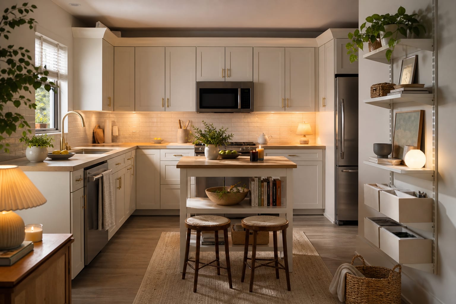
Keep the palette tight. In a dated rental kitchen, two main finishes are usually enough: one calm neutral surface and one warm accent. White removable tile with black hardware can work; white tile, brass handles, blue art, checkerboard floor stickers, open shelves, and five wood tones usually looks frantic.
Which temporary kitchen upgrades are worth doing first?
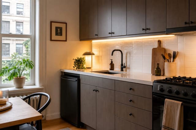
The best temporary kitchen upgrades are the ones that change how the kitchen works while also cleaning up the visual noise. In most rentals, that means light first, backsplash second, hardware third, and only then decorative storage.
Add plug-in or rechargeable under-cabinet lights anywhere you chop, rinse, or make coffee. Place each light bar 18"–24" above the counter if it mounts under an upper cabinet, choose 2700K–3000K for a warm residential look, and avoid blue-white strips that make laminate counters look harsher. If you want more placement detail, this guide to task lighting in kitchen placement explains where light actually needs to land, not just where a fixture looks symmetrical.
Replace removable cabinet pulls if the existing ones are ugly or grimy. Measure the center-to-center distance between screws, usually 3", 3 3/4", or 5", and buy the same size so you are not drilling new holes. Put every original pull and screw in a labeled zip bag the same day you remove them. That tiny bit of discipline saves a move-out panic later.
Use a runner when the floor is the problem but the budget is not there for removable floor tile. Choose a low-pile washable rug with a non-rubber pad, keep at least 2" of floor visible along cabinet bases, and avoid thick jute near the sink because water stains it quickly. In a narrow galley kitchen, a runner that stops 6"–12" short of the toe-kick line looks intentional instead of jammed in.
If the room feels cave-like, do not assume the cabinets are the only problem. Dark counters, heavy window coverings, and a single ceiling bulb can make even white cabinets feel dingy. The same logic used to make a dark kitchen feel bright applies in a rental: bounce light, reduce contrast, and keep the counter plane as clear as possible.
Test this on your own room photo with ReDesign before you choose the final direction; keep the doorway, walls, windows, main furniture, lighting, and awkward fixed features visible so the preview solves the room you actually have.
How do you make removable surfaces look less fake?
Removable surfaces look fake when they ignore the real edges of the kitchen. The trick is not finding the most dramatic peel-and-stick pattern; it is cutting, aligning, and stopping in places that mimic a permanent installation.
For peel-and-stick backsplash, choose a small-scale tile print or raised panel with a grout line no wider than about 1/16" if the kitchen is tiny. Oversized marble veining on a 24" strip often announces itself as plastic. Before installation, clean the wall with mild degreaser, let it dry fully, and test one hidden square for at least 24 hours. Grease, old paint, and textured plaster are the three things that make removable adhesive behave badly.
Stop the backsplash at a believable endpoint: the underside of the upper cabinets, the outside edge of the counter, or a vertical trim line. Wrapping peel-and-stick tile around a random corner usually looks like a craft project. If you are unsure which product type is worth the trouble, read the honest peel-and-stick backsplash review before ordering three boxes of something glossy and unforgiving.
Counter contact paper is riskier than backsplash because counters take heat, water, knives, and coffee rings. If you use it, keep it to a low-abuse zone like a coffee station or baking corner, and leave a 1/8" relaxation gap where the film turns down over an edge so it does not pull tight and lift. Never put a hot pan on vinyl film, and do not pretend a contact-paper counter will survive like stone.
Open storage can help, but only if it reduces clutter. A freestanding 30"–36" wide metal baker's rack can add a microwave shelf, bowl storage, and a landing spot for pantry jars without touching the walls. Keep the top shelf below eye level if the kitchen is already visually busy; tall stacks of objects above 60" make a rental kitchen feel more crowded.
Common rental kitchen mistakes to avoid
The first mistake is using permanent behavior with temporary materials. Drilling new cabinet holes, painting over unknown landlord paint, or caulking peel-and-stick tile to the wall turns a reversible update into a repair negotiation. Use existing holes, removable adhesive, tension rods, magnetic hooks on metal appliances, and freestanding pieces first.
The second mistake is buying the loudest pattern because the kitchen is boring. A rental kitchen already has visual interruptions: outlet plates, seams, appliance gaps, upper cabinets, and a faucet you probably did not choose. A calmer backsplash, a plain runner, and one metal finish usually beat a dramatic pattern that fights every break in the room.
The third mistake is ignoring scale. Tiny knobs on wide slab doors look cheap, but oversized handles on narrow cabinet fronts look just as wrong. As a simple rule, use pulls around 4"–6" long on standard base cabinet doors and longer pulls, around 8"–12", only on wide drawers where the hardware has breathing room.
The fourth mistake is covering every surface because each product is technically removable. Floor stickers, counter film, backsplash panels, appliance wrap, and cabinet vinyl can all be renter-safe on their own; together they can make the kitchen feel like a sample board. Pick one major surface to correct and let the other updates support it.
The fifth mistake is forgetting the exit plan. Keep original hardware, take photos before you install anything, and save product labels so you know what adhesive you used. At move-out, a hair dryer, plastic scraper, microfiber cloths, and a citrus-based adhesive remover are safer starting tools than metal blades or harsh solvent.
Use AI to preview your rental kitchen before you stick anything down
AI design is especially useful in a rental kitchen because the wrong temporary product can still waste a weekend. Upload a straight-on photo of the kitchen, then preview one change at a time: backsplash only, runner only, hardware only, lighting warmth only. If the design only works when every surface changes at once, it is probably too fragile for a real rental.
Take the photo in daylight with the ceiling light on, stand far enough back to show the cabinet run from floor to ceiling, and clear only the clutter you would realistically clear on a normal day. Do not hide the microwave, trash can, or dish rack if those objects must live there. A useful preview should solve the kitchen you have, not a fantasy version with no appliances.
Use the AI results to compare restraint. Ask for a white subway-style removable backsplash, then a warm zellige-style look, then no backsplash with better lighting and hardware. The winning version is often the one that makes the cabinets look less offensive without turning the entire kitchen into a theme.
Once you have a direction, translate the preview into real specs before you shop. Match the visual weight of the hardware, the color temperature of the light, the width of the runner, and the stopping point of the backsplash. That is how rental kitchen makeover ideas become a plan instead of a cart full of almost-right products.
Frequently Asked Questions
Can renters change kitchen cabinet hardware?
Yes — unscrew the originals, store them in a labeled zip-bag taped inside one cabinet, and install new pulls on the existing screw holes; reverse at move-out in under an hour with the original hardware. Use the room photo to compare the visible layout and fixed constraints before committing, because door swings, windows, outlets, storage reach, circulation, and existing furniture decide whether the idea survives daily use.
What rental kitchen upgrade has the biggest visual impact?
A peel-stick backsplash above the counter, combined with new pulls and a warm 2700K bulb swap in the overhead, transforms the kitchen in one weekend without touching the cabinets or paint. Keep the preview honest by leaving the problem area visible in the frame, then compare one conservative version against one bolder version before you buy lighting, paint, furniture, or storage.
Can I paint rental kitchen cabinets?
Rarely worth it — the labor and risk outweigh the reward, and even the best paint job means a full strip and repaint at move-out; use removable cabinet wraps or contact paper instead. Check the result against ordinary movement first: drawer clearance, chair pullout, walkway width, glare, switch access, and sightlines matter more than a perfect catalog angle.
What rental kitchen swap is most often regretted?
Cabinet wraps over dark, glossy, or laminate fronts often peel at edges within 6 months in kitchen humidity; test one cabinet first and budget for a full strip if it lifts. Use the image to narrow priorities and measurements before ordering anything custom; final purchases still need real dimensions, outlet locations, installation limits, and product clearances.
How do I make a rental kitchen photograph well?
Clear the counters to three items, replace the overhead bulb with 2700K, add a wood cutting board on display, hang one small piece of framed art on a wall hook, and the kitchen photographs as designed. If the preview invents architecture or hides the awkward feature you need solved, rerun it with stricter instructions so the result remains tied to your actual room.
Three transformations to try
- Swap hardware plus peel-stick backsplash over counter
- Contact-paper cabinet fronts with warm bulb swap
- Three-item counter with cutting board and framed art