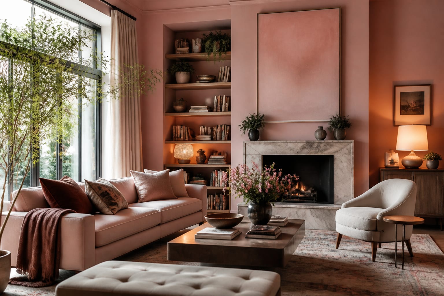
Pink gets dismissed as a nursery color, but a muted, dusty pink behaves like one of the warmest neutrals you can put on a living room wall. The trick is to drop the saturation and lean into the brown and gray undertones that make blush and dusty rose feel grown-up rather than girlish. Ground the pink with wood, brass, and a few darker anchors, and it reads sophisticated and inviting; pair it with white and chrome and it tips toward bubblegum. The decision that matters is which pink you choose and how much of it the room should carry.
Which pink works in a grown-up living room?
The pinks that read as adult are the muted, complex ones, not the bright candy shades. Blush, a barely-there pink with a strong gray or beige base, behaves almost like a warm neutral and is the safest choice for walls; in many rooms it reads as a soft, flattering off-white with a rosy glow. Dusty rose goes a step deeper and warmer, a muted mauve-pink that feels rich and slightly vintage, ideal for an accent wall or a velvet sofa. At the bold end, magenta and fuchsia are saturated and energetic, best used in small, deliberate doses, a single chair, a pair of cushions, or an art piece, where they punch against a calmer backdrop.
Undertone is what separates a sophisticated pink from a juvenile one. Pinks with a brown, gray, or even a slightly peachy undertone feel earthy and grounded, while pure, cool pinks veer toward the nursery. Paint a 2 by 2 foot sample and watch it through the day, since a north-facing room cools blush toward gray while a west-facing room warms it into a deeper rose by late afternoon. The more saturated the pink, the more your light shifts it. For the broader framework of anchoring any bold color in a coordinated scheme, our Living Room Color Ideas guide is a useful companion.
What colors and materials pair with pink?
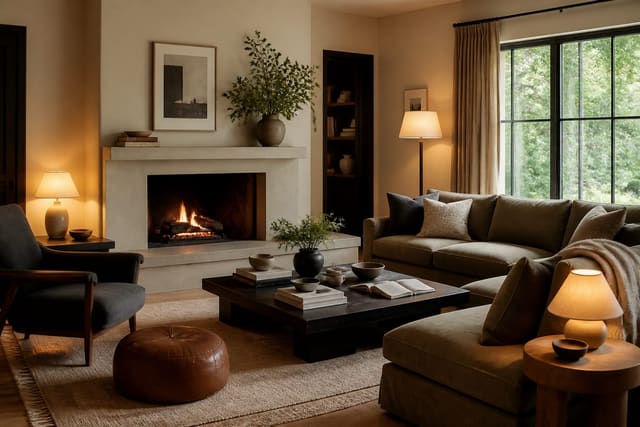
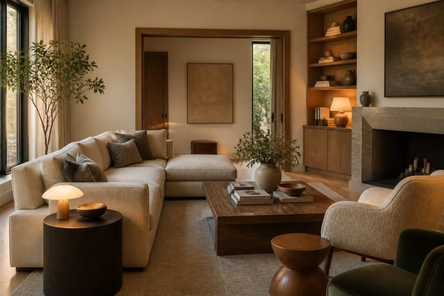
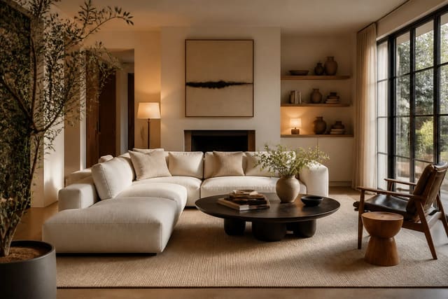
Pink lives or dies by its partners, and the right ones make it look intentional rather than accidental. Wood is the key grounding element: walnut and oak warm a blush or dusty rose room and pull it toward earthy sophistication, where too much white leaves the pink looking thin and sweet. Natural materials reinforce this, so a jute rug, rattan, and linen upholstery all keep a pink room feeling collected and calm.
Metals set the register. Brass and aged gold flatter every pink, adding a warm, slightly luxe glow that suits dusty rose especially well; black and bronze sharpen the look into something more modern and graphic. For a second color, pink is more flexible than its reputation suggests. It pairs beautifully with deep green for a fresh, garden-inspired contrast, with charcoal or navy for grounding drama, with terracotta and rust for a warm earthy scheme, and with camel and cream for a soft, tonal calm. The rule is to give pink at least one darker anchor and one warm wood so it has weight; a room of pink and white alone almost always reads juvenile. If you are arranging the seating to feature a pink accent wall rather than a screen, the layout principles in Living Room Without TV Ideas help you point the room at the color.
How much pink should you use?
The dose of pink decides whether the room feels like a quiet, warm envelope or a bold statement. Here are concrete ways to bring pink into a living room across that range:
- Paint all four walls a soft blush at a matte sheen so the color works as a warm, rosy neutral.
- Use dusty rose on a single accent wall behind the sofa and keep the other walls a warm cream.
- Anchor a neutral room with a dusty rose velvet sofa as the one piece of saturated color.
- Add a magenta or fuchsia accent chair against a charcoal or forest-green backdrop for contrast.
- Layer blush and mauve cushions across a camel or cream sofa for a low-commitment dose of pink.
- Pair pink walls with walnut shelving and brass picture lights for an earthy, grown-up scheme.
- Run dusty rose up a fireplace surround or alcove to spotlight one architectural feature.
- Combine a blush wall with deep green furniture for a fresh, garden-inspired color pairing.
For most living rooms, a soft blush on the walls is the most versatile starting point, since it reads as a warm neutral and lets your furniture and wood carry the rest. Save the bold magenta moments for accents, where a small dose of high saturation energizes the whole scheme without overwhelming it. If you want depth without going bright, dusty rose on a single feature wall is the reliable middle path. The neutral-room logic of layering texture and undertone in Neutral Living Room Ideas translates directly when you treat blush as your base.
How do you light and finish a pink living room?
Lighting decides whether pink stays warm and rosy or flattens into something washed-out, and the lever is color temperature. Warm bulbs at 2700K keep blush and dusty rose glowing and flattering, while a cool 4000K bulb drains the warmth and can push pink toward a flat, slightly gray cast. Put the main fixtures on dimmers and layer table and floor lamps at mid-height so the pink is lit from several warm sources rather than a single overhead.
Sheen and texture finish the room. A flat to matte wall finish, around 2 to 5 percent sheen, gives blush and dusty rose a soft, chalky depth and hides imperfections; keep eggshell for the trim. Build in texture so the color never reads as a flat block: a boucle chair, a jute rug, linen curtains hung high and wide, and a chunky knit throw all add tactile richness. Bring in a few darker accents, a charcoal lamp, a walnut coffee table, black metal frames, so the pale pink has contrast and structure. Edit the accessories down and keep the warm metals consistent, since a grown-up pink room depends on restraint as much as on the color itself.
See it first in Re-Design
Pink is the color most likely to read differently between the swatch and the wall, and the gap between sophisticated and juvenile is narrow, so previewing first is worth it. Upload a photo of your living room to Re-Design and try a soft blush across all the walls, a dusty rose accent wall, or a magenta chair against your existing furniture and light. You can compare a warm brown-based blush with a cooler version to see which undertone your room's exposure flatters, and test how walnut wood and brass change the whole feel before you commit to paint or a sofa. Seeing the pink in your own room settles the shade-and-dose question that a paint chip can never answer.
Frequently Asked Questions
How do I make pink look grown-up in a living room?
Choose muted pinks with brown or gray undertones, like blush and dusty rose, rather than bright candy shades. Ground the color with warm wood such as walnut or oak, add brass for a luxe glow, and include at least one darker anchor like charcoal or forest green. Pink with wood and a dark accent reads sophisticated, while pink with only white and chrome reads juvenile.
What colors go with pink in a living room?
Pink is surprisingly flexible. It pairs with deep green for a garden-inspired contrast, with charcoal or navy for grounding drama, with terracotta and rust for a warm earthy scheme, and with camel and cream for a soft tonal calm. Warm metals like brass and aged gold flatter every shade. Give pink at least one darker anchor and one warm wood so it has weight.
Is a pink living room hard to pull off?
Not if you treat a muted blush as a neutral. Soft blush behaves almost like a warm off-white and is one of the easiest wall colors to live with. The bolder shades, magenta and fuchsia, take more care and work best in small accent doses. The main pitfall is pairing pink only with white and chrome, which tips it toward bubblegum.
What lighting suits a pink living room?
Use warm bulbs at 2700K so blush and dusty rose stay rosy and flattering. Cool bulbs above 4000K drain the warmth and push pink toward a flat, gray cast. Put the fixtures on dimmers and layer lamps at mid-height so the color is lit from several warm sources rather than flattened by a single overhead fixture.