Quiet luxury interior design rewards restraint over spectacle, letting craftsmanship and material quality carry the room. The strongest interiors in this style hide their cost rather than announce it. You build a tonal envelope of warm neutrals, then layer texture, weight, and proportion so the eye reads richness slowly. Nothing shouts, yet everything feels considered. This guide breaks down the palette logic, the materials worth investing in, the lighting that flatters them, and the mistakes that turn understatement into something flat and forgettable.
Building the Tonal Palette That Defines Quiet Luxury
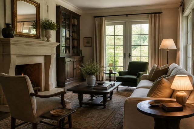
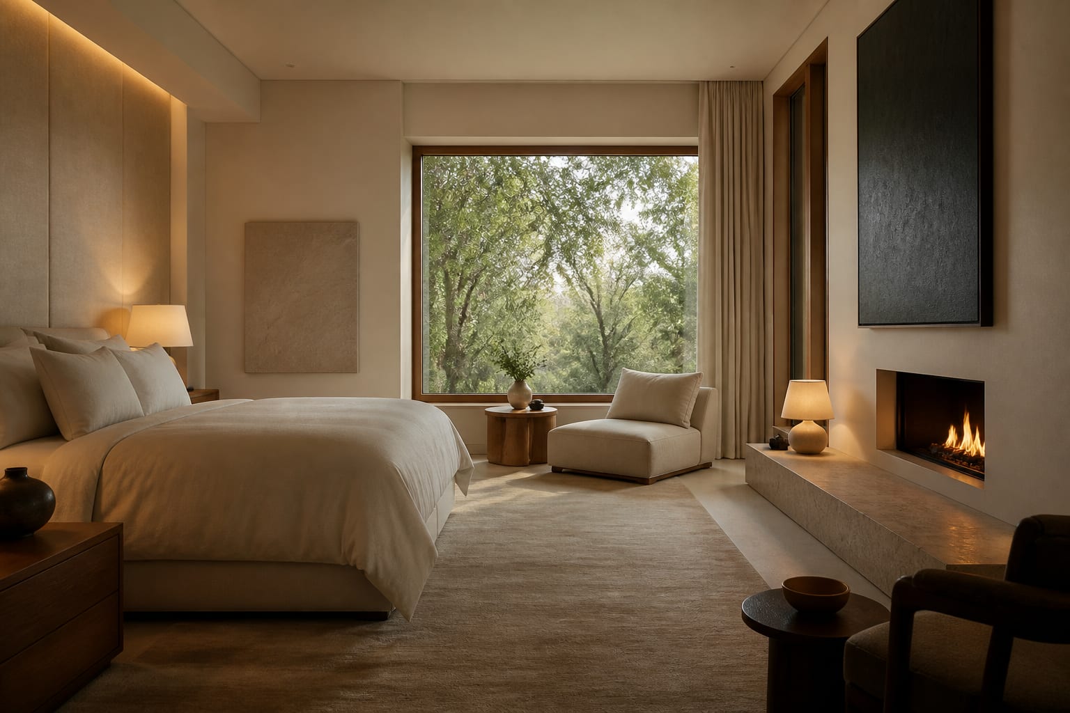
Quiet luxury interior design starts with a narrow band of warm neutrals held within a tight range, usually no more than three to four close values from oatmeal through greige to soft taupe. Keep at least 60 percent of the visible surfaces in your two lightest tones, reserve about 30 percent for a mid value on upholstery or rugs, and let the final 10 percent carry a deeper anchor such as walnut or charcoal. Avoid stark white, which photographs crisp but reads clinical in person; choose a warm off-white with roughly 5 to 8 percent of a yellow or pink undertone mixed in. Test paint on a 2 foot by 2 foot board and view it across morning and evening light before committing, since neutrals shift dramatically with color temperature. The palette should feel almost monochromatic, with contrast carried by texture rather than hue. A linen sofa, a wool rug, and a plastered wall can all sit within two value steps of each other and still read as layered because the surfaces catch light differently. When you want a hint of color, pull it from nature in muted form: sage, clay, or a dusty blue desaturated by 30 to 40 percent from its pure version. The goal is a room that never resolves into a single focal hue, so the eye keeps moving across subtle gradations. This is why quiet luxury photographs poorly on a phone yet feels deeply calming in person, where depth comes from the slow accumulation of close tones. Mind undertone consistency too, since a green-based greige beside a pink-based beige clashes even when the values match. Pull paint, fabric, and stone samples together in the room and discard anything whose undertone fights the group, so the whole envelope reads seamless rather than accidental.
See also our guide to Old Money Aesthetic Home Decor for more on quiet luxury interior design.
Choosing Honest Materials Over Visible Branding
Material honesty drives quiet luxury interior design more than any single decorating move. Choose surfaces that age gracefully and show their structure: solid oak rather than veneer, full-grain leather rather than bonded, natural stone rather than printed laminate. A dining table in solid white oak at least 1.5 inches thick will develop a patina over a decade that no factory finish can fake. For upholstery, favor heavyweight linen or wool in the range of 12 to 16 ounces per yard, since lighter fabrics pill and sag within two years. Stone countertops should be honed rather than polished, with a matte surface that hides etching and reads softer underfoot and underhand. Keep hardware solid brass or stainless in an unlacquered finish so it darkens naturally instead of flaking. The rule is that every material should be what it appears to be, with no printed grain, no faux finishes, and absolutely no logos or monograms on display. Texture variation does the heavy lifting here. Pair a rough plaster wall with smooth marble, a nubby boucle chair with a sleek leather bench, so the hand registers difference even when the color barely changes. Spend your budget on the pieces you touch daily, like seating and the dining table, and economize on items that simply fill space. A single well-made sofa at the 8 foot scale will outperform three trendy pieces, both in longevity and in how the room feels under your fingers over years of use. When you must economize, do it on case goods rather than upholstery, since a clean-lined oak shelf reads honest at almost any price while a cheap sofa announces itself the moment you sit down. Look for dovetailed drawers and tight seams, the joinery cues that signal lasting construction.
For a related angle on quiet luxury interior design, read Dopamine Decor Ideas.
Lighting and Layering for Depth Without Glare
Lighting makes or breaks quiet luxury interior design because flat overhead light erases the texture you worked to build. Skip the single ceiling fixture and layer at least three sources at different heights: a floor lamp around 60 inches tall, table lamps at roughly 28 to 32 inches, and discreet picture or cove light washing a wall. Hold every bulb at 2700K and below, since warmer color temperature flatters wood, linen, and skin, while anything above 3000K turns neutrals gray and cheap. Put every fixture on a dimmer so you can drop evening levels to about 30 percent for a softer, candlelit feel. Aim lamp light to graze textured surfaces rather than flood them; raking light across plaster or boucle reveals depth that frontal light flattens. Choose shades in unbleached linen or paper that diffuse the glow and add their own warm cast. For ambient layering, repeat materials across the room so the eye reads continuity: the same oak in the floor, the table, and a shelf ties the space together without matching everything exactly. Keep window treatments simple, with floor-length linen panels that puddle 1 to 2 inches and filter daylight into a soft wash. Negative space matters as much as the objects, so leave at least one-third of every surface empty and let a few well-chosen pieces breathe. The cumulative effect is a room that glows quietly from several low sources, with shadows that give weight and a calm that bright, even lighting can never produce. Choose bulbs with a color rendering index of 90 or higher so the true depth of your wood and textiles shows rather than washing gray. Space sources so no corner falls dark, and your quiet luxury palette reads its richest after the sun goes down.
Proportion, Scale, and the Discipline of Editing
Proportion is the quiet engine of quiet luxury interior design, and getting scale right matters more than any individual object. Float seating off the walls by at least 12 inches so the room breathes, and size your rug large enough that the front legs of every major piece sit on it, which usually means an 8 foot by 10 foot rug for an average living room. Hang art so its center lands at 57 to 60 inches from the floor, the standard eye level, and let a single large piece anchor a wall rather than a scattered gallery. Coffee tables should sit within 1 to 2 inches of the sofa seat height and stop about 18 inches from the seat edge for easy reach. The discipline lies in editing. Remove anything that does not earn its place, and resist filling shelves; a bookcase styled at 60 to 70 percent capacity reads intentional, while a packed one reads cluttered. Choose furniture with clean, tailored lines and substantial frames, since spindly legs and thin profiles undercut the sense of permanence this style depends on. Keep a consistent visual weight across the room so no corner feels heavier than another. Repeat a few shapes to create rhythm without obvious matching. When the proportions are correct, even an inexpensive room feels expensive, because the eye reads balance as luxury before it registers any price. Restraint, not addition, is the final move. Before you add one more object, try removing two and live with the room for a week, because the eye adjusts and what felt sparse begins to feel intentional. Give tall elements at least 6 inches of clearance from the ceiling so nothing crowds the room. These disciplines of spacing and subtraction let quiet luxury read as deliberate rather than underfurnished.
Here are the common mistakes to avoid: - Mixing too many neutral undertones so the palette reads muddy instead of cohesive. - Choosing veneer and faux finishes that betray themselves up close. - Flooding rooms with cool overhead light above 3000K that flattens every texture. - Overcrowding shelves and surfaces instead of leaving generous negative space. - Buying undersized rugs that strand furniture and shrink the whole room.
Bring the look home with Re-Design
Want to see quiet luxury interior design in your own space before spending a cent on materials? Upload a room photo to Re-Design and preview restrained neutral palettes, honed stone, and warm linen layered onto your actual walls and furniture. The tool keeps your room's proportions intact so you can judge how tonal shifts and softer lighting read at your scale. Compare a greige scheme against a warmer taupe, test where a single anchor piece belongs, and refine the look until it feels calm and considered rather than flat.
Frequently Asked Questions
What colors work best for quiet luxury interiors?
Stay within warm neutrals: oatmeal, greige, taupe, and soft charcoal as an anchor. Keep all tones within three or four close values and let texture create contrast. Pull any color from desaturated natural hues like sage or clay rather than saturated statement shades.
Is quiet luxury the same as minimalism?
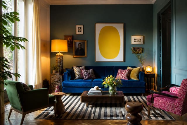
No. Minimalism prioritizes emptiness and sharp lines, while quiet luxury prioritizes material richness and warmth within a restrained palette. Quiet luxury rooms layer texture, patina, and weight rather than stripping back to bare essentials, so they feel inviting instead of austere or clinical.
How do I achieve the look on a budget?
Spend on the pieces you touch daily, like seating and the dining table, and economize elsewhere. Choose honest materials over branded ones, paint walls a warm off-white, add layered warm lighting on dimmers, and edit ruthlessly so a few quality pieces breathe.