Regencycore interior design borrows the lavish grace of early nineteenth-century England, all gilt frames, fluted columns, and saturated jewel tones. The look works best when you commit to ornament rather than dabble in it. Half-measures read as costume; full immersion reads as a styled period drama. You combine symmetrical layouts, deep wall color, ornate millwork, and curved antique silhouettes to build rooms that feel grand yet still livable. This guide walks through the palette, the architectural detailing, the furniture proportions, and the styling mistakes that flatten Regencycore into a thin imitation.
Choosing Jewel Tones and Period Color Schemes
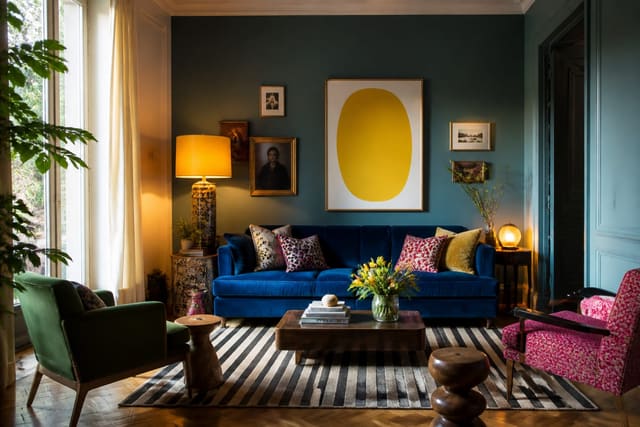
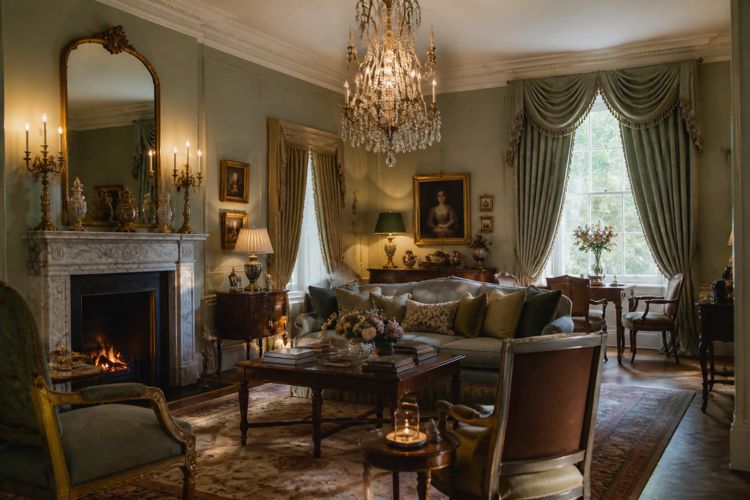
Color carries the drama in Regencycore interior design, so commit to deep, saturated jewel tones rather than safe pastels. Anchor a room in one rich field color: emerald, sapphire, garnet, or a warm ochre, applied across roughly 60 percent of the wall surface for full enveloping effect. Period rooms often used distemper and oil paints in chalky, complex shades, so reach for colors with visible depth rather than flat modern hues. Pair the dominant tone with about 30 percent in a complementary neutral like cream, soft gold, or warm stone, then reserve the final 10 percent for metallic gilt accents on frames, mirrors, and hardware. Ceilings traditionally went lighter, so keep them a pale cream or the palest tint of the wall color. If full saturation feels overwhelming, paint below a chair rail at 32 to 36 inches in the deep tone and keep the upper wall lighter, which grounds the room while preserving brightness at eye level. Avoid cool, gray-based modern paints, since they fight the warm candle-era glow this style depends on. Layer the palette with rich textiles: a velvet sofa in the field color, drapery in a coordinating damask, cushions in gold and cream. The richness should accumulate so no single element dominates. The room should read as one immersive color story with gilt sparking against deep walls, the way a Regency drawing room glowed by firelight and beeswax candles rather than bright overhead fixtures. Test your field color on a board at least 2 feet by 2 feet against trim and gilt samples, since deep tones shift more than neutrals. If a true jewel tone feels too heavy on all four walls, commit it to one feature wall and carry a lighter version of the same hue around the rest of the room.
See also our guide to Dopamine Decor Ideas for more on regencycore interior design.
Architectural Detailing: Moldings, Mirrors, and Millwork
Architectural ornament separates true Regencycore interior design from a simple color scheme. Crown molding is essential, ideally a substantial profile of 5 to 7 inches that includes egg-and-dart, dentil, or rope detailing rather than a plain modern cove. Add a chair rail at roughly 32 inches and a deeper baseboard of 6 to 8 inches to frame the wall the way period rooms did. If you can install wall paneling or applied molding in symmetrical rectangles, place them with even margins of 3 to 4 inches around each panel so the geometry reads deliberate. Ceiling medallions around a central light fixture, 24 to 36 inches in diameter, reinforce the formality and give a chandelier its proper anchor. Mirrors do enormous work in this style: hang a large gilt-framed mirror over the mantel or console, ideally 40 inches or taller, to bounce light and double the sense of grandeur. Convex bullseye mirrors with an eagle crest are a signature period touch. Fluted pilasters or half columns flanking a doorway or fireplace add architectural weight even in a plain room. If structural changes are not possible, lightweight polyurethane molding and applied trim can fake the profiles convincingly when painted to match the wall. The detailing should feel layered and symmetrical, with ornament concentrated at the ceiling line, the chair rail, and the fireplace. These three zones carry most of the period character, so investing there yields the strongest Regencycore impression for the least overall effort and cost. Paint the molding the wall color for a tonal effect, or pick it out in cream and gilt for sharper contrast. When applying trim yourself, plan the panel layout on paper so each rectangle stays within about 1 inch of its neighbors, since precise symmetry reads as craftsmanship and signals the period.
For a related angle on regencycore interior design, read Soft Industrial Style Ideas.
Furniture Silhouettes and Symmetrical Layouts
Furniture shape anchors Regencycore interior design, and the silhouettes matter as much as the upholstery. Seek curved, antique-inspired forms: a camelback or Chesterfield sofa, klismos chairs with their distinctive saber legs, and side tables with cabriole legs and carved detail. Wood tones run dark and warm, mahogany and walnut especially, often with brass inlay or sabots on the feet. Scale should feel generous; a settee or sofa at the 7 to 8 foot range suits the grandeur, paired with a tea table or round pedestal table about 30 inches in diameter. Symmetry governs the layout, so arrange furniture in balanced pairs wherever you can: two armchairs flanking a fireplace, two table lamps on matching consoles, a pair of urns or candlesticks framing a mirror. Float a primary seating group around a central axis rather than pushing everything to the walls, and leave at least 18 inches between a sofa and coffee table for circulation. Mix genuine antiques or reproductions with newer upholstered pieces so the room feels collected rather than bought as a set. Gilt and gold leaf on chair frames or table edges catch light and reinforce the opulence. Drapery should hang floor to ceiling and puddle slightly, with the rod mounted near the crown molding so windows read taller. Keep upholstery in velvet, silk, or damask, never casual cottons. The combined effect is a formal, layered arrangement where every pairing has a partner and the eye finds balance at every turn around the room. Resist matching every piece from one showroom set, since a perfectly matched suite reads flat rather than collected over generations. Leave at least 36 inches of walkway around the central grouping, and let one tall statement piece break the height line and draw the eye up toward the ceiling detailing.
Layering Pattern, Texture, and Decorative Flourishes
Pattern and ornament finish Regencycore interior design, but they demand discipline to avoid visual chaos. Limit yourself to about three pattern scales working together: a large damask on drapery or a feature wall, a medium stripe or toile on upholstery, and a small motif on cushions or a lampshade. Keep all three within the same color family so the eye reads them as one layered story rather than competing fights. Wallpaper is a strong move here; a hand-blocked floral or chinoiserie design above a chair rail, with the deep paint below, splits the wall at roughly 36 inches and balances pattern with calm. Texture deepens the look: velvet, silk, and damask upholstery, a wool or silk-blend rug with a classic Aubusson or floral medallion pattern sized at least 8 feet by 10 feet to hold the seating group. Decorative flourishes carry the period spirit, so style surfaces with gilt-framed botanical prints, porcelain urns, fresh or dried floral arrangements, and beeswax taper candles in brass or silver holders. Fresh flowers in particular signal the Regency romance, so keep a generous arrangement on the dining table or console. Books bound in leather, a globe, and small busts add scholarly grandeur. Hang art salon-style in dense, symmetrical clusters with gilt frames, leaving 2 to 3 inches between pieces. The styling should feel abundant yet ordered, with ornament concentrated on the mantel, the console, and the tabletop rather than scattered evenly across every surface in the room. Group accessories in odd numbers at varied heights so each vignette has a tall, medium, and low element rather than a flat row. Repeat your metallic finish across at least three points so the gilt reads intentional. When pattern, texture, and flourish all pull toward one palette, the Regencycore room reads as a single romantic, abundant whole.
Here are the common mistakes to avoid: - Using cool gray paints that fight the warm candle-era glow of the style. - Pushing all furniture to the walls instead of building symmetrical groupings. - Mixing too many pattern scales until the room reads chaotic rather than layered. - Skipping ornate millwork and expecting color alone to carry the period look. - Choosing casual cottons over velvet, silk, and damask for upholstery.
Bring the look home with Re-Design
Curious how Regencycore interior design would look in your space before committing to deep paint and gilt? Upload a room photo to Re-Design and preview jewel-tone walls, ornate molding, and antique-inspired silhouettes mapped onto your actual room. The tool preserves your windows and proportions so you can judge how an emerald scheme or applied paneling reads at your scale. Test a chair-rail color split, swap a velvet sofa against a damask one, and refine the period mood until it feels romantic and grand rather than costumey or overdone.
Frequently Asked Questions
What is Regencycore interior design?
Regencycore draws on early nineteenth-century English Regency style, popularized by period dramas. It combines jewel-tone walls, ornate moldings, gilt mirrors, curved antique furniture, and rich textiles like velvet and damask. The look is symmetrical, opulent, and romantic, built around abundant pattern, gold accents, and formal layered detailing.
How do I make Regencycore feel livable, not theatrical?
Balance ornament with restraint. Keep one or two truly grand gestures, like a gilt mirror and deep wall color, then ground the room with comfortable upholstery and edited surfaces. Mix genuine antiques with newer pieces, and limit pattern to three coordinated scales so the room reads collected rather than costumed.
Can Regencycore work in a small room?
Yes. Deep jewel tones actually flatter small spaces by making walls recede into shadow. Use large gilt mirrors to bounce light and add depth, hang drapery high to lift the ceiling, and concentrate ornate detailing on the fireplace or one feature wall rather than every surface.