Sage green earned its place as a near-neutral because it borrows the calm of gray while keeping the warmth a true gray lacks. The trap is assuming all sages behave the same way; they absolutely do not. A yellow-leaning sage glows in a north-facing room, while a gray-leaning sage can turn flat and cold in the exact same light. My take: choose the undertone for the room's light first, and treat the color name as a starting point rather than a decision.
This guide compares the shades worth buying, the finish each room needs, and the errors that turn a soft sage into a murky disappointment. A sample pot and ten minutes of honest looking will save you from repainting a whole room.
The sage greens worth comparing
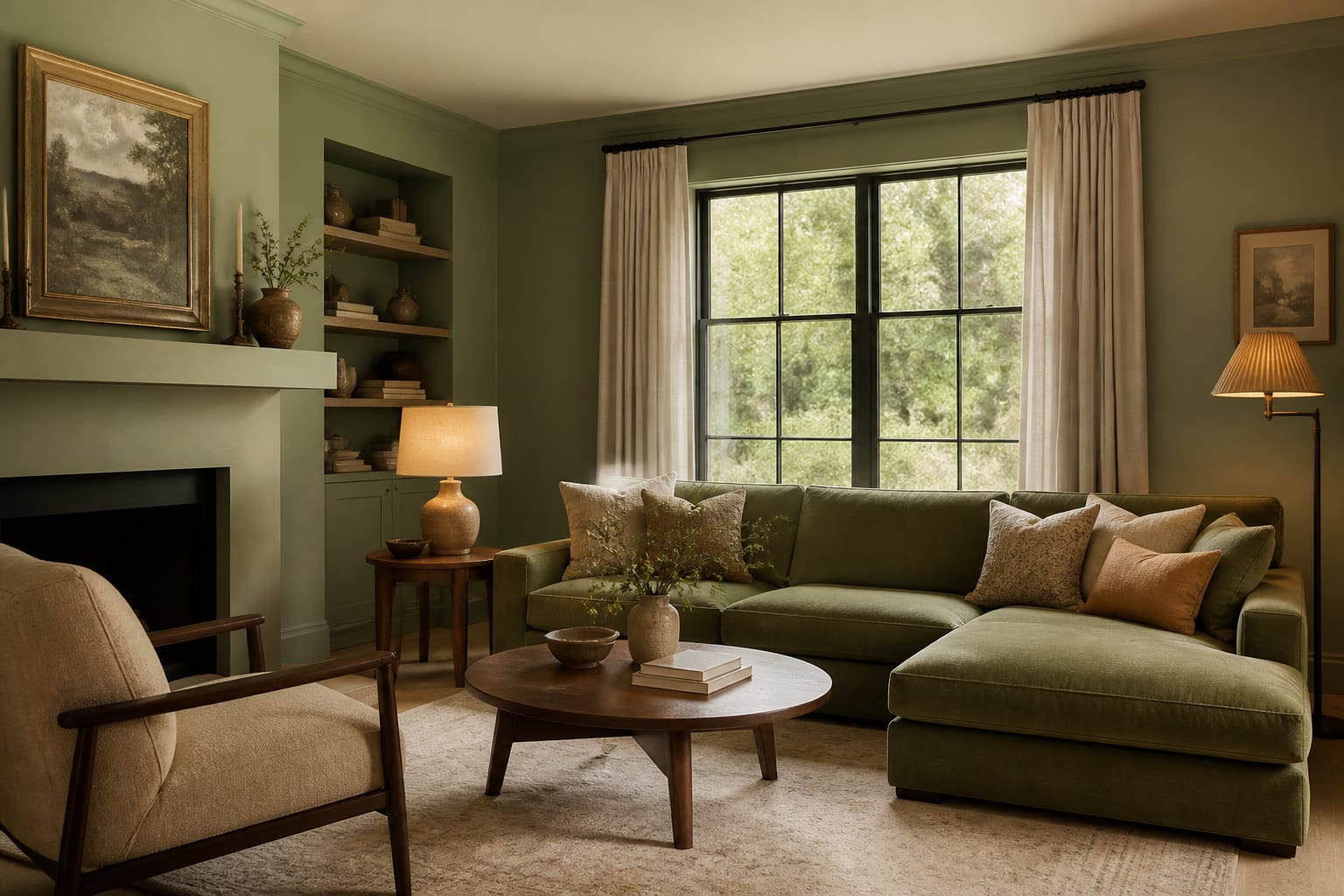
Sage is a family, not a single color, and the named picks span a real range. On the warmer, more inviting end sit shades like Benjamin Moore October Mist and Sherwin-Williams Evergreen Fog, which carry a soft gray-green warmth that reads cozy on a wall. Cooler and quieter options like Farrow & Ball Card Room Green lean deeper and more saturated, better suited to a moody study than a bright kitchen.
A practical way to sort them by light reflectance value:
- Warm sage for low light: October Mist and Saybrook Sage, around an LRV of 45 to 60
- Cool sage for bright rooms: a grayer green that holds its edge near an LRV of 35 to 50
- Deep sage for drama: a saturated, near-forest tone for a study or powder room
- Muted sage for a near-neutral: a barely-there green that behaves like a warm greige
LRV, the light reflectance value printed on every paint chip, tells you how much light a color bounces back into the room. A sage at 55 keeps a small room airy, while one at 30 will read noticeably darker and moodier, even if the name sounds identical on paper.
The undertone hiding inside a sage is what separates two greens that look identical on the chip. Some sages carry a yellow base that warms toward olive, some carry a blue base that cools toward gray-green, and a few carry a touch of true gray that reads almost like a soft greige. Hold three sage chips side by side under daylight and the differences jump out; viewed alone, any one of them looks like the platonic sage. That side-by-side test is the single most useful habit when shopping this color family.
Matching the right sage to each room
Light dictates everything. A north-facing room gets cool, flat daylight, so a warm sage with a yellow base counteracts the gloom and keeps the space from feeling clinical. A south-facing room floods with warm light, so a cooler sage stays balanced instead of sliding toward lime by mid-afternoon. East and west rooms swing through the day, so test the color at both 9 a.m. and 5 p.m. before you commit.
Finish is the other half of the decision. Use eggshell for living rooms and bedrooms, where you want a soft, low-glare surface, and satin or semi-gloss for kitchens, baths, and trim, where you need a wipeable finish that survives splatter and steam. Plan on 2 coats over a tinted primer for even coverage, and budget roughly $40 to $70 per gallon for a quality paint that holds its color over time. One gallon covers about 350 square feet per coat, so a 12-by-15-foot room usually needs two gallons for full coverage.
Sage is also a quiet workhorse in tight quarters. It recedes gently, which makes it a smart pick for small spaces where a louder color would crowd the walls inward. In a rental you cannot fully renovate, a single sage accent wall does a surprising amount of work, and our guide to a rental apartment covers low-commitment ways to bring the color in without losing a deposit.
Sage flexes across more rooms than most colors. In a kitchen it makes a calm, current cabinet color that pairs with brass pulls and warm wood counters. In a bedroom it lowers the visual temperature and reads restful behind a linen headboard. In a home office it stays focused without the heaviness of a true dark green, and in a powder room a deeper sage turns a tiny space into a jewel box. The shade you pick should shift with the room: lighter and warmer where you want air, deeper and cooler where you want drama.
Common mistakes to avoid with sage green
Sage punishes a few specific shortcuts. The mistakes to avoid:
- Judging the color on a tiny chip, since sage shifts dramatically at full-wall scale.
- Ignoring undertone, then wondering why the wall reads gray, blue, or mint.
- Pairing a warm sage with a cool-white trim, which makes the green look dirty.
- Skipping primer over a bold old color, which forces a muddy third coat to cover.
The cleanest pairings keep undertones aligned: warm sage with creamy whites and brass, cool sage with crisp whites and brushed nickel. Mixing a warm green with cold metals is the quickest way to make an expensive paint job look cheap. Stage the room with these combinations before you commit, because the same green that sells a home-staged room can fall completely flat against the wrong fixtures and flooring.
Flooring is the partner people forget. Sage sits beautifully over warm oak and natural stone, but it can turn slightly sour over an orange-toned wood or a cold gray tile, so judge the green against the floor you already own rather than a white showroom card. Cabinetry has the same effect in a kitchen; a sage that looks perfect on a bedroom wall can read muddy next to a yellow-beige counter.
Sheen makes a real difference in how the color lands. Higher-gloss finishes bounce more light and can make a sage look a shade lighter and cooler, while a flat or matte finish deepens it and hides wall imperfections. If a sage looks right in eggshell but you need satin for a bathroom, buy a sample in the actual finish, since the same tint shifts noticeably between the two. The label color is only ever a starting point until you see it in the right sheen on your own wall.
Use AI design to preview sage green before you commit
A sample pot costs little, but the hours spent painting swatches and squinting at them across three times of day add up fast. Upload a photo of your room to Re-Design and try October Mist, Evergreen Fog, and a deeper sage on the actual walls in seconds. You can see how each shade behaves against your flooring, your trim color, and your real window light, then narrow four contenders down to one before you ever pry open a can. That preview turns a weekend of test patches into a single confident decision.