Scandi-boho sounds like a contradiction, and that tension is exactly why it works. Scandinavian style is restrained, light, and a little austere; boho is layered, warm, and gloriously cluttered. My read is that the blend succeeds when you let Scandi run the structure and let boho run the texture, so you get a calm, bright room that still feels collected and lived-in rather than sterile. One side sets the rules, the other breaks them just enough.
The failure mode is treating it as two styles fighting for the same room. Pile boho's macrame, rugs, and saturated patterns into a Scandi space with no editing and you get a mess that reads as neither. The win is a tight, light palette with a few warm, textural moments. This guide covers the palette, the materials, and the layering rhythm that keeps Scandi-boho on the right side of the line.
The palette that holds it together
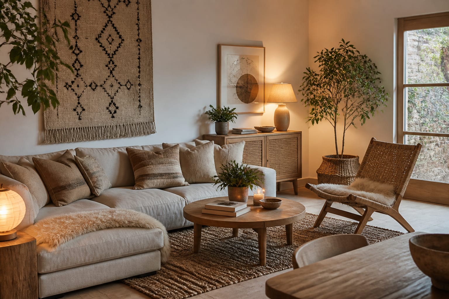
A Scandi-boho room lives or dies by its palette, and the discipline comes from the Nordic side. Start with two or three light neutrals, a soft white, a warm oatmeal, a pale grey, and let those cover the big surfaces: walls, the larger furniture, the main rug. Keeping the base quiet is what gives the boho layers room to breathe later. If you want a deeper reference for getting these light tones right, the breakdown in scandinavian-color-palette is where I would start before buying paint.
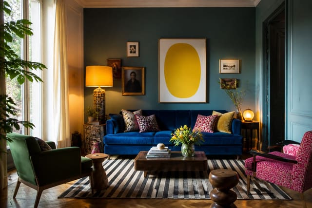
Warmth is where boho earns its place, but it enters through tone and material rather than bright color. Think terracotta, rust, mustard, and muted sage used sparingly, as a cushion or a throw, not a feature wall. The boho version of color is dustier and more sun-faded than primary, which keeps it from fighting the Scandi calm. If you do crave a punchier accent, the joyful-color thinking in dopamine-decor-ideas shows how to add one bold note without unbalancing a restrained scheme.
The rule I hold to is roughly 70 percent restraint to 30 percent layering, give or take a 5 percentage swing either way. The Scandi base keeps the room light and uncluttered; the boho 30 percent adds the soul. Tip too far toward boho and it gets heavy and dark; too far toward Scandi and it feels like a showroom nobody lives in.
Materials and texture do the heavy lifting
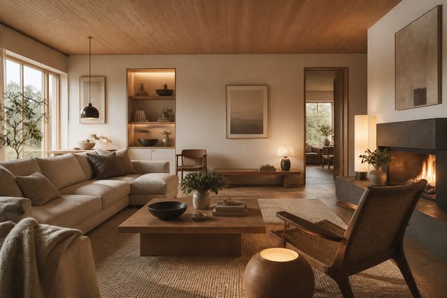
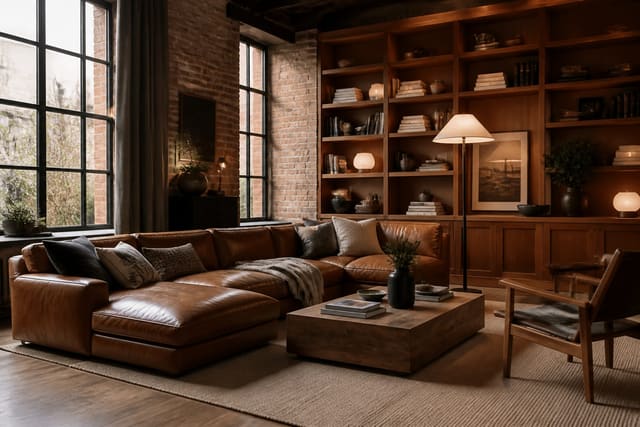
Since the color stays quiet, texture is what makes a Scandi-boho room feel rich. Both styles love natural materials, which is the common ground that makes the blend coherent. Light woods, ash, birch, and pale oak, anchor the Scandi side, while jute, rattan, and seagrass bring the boho earthiness. Mixing these warm naturals against white walls is the whole trick in one move.
Textiles are where you layer. A flatweave wool rug with a jute rug layered partly over it, linen curtains, a chunky knit throw, and a few woven cushions build depth without adding a single loud color. The goal is a room you want to touch. When you are choosing what to bring in, lean toward these:
- A jute or seagrass rug, ideally around 8 by 10 feet, as the textural base layer
- A handwoven or Berber-style wool rug in tonal neutrals on top
- Linen or cotton curtains that pool 1 to 2 inches at the floor
- Rattan or cane furniture, like a chair or a light pendant
- A chunky knit or sheepskin throw for tactile contrast
- One or two macrame or woven wall pieces, used sparingly
That last restraint matters. A single well-placed macrame hanging reads as bohemian soul; three of them on one wall reads as a craft fair. The Scandi instinct to edit is what keeps the boho elements feeling chosen.
Furniture, plants, and keeping it personal
Furniture should follow the Scandi playbook for shape and the boho playbook for soul. Clean-lined, light-wood frames and simple upholstered pieces keep the room from feeling heavy, while a vintage rattan chair or a low, well-worn leather pouf adds the lived-in warmth boho wants. The pieces can mix eras and origins, which is part of the charm, as long as the palette stays consistent across them.
Plants are non-negotiable in this style, because greenery is the fastest way to bring life and the organic feel both Scandi and boho share. A tall fiddle-leaf or a cluster of trailing plants in woven baskets does double duty, adding height, color, and texture at once. Finish with a few genuinely personal objects, ceramics, books, a thrifted vessel, so the room reads as yours. If you like a slightly rawer, more tactile edge, the material mixing in soft-industrial-style-ideas pairs well with the boho side without breaking the calm.
Lighting deserves the same gentle treatment as the palette. Scandi style chases bright, even daylight, while boho leans toward a warm, low glow, and the blend lives in between. A warm 2700K bulb in a rattan or paper pendant gives you the soft boho cast without the room going dark, and a couple of low table lamps fill the corners that an overhead fixture leaves flat. Skip the cool, bright bulbs builders favor, because they strip the warmth out of the natural woods and faded textiles that the whole style depends on. The light should feel like late afternoon sun rather than a showroom, and that single choice does as much for the mood as any rug or throw you add.
Common mistakes to avoid
The most common mistake is over-layering. Boho tempts you to keep adding rugs, cushions, and wall hangings until the Scandi calm is buried, at which point the room just looks busy. Add one textural layer at a time and stop the moment it feels full.
Another mistake is letting color creep in loud. Bright, saturated boho prints fight the light neutral base and break the whole mood, so keep accent colors dusty and muted. Sun-faded beats vivid in this style every time.
The last one is forgetting the warmth and ending up with pure Scandi. If the room feels cold and a little empty, you have under-delivered on the boho 30 percent, so add a worn leather piece, a plant, or a handmade ceramic to bring the soul back.
Use AI design to preview scandi boho interior design before you commit
The hardest part of Scandi-boho is judging that 70-30 balance, because texture and warmth are exactly the things a moodboard cannot convey. Re-Design makes the balance visible. Upload a photo of your room and the AI can re-render it with a light neutral base, layered jute and wool rugs, rattan accents, and a few warm boho textiles, so you can see whether the room reads calm-and-collected or tips into either cold or cluttered.
I find it most useful for dialing the ratio. You can preview a more restrained Scandi-leaning version against a warmer, more layered boho version of the same space, then settle on the mix that feels right for how you actually live. It is also a quick way to test whether that single macrame piece or that rust-colored throw earns its spot before you order anything. Try a few balances on screen, keep the one that feels like home, and shop with confidence.