The Scandinavian color palette is one of the most misunderstood in interior design, reduced by most people to a single word — white — when in fact it is a carefully balanced system of warm and cool neutrals, muted natural accents, and light-responsive surfaces. The palette works because every tone in it was originally derived from the Nordic landscape: birch bark, storm cloud, arctic water, winter heather.
Getting it right means understanding undertones, selecting materials that amplify rather than undercut the colors, and knowing exactly where the common mistakes happen. This guide walks through the full system with specific values and ratios so you can apply it without guesswork.
Building the Base: Whites, Off-Whites, and Warm Greys
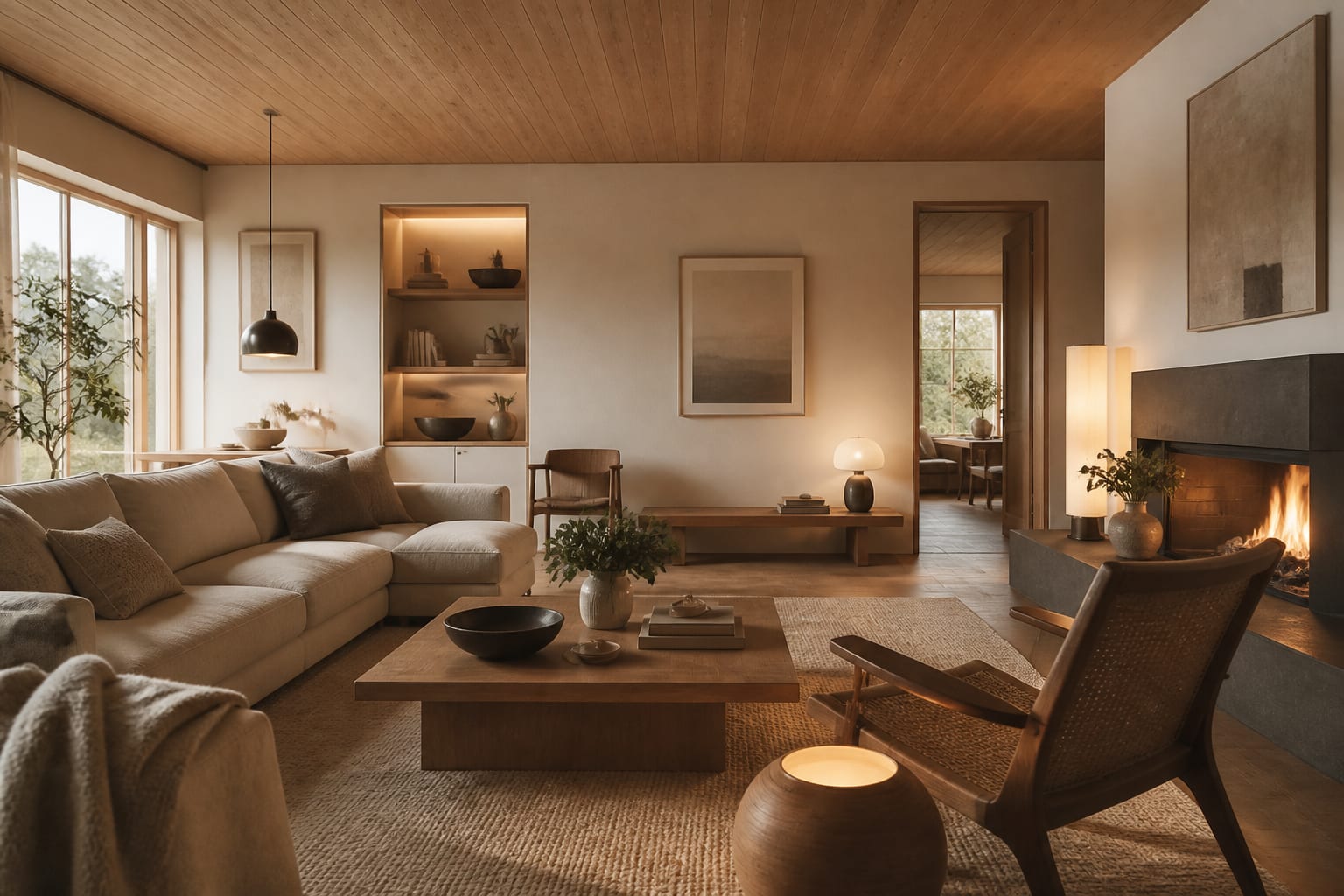
The foundation of the Scandinavian color palette is not a single white — it is a family of whites differentiated by undertone and light response. Pure blue-white walls read as clinical in rooms with northern or eastern exposure. The correct starting point is a warm white with a light reflectance value between 85 and 92, which keeps the room bright without the harshness of a true-white finish.
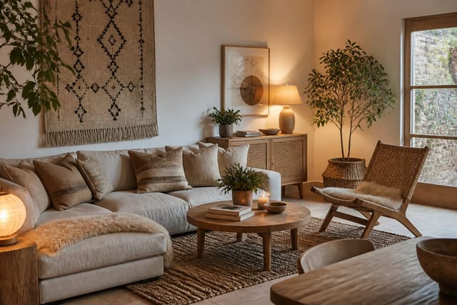
Off-whites with a subtle yellow or pink undertone — think cream rather than chalk — complement the blonde wood tones that run through Scandinavian furniture. A warm grey, typically in the range of 50 to 60 percent light reflectance, works as a secondary base for accent walls, cabinetry, or textile choices. Keep these two tones — the warm white and the warm grey — as your architectural backdrop. Every other decision in the room should work within or against this base.
In rooms under 120 square feet, stick entirely to the warm white family and introduce grey only through textiles. Painting two walls grey in a small room compresses the space visually more than any furniture arrangement can compensate for.
See also our guide to Scandi Boho Interior Design for more on scandinavian color palette.
Muted Accents: How to Choose and Proportion Them
The accent layer in a Scandinavian color palette is where most errors originate. The correct accents are not jewel tones, saturated primaries, or trendy statement colors — they are desaturated, nature-referenced hues: sage green, dusty blue, warm terracotta, stone taupe, or heathered mauve. These read as belonging to the Nordic landscape rather than fighting against it.
Proportioning matters as much as the hue itself. A reliable rule is the 60/30/10 split with strict definitions: 60 percent base neutrals, 30 percent light wood and natural material texture, and 10 percent muted accent color. In practice, that 10 percent is roughly one sofa throw, two cushions, or a single medium-sized rug. Anything larger and the accent begins to compete with the base rather than complementing it.
Another reliable test: if you can name the accent color from across the room without squinting, it is probably too saturated for the palette. The Scandinavian accent should register as a quiet depth of color rather than a pop or a statement. Pull paint chips into natural daylight — never fluorescent — before committing, as these tones shift significantly under different light sources.
For a related angle on scandinavian color palette, read What Is Industrial Design.
Natural Materials as Palette Anchors
Light birch, white-oiled ash, and limed oak read as neutrals within the Scandinavian color system rather than as warm accent colors. Their value lies in introducing organic texture without adding a distinct hue that the eye must reconcile against the base palette. A birch floor at roughly 70 percent light reflectance ties together warm-white walls and grey-toned furniture without creating a third competing tone.
Stone and concrete surfaces — whether a limestone windowsill, a concrete-look tile floor, or a soapstone kitchen counter — introduce a cool counterweight to the warmth of the wood. Using both materials in the same room, even at modest scale like a 24-by-24-inch tile section alongside birch shelving, creates the tonal tension that makes Scandinavian interiors feel complex despite their apparent simplicity.
Textiles in natural linen, undyed wool, and raw cotton amplify the palette without introducing new color. A linen sofa in unbleached natural reads in the same tonal family as warm-white walls. Keep material weight varied — rough-weave linen alongside smooth-finish plaster, matte ceramic beside polished wood — to maintain visual interest within a restricted color range.
The Four Mistakes That Break a Scandinavian Color Palette
The first mistake is choosing a cool-white or blue-toned base. Paints with blue or green undertones look fresh on the chip but read as cold and slightly institutional once they are on four walls under northern light. Always test with a 12-by-12-inch sample in situ for at least 48 hours before committing.
The second mistake is using warm bulbs below 2700K kelvin, which push the palette into amber territory and flatten the tonal distinctions between warm white and warm grey that the scheme depends on. The sweet spot is 2700K to 3200K — warm without going golden. The third mistake is introducing dark-stained or ebonized wood as the primary wood tone. Blackened or heavily stained wood belongs to other Scandinavian-adjacent aesthetics; the core palette uses light blonde woods precisely because they function as extended neutrals rather than contrast elements.
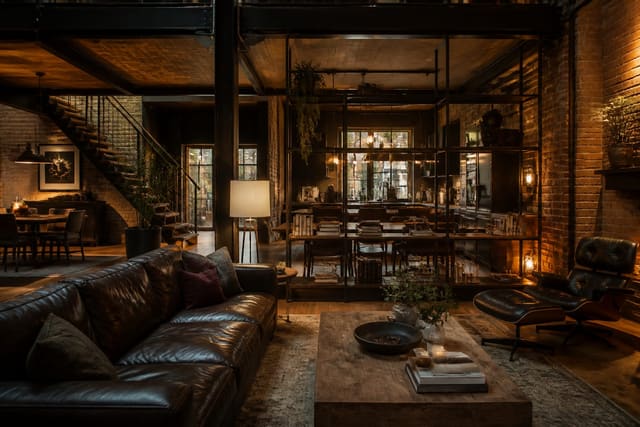
The fourth mistake is overusing contrast through black accessories. Small black accents — a lamp base, a picture frame, cabinet pulls at roughly 1.5 inches wide — add graphic definition. But when black objects accumulate to more than 5 percent of the visual field, the palette shifts away from Nordic calm toward something closer to modern industrial, which has its own appeal but is a fundamentally different design language.
Here are the common mistakes to avoid: - Pulling warm-white paint chips under fluorescent store lighting instead of natural daylight gives a false undertone read. - Combining more than two muted accent colors in the same room dissolves the palette's intentional restraint. - Using dark-stained walnut or ebonized wood as the primary surface material conflicts with the blonde-wood logic of the palette. - Lighting the space with bulbs above 4000K kelvin strips the warmth from every neutral surface simultaneously.
Bring the look home with Re-Design
Re-Design lets you upload a photo of your room and experiment with a full Scandinavian color palette using AI before you buy a drop of paint. Try warm-white versus off-white walls, test muted sage or dusty blue accents, and preview how different wood tones interact with your existing light — all from a single photo. It is the most efficient way to lock in the right palette with confidence.
Frequently Asked Questions
Is black part of the Scandinavian color palette?
Black appears in the Scandinavian palette as a contrast accent, not a base tone. It works best in small, defined applications — lamp bases, door hardware, thin picture frames — where it provides graphic sharpness without dominating. When black surfaces accumulate beyond roughly 5 percent of the visual field, the space reads as modern industrial rather than Nordic.
Can color be used more boldly within a Scandinavian palette?
Yes, within limits. Traditional Swedish and Finnish interiors used deeper blues, forest greens, and even terracotta as accent wall colors, particularly in rooms with abundant natural light. The key is keeping the accent to a single surface and maintaining warm-white or light-grey as the surrounding base so the bold tone has room to read clearly.
What is the difference between Scandinavian white and hygge-style warm neutrals?
Scandinavian white stays within a cool-to-neutral range with light reflectance above 85, prioritizing brightness and spatial clarity. Hygge-style warm neutrals drift into deeper creams, taupes, and camel tones that read cozier but also darker. Both are valid Nordic aesthetic references, but they produce different room temperatures and suit different light conditions.