A white-box rental softens without paint when one wall carries an oversized art moment or fabric hanging, every bulb switches to 2700K, two matching warm-tone floor lamps sit at the perimeter to wash the walls, and at least one large textured rug warms the floor — five reversible moves that change how the white reads from clinical to warm. White box apartment walls are not neutral when they make every chair, cord, and shadow look exposed. My opinion: blank rental walls need fewer tiny decorations and more scale. If you cannot paint, you can still change how those walls read by adding texture, depth, warmth, and stronger visual anchors. The goal is not to hide every inch of drywall; it is to make the room feel chosen instead of temporarily occupied.
What makes white apartment walls look better without paint?
You make white apartment walls look better without painting by adding scale, shadow, texture, and warmer light to break up the flat white plane. Paint is only one way to create depth; renters can get much of the same softness from pieces that sit proud of the wall, hang from existing hardware, or lean against furniture.
Start with the largest blank wall, not the easiest corner. A sofa wall, bed wall, dining wall, or entry wall usually needs one dominant move that covers at least 50%–70% of the furniture width below it. Over a 78" sofa, that means art, a textile, or a grouped arrangement roughly 40"–55" wide, not three postcard frames floating in a nervous row.
Hang art so the center lands around 57"–60" from the floor, or lower when it relates to furniture. Above a sofa, keep the bottom edge about 6"–10" above the back cushion so the wall and furniture read as one composition. If you want a full no-damage method, use this guide to hang art in a rental without wall damage before trusting random adhesive hooks with heavy frames.
Scale also comes from furniture height. A 30" console, 42" bookcase, or 60" floor lamp gives the wall a vertical rhythm that flat framed prints cannot create alone. White walls feel sterile when every object stops below waist height; add one or two taller silhouettes and the room immediately feels less unfinished.
Which wall treatments add texture without violating the lease?
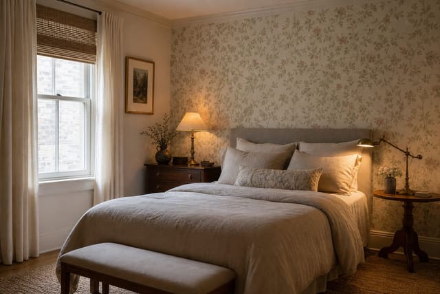
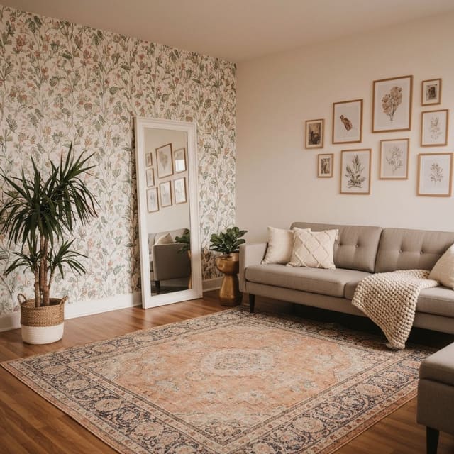
Fabric is the fastest way to make a white wall feel less hard. A woven wall hanging, quilt, framed scarf, curtain panel, or stretched canvas panel absorbs echo, adds shadow, and introduces color without committing you to adhesive across the whole room. For a bed or sofa wall, avoid anything under 24" wide unless it is part of a larger grouping; a single textile around 36" x 48" often looks more adult than a scatter of small macrame pieces.
Removable wallpaper can work, but it should be used like a finish, not a miracle. Choose one contained zone: behind the bed, inside a dining nook, on the back wall of a desk niche, or above a low cabinet. A full living room perimeter in peel-and-stick paper is harder to align, harder to remove, and more likely to show every crooked rental corner.
Before ordering rolls, test a sample on the exact wall for 48–72 hours. White rental paint can be chalky, glossy, dusty, or freshly touched up; each condition changes how adhesive behaves. If the sample curls, lifts paint, or shows bumps from orange-peel texture, switch to framed panels, a tapestry, or freestanding storage instead. This temporary wallpaper brand review is worth reading before you buy based on pattern alone.
For texture with almost no wall contact, use a leaning mirror, folding screen, tall plant, or open bookcase. A 30"–36" wide mirror leaned behind a chair can break a dead wall while reflecting lamp light. A 72" bookcase gives the room architecture, especially if the shelves include books, lidded boxes, ceramics, and one darker object every 12"–18" so the whole thing does not dissolve into pale clutter.
Test this on your own room photo with ReDesign before you choose the final direction; keep the doorway, walls, windows, main furniture, lighting, and awkward fixed features visible so the preview solves the room you actually have.
How should art, curtains, and lighting work together?
White walls look cold when the room has no shadow. That is why art, curtains, and lighting should be planned as one wall-softening system rather than separate shopping decisions. Flat white drywall needs depth at three levels: near the ceiling, at eye height, and close to the floor.
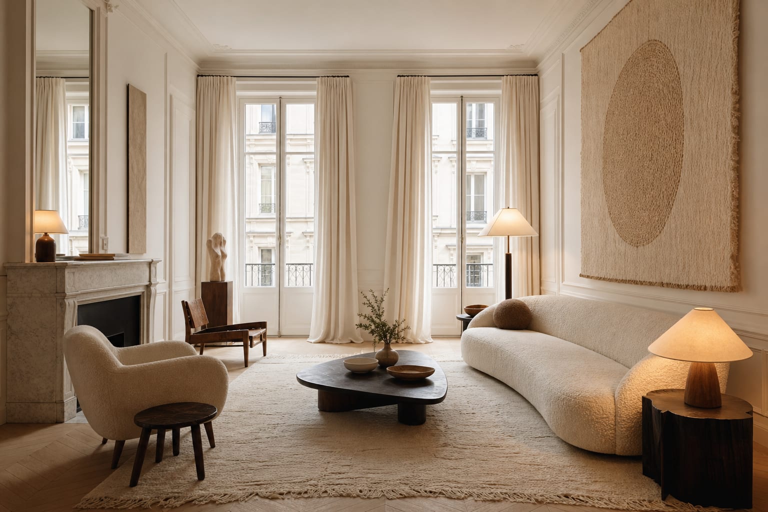
Curtains are the most underrated wall alternative to paint. Mount a tension rod or no-drill bracket as high as the lease and trim allow, ideally 6"–10" above the window casing. Let the panels kiss the floor or stop within 1/2" of it; short curtains make a white wall feel chopped up. Even if the window is narrow, extend the rod 8"–12" beyond the frame on each side so the fabric creates width instead of blocking daylight.
Lighting decides whether white reads crisp or clinical. Use warm white bulbs around 2700K–3000K in lamps and sconces, and avoid cool bulbs that turn rental paint blue. A floor lamp that reaches 58"–68" high throws light across the wall, while a tiny table lamp only brightens the shade and leaves the drywall looking gray. If the apartment has one weak ceiling fixture, borrow the same principles used to fake natural light in any room: bounce light toward vertical surfaces, repeat warm bulbs, and place lamps where they wash the wall rather than glare into your eyes.
A gallery wall can soften a white box, but spacing matters. Keep 2"–3" between frames in a tight group, repeat one frame color, and vary sizes enough that the arrangement has a clear anchor. A good renter gallery wall usually has one large piece, two medium pieces, and a few small pieces; ten identical 8" x 10" frames can look more like a hallway in an office than a home.
Common mistakes that keep white rental walls looking sterile
The first mistake is decorating too small. Tiny art, tiny shelves, tiny mirrors, and tiny plants make a large white wall feel even larger because the empty space around them becomes the main event. Choose one piece that is almost uncomfortably big, then support it with quieter objects.
The second mistake is using only white, gray, and clear acrylic because the apartment already feels clean. A white room needs warmth somewhere: oak, walnut, rattan, terracotta, olive, camel, rust, oatmeal, or aged brass. You do not need a loud palette, but you do need one material that is visibly warmer than the wall.
The third mistake is pushing every piece of furniture against the perimeter. When the sofa, desk, bed, and storage all cling to the walls, the room becomes a ring of objects around a blank center. Pull a chair 6"–12" off the wall, float a small side table beside it, or place a floor lamp behind the seat so the wall has layers in front of it.
The fourth mistake is trusting adhesive before checking weight, paint condition, and removal. Many removable strips work beautifully on sound paint and badly on dusty or weak paint. Clean the spot, let it dry, press the strip for the full time the manufacturer requires, and keep heavy glass frames for studs, existing holes, or leaning placements.
The fifth mistake is covering every wall because the first blank wall bothered you. One strong wall, one softer window treatment, and one warmer lighting plan usually beat four walls filled with unrelated art. Leave some white space on purpose so the room still breathes.
Use AI design to preview your white box apartment before you buy
AI design is useful for white apartment walls because the problem is often proportion, not a missing product. Upload a straight-on photo of the blank wall with the furniture, floor, ceiling line, window trim, outlets, and existing light visible. Do not crop out the awkward vent, thermostat, cable outlet, or radiator if those details will still be there after you decorate.
Preview one category at a time. Ask for an oversized textile above the sofa, then a large framed print, then floor-to-ceiling curtains, then a removable wallpaper panel behind the bed. If the design only works when every surface changes at once, it is probably too fragile for a real rental and too expensive for the actual problem.
Pay attention to measurements in the preview. Note whether the art wants to be 36", 48", or 60" wide; whether curtains should be ivory, flax, or warm gray; whether the lamp needs a drum shade or an arched arm; and whether a bookcase should stop below the ceiling or climb close to it. The preview should become a shopping brief, not a fantasy image.
For renters, run a removal-minded version beside the prettiest version. Compare a wallpapered wall against framed fabric panels, a leaning mirror, and a curtain wall. The best solution is the one that softens the white box, respects the lease, and still looks intentional when you remove a single item.
Frequently Asked Questions
How do I add warmth to white apartment walls without painting?
Swap every bulb to 2700K, add wool or jute rugs, layer textured throws and pillows in warm tones (cream, oat, terracotta, rust), and hang one large piece of warm-toned art — the white walls now read as a backdrop rather than the dominant color. Use the room photo to compare the visible layout and fixed constraints before committing, because door swings, windows, outlets, storage reach, circulation, and existing furniture decide whether the idea survives daily use.
What single move warms up a white-box apartment fastest?
Replace cool overhead bulbs (3000K and above) with warm 2700K dimmable LEDs — this single 30-dollar move shifts the entire room's color temperature and the white walls read warm immediately. Keep the preview honest by leaving the problem area visible in the frame, then compare one conservative version against one bolder version before you buy lighting, paint, furniture, or storage.
Can I use temporary wallpaper in a white-box rental?
Yes — one accent wall in textured peel-stick wallpaper (grasscloth-look, soft tone) or a fabric wall hanging adds warmth and visual interest; full-room temporary wallpaper rarely earns the install effort for a 12 to 24-month stay. Check the result against ordinary movement first: drawer clearance, chair pullout, walkway width, glare, switch access, and sightlines matter more than a perfect catalog angle.
How do I add color to white walls without painting?
Use art, textiles, and books — a 30 by 40-inch warm-toned print or canvas, two thrown blankets in muted colors, and an open bookcase of warm-spine books reads as color on the walls without any paint. Use the image to narrow priorities and measurements before ordering anything custom; final purchases still need real dimensions, outlet locations, installation limits, and product clearances.
Why does a white apartment feel cold even with warm furniture?
Cool overhead bulbs and bare floors transmit cold from above and below; pair warm 2700K bulbs with at least one large textured rug per room to break the cold sandwich effect. If the preview invents architecture or hides the awkward feature you need solved, rerun it with stricter instructions so the result remains tied to your actual room.
Three transformations to try
- Oversized warm-toned art on one wall
- 2700K floor lamps washing white walls
- Textured rug and throws in cream and rust