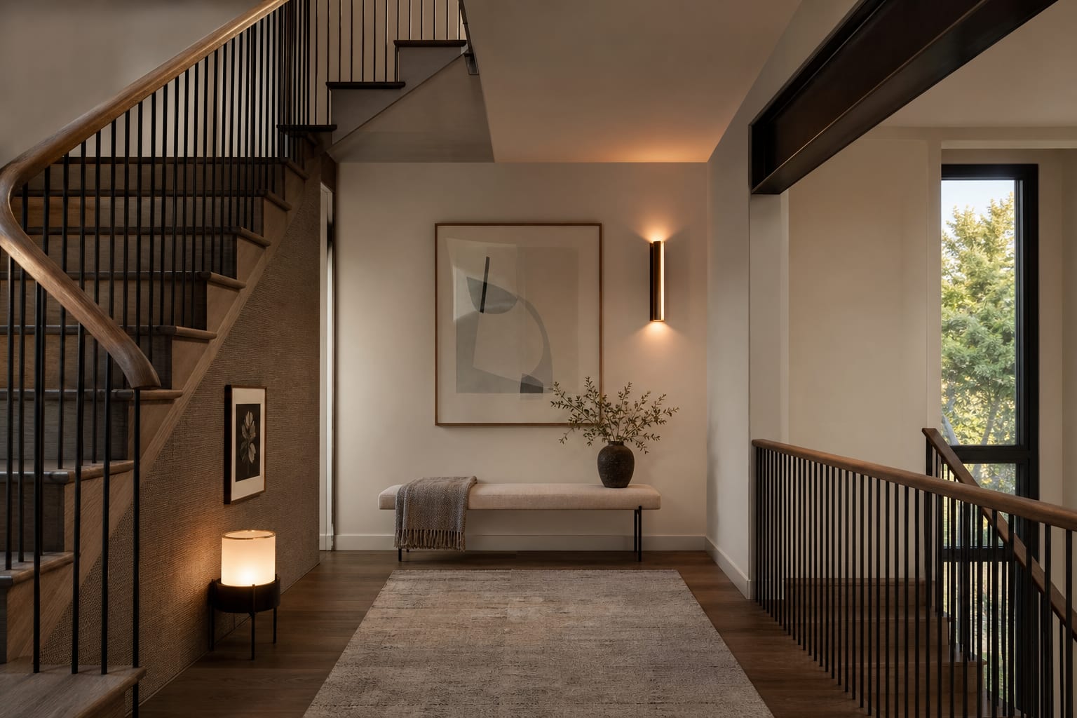
Staircase landings work as design destinations when one anchor piece (oversized art, tall plant, accent chair, or built-in window seat) gives the landing a purpose, lighting drops to landing height, and the wall along the staircase becomes a gallery zone tied to the landing piece. A staircase landing is not bonus square footage if it only collects laundry, delivery boxes, or one lonely plant. My firm opinion: the best staircase landing ideas treat the landing as a pause, not a room. Use a staircase landing area for one clear purpose: a reading perch, shallow storage, art wall, plant ledge, lighting moment, or small desk only when the walking path stays clear. The goal is to make the dead space feel deliberate without making the stairs harder to use.
What do you do with a staircase landing area?
You turn a staircase landing into a useful pause by assigning it one job and protecting the stair circulation before adding decor. A landing is usually a transition zone first, so seating, shelves, plants, art, and lighting have to stay slim enough that people can pass with a basket, suitcase, or sleeping child.
Start with the clear floor. If the landing is also the turn between two stair runs, keep at least 36 inches of open walking width where feet naturally land. A 30 inch path may work in a tight older house, but it should not be narrowed by a basket handle, bench leg, or plant pot that catches ankles. Anything deeper than 15 to 18 inches needs to earn its place, because landings rarely have the spare depth people imagine from photos.
Think about the eye level from both directions. A landing is seen from below, from above, and often from a hallway, which means the back of a chair, the side of a cabinet, and the underside of a shelf all matter. If the stair already feels chopped up, borrow the continuity thinking in staircase design ideas that connect the whole house: repeated wood tones, one metal finish, and lighting that relates to the rail can make the landing feel built into the stair rather than perched on it.
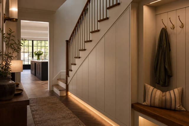
Lighting is often the quickest win. A single sconce mounted around 60 to 66 inches from the floor can make a blank landing wall feel intentional, especially with a warm 2700k to 3000k bulb. If wiring is not realistic, a plug-in picture light or rechargeable sconce can still give the landing a purpose after dark.
The traffic decision that controls every landing idea
The hard decision is whether the landing can hold furniture or should stay mostly vertical. Many awkward stair landing decor mistakes happen because someone tries to furnish a landing that should have been treated like a wall.
A square landing at least 5 feet by 5 feet can usually support a small bench, low bookcase, or chair if the stair openings do not fight it. A narrow turn landing may only support art, lighting, or a 6 to 10 inch ledge. That is not a failure; a shallow design can look more expensive than a cramped furniture vignette.
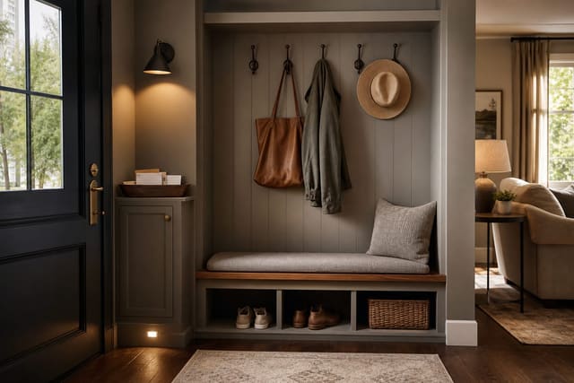
Benches work best when they are truly slim. Choose a bench around 12 to 16 inches deep, with open legs or a visually light base, and place it tight to the wall rather than floating it into the stair path. If people sit there to put on shoes, leave room for knees; if the bench is mostly a landing spot for a bag or folded blanket, a ledge may do the same job with less bulk.
Storage has to be honest. A cabinet on a landing should usually be 10 to 14 inches deep unless the landing is unusually generous. Deep furniture near stairs feels risky because bodies move there at speed and often with hands full. If the landing connects to a hallway, the planning logic in hallway design ideas for tight passages applies directly: keep the path readable, choose shallow pieces, and let the wall do more work than the floor.
Runners and rugs need caution. A rug on a flat landing can soften the pause, but it must sit flat, use a proper pad, and stop short of stair nosings. A curling corner on a landing is not charming; it is a trip waiting for bare feet at night.
Test this on your own room photo with ReDesign before you choose the final direction; keep the doorway, walls, windows, main furniture, lighting, and awkward fixed features visible so the preview solves the room you actually have.
Which staircase landing ideas earn the square footage?
The best landing area design ideas either improve light, create a destination, or solve a tiny storage problem without making the stairs feel crowded. Skip anything that exists only because the landing looked empty.
- A slim reading perch works when the landing has a window or a calm wall. Use a chair with a back under about 34 inches, a small table no wider than 16 inches, and a wall light instead of a floor lamp if the landing is tight. Angle the chair toward the stair opening by 15 to 30 degrees so it feels connected to the house rather than abandoned in a corner.
- A gallery wall works when the floor cannot spare depth. Keep the lowest frame high enough that shoulders and bags do not brush it, often around 48 inches from the floor to the bottom edge on a busy stair wall. Use frames that relate in color or spacing, because a landing gallery is seen while moving and cannot rely on fussy detail.
- A plant ledge works when the landing gets real daylight. Choose one substantial plant or three small plants in related pots rather than a crowded greenhouse. Keep pots under the sill or rail height where possible, and leave 3 to 6 inches around heat vents or radiators so leaves do not bake in winter.
- A shallow book wall works when the landing is wide and quiet. Shelves 8 to 10 inches deep can hold paperbacks, framed art, and a small lamp without acting like a full cabinet. If the landing is used by kids, anchor the shelving properly and avoid glass objects at hip height.
- A small work ledge works only when the landing is not the main stair turn. A laptop shelf should be at least 18 inches deep and roughly 29 inches high, with a chair that can tuck fully out of the path. If the chair blocks the stair, the landing is not an office; it is a hallway pretending to be one.
For homes where the stair zone already has dead space below, pair the landing plan with an under-stair storage guide for awkward voids. The landing should not be asked to store everything when the underside of the stair may be better suited to closed cabinets, drawers, or pet gear.
Common staircase landing mistakes that make dead space worse
The first mistake is adding a console table because the wall is blank. A 16 inch deep console can look harmless until someone carries bedding down the stairs and clips the corner. If the landing is narrow, use a picture ledge, sconce, or framed textile instead.
The second mistake is treating the landing as a dumping station. Baskets for returns, laundry, library books, and school bags may feel organized for one day, then train the whole household to abandon things halfway between floors. If storage belongs there, make it closed, shallow, and category-specific: dog leashes, winter hats, spare throws, or stair-safe books.
The third mistake is using decor that fights the rail. A black metal railing, oak treads, brass picture light, and chrome plant stand can make the landing feel assembled from leftovers. Repeat one finish from the stairs on the landing, even if it is only a black frame, oak bench, or aged brass sconce.
The fourth mistake is ignoring sound. Landings can echo because stairwells have hard walls, tall voids, and bare treads. A flatwoven runner on the landing, fabric wall hanging, upholstered bench cushion, or lined drapery near a landing window can soften the stair zone without filling the floor.
The fifth mistake is over-styling the view from one direction. A landing that looks perfect from the bottom stair may show an ugly cabinet side from the upper hall. Walk the stairs both ways before deciding where art, lamps, plants, and furniture should face.
Use AI to preview your staircase landing before you commit
AI design is useful for staircase landings because the decision is spatial, not just decorative. Upload a photo from the bottom of the stairs looking up, one from the top looking down, and one straight across the landing if there is enough distance. Those three views show whether a bench blocks the turn, a gallery wall feels too busy, or a dark paint color makes the stairwell feel tighter.
Ask for specific landing tests instead of a vague stair makeover. Try one preview with “narrow staircase landing, 14 inch deep oak bench, warm wall sconce, framed black and white art, clear stair path, soft neutral walls.” Then compare it with “stair landing gallery wall, no furniture, picture light, pale runner, one tall plant by the window.” Keep the rail, treads, doors, and window positions consistent so the comparison tests the landing rather than inventing a different house.
Look for practical clues in the image. Does the bench sit outside the footpath? Does the plant block the handrail? Does the art scale look strong from the lower stair, or does it shrink against the stairwell height? Does the lighting land on the landing wall rather than glare into someone’s eyes as they climb?
AI cannot verify building code, handrail clearance, stair nosing safety, outlet locations, or shelf anchors. It can show whether the landing wants furniture, vertical decor, better lighting, or simply one disciplined focal point before you buy pieces that are annoying to return.
After the preview, tape the proposed bench depth, shelf projection, rug edge, and art outline in the actual landing. Walk the stairs while carrying a laundry basket, then walk them again at night with only the planned light on. A landing idea is ready when it improves the pause between flights and leaves the stairs feeling safer, calmer, and more intentional than before.
Frequently Asked Questions
What goes on a staircase landing?
Pick one anchor — large art (60+ inches), a tall plant, an accent chair, or a built-in window seat; one strong piece reads designed while three small pieces read cluttered. Use the room photo to compare the visible layout and fixed constraints before committing, because door swings, windows, outlets, storage reach, circulation, and existing furniture decide whether the idea survives daily use.
Should the landing have its own lighting?
Yes — a sconce, pendant, or table lamp at landing height (not just the staircase pendant up high) treats the landing as a room not a passthrough. Keep the preview honest by leaving the problem area visible in the frame, then compare one conservative version against one bolder version before you buy lighting, paint, furniture, or storage.
Can a staircase landing have a rug?
Yes — a small rug (4x6 or runner) anchors a seating piece on the landing; the rug stops at the top stair, never overlaps the riser. Check the result against ordinary movement first: drawer clearance, chair pullout, walkway width, glare, switch access, and sightlines matter more than a perfect catalog angle.
What window treatment works on a landing?
A floor-length curtain or a roman shade — short shades read cheap on landing windows. If the window is high, treat it as architecture, not a treatment opportunity. Use the image to narrow priorities and measurements before ordering anything custom; final purchases still need real dimensions, outlet locations, installation limits, and product clearances.
Does AI preview landing designs?
Yes — upload the landing photo and AI previews anchor pieces, lighting placement, and gallery wall additions before any commit. If the preview invents architecture or hides the awkward feature you need solved, rerun it with stricter instructions so the result remains tied to your actual room.
Three transformations to try