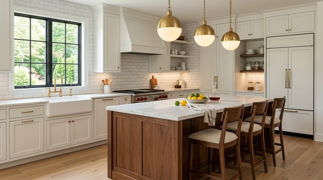
Subway tile gets dismissed as the safe default, and I get why, but that reputation misses how much the details change the result. My read is that the tile itself is almost neutral, and grout color, size, and layout are what decide whether it looks fresh or builder-grade.
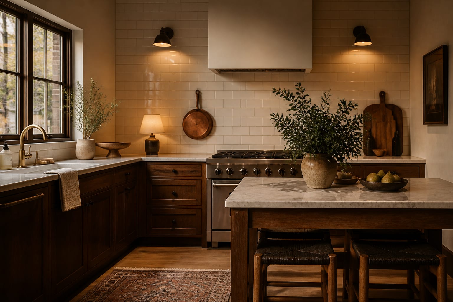
What is the best subway tile size and grout color? The classic 3-by-6-inch tile in a running bond with a soft grey grout is the most reliable choice, because grey hides dirt, defines each tile gently, and avoids the stark high-contrast look that dates quickly. If you want a more current feel, a larger 4-by-12 or 4-by-16 tile with a tight matching grout reads cleaner and more modern without abandoning the format entirely. The tile is a blank canvas; the grout and proportion do the talking, and that is genuinely good news because it means an inexpensive tile can look high-end with the right pairing.
Picking a size and finish
The 3-by-6 classic is timeless but increasingly common, so if you want subway tile that does not look like every flip on the market, change the proportion. A 4-by-12 tile cuts the grout lines roughly in half and feels calmer and more contemporary, and a skinny 2-by-8 reads crisp and architectural. Finish carries just as much weight: a glossy glaze throws light around a dim galley kitchen, while a matte or slightly irregular handmade-look tile brings warmth that flat machine tile cannot.
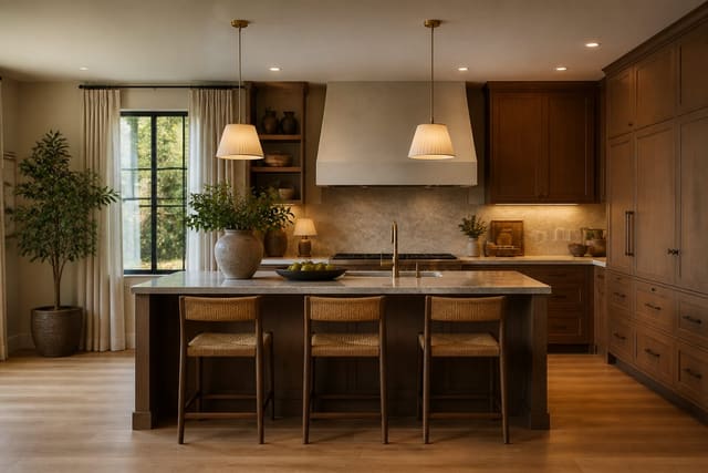
Material affects the read as well. Ceramic is the affordable workhorse and covers most kitchens fine, while a zellige-style handmade ceramic brings irregular edges and a glaze that pools and varies, giving the same shape far more soul. Glass subway tile reads sleek and bounces light hard, which suits a contemporary kitchen but can look cold in a traditional one. None of these is wrong; they simply move the tile along the spectrum from rustic to modern before you have even chosen a layout.
When you are planning the larger room, the backsplash should answer to the cabinets and counters rather than stand alone, which is why I treat tile selection as one move within the broader plan in AI kitchen design ideas. Pick the tile last, after the cabinet color is settled, and the choice gets much easier.
The classic field tile is 3 inches by 6 inches, though oversized 4 inch by 12 inch planks now read more current, and budget options start near $2 per square foot.
Grout color is the real decision
Grout is where subway tile lives or dies, and most people underthink it. White grout with white tile gives a seamless, soft look that is gorgeous on day one and grimy by month six in a working kitchen. Soft grey grout is the workhorse: it gently outlines each tile, hides cooking splatter, and never looks dated. Dark charcoal grout against white tile creates a graphic grid that is striking but unforgiving of any layout imperfection, so it demands a precise installer. A middle path that works in a lot of kitchens is a greige grout a touch warmer than pure grey, which flatters cream and off-white tile better than a cool grey ever could.
Grout joint width matters too. A standard 1/16 to 1/8 inch joint suits machine-made tile, while handmade tile needs a wider 1/8 to 3/16 inch joint to absorb its size variation. There is also a finish choice in the grout itself: epoxy grout resists stains and never needs sealing, which is worth the higher cost behind a stove where grease lands, while standard cement grout is cheaper but wants resealing every year or so to stay clean.
A quiet trick is to match the grout to the wall color rather than the tile when the tile is an accent, which lets the backsplash blend into the room instead of asserting a grid. If your tile run wraps a counter extension or peninsula, keep the grout logic consistent so the eye reads it as one surface, a detail worth coordinating with any kitchen peninsula work.
Layouts that modernize a classic
The default 50 percent running bond is fine, but it is also why subway tile can feel generic. Shifting to a one-third offset adds subtle movement, a vertical stack reads tall and contemporary, and a vertical running bond draws the eye upward in a low-ceilinged kitchen. Herringbone turns the same plain tile into something that looks custom, and a stacked grid with tight grout gives the cleanest, most modern face of all.
Height is the lever most people forget to pull. Running the tile all the way to the underside of the upper cabinets, or better yet to the ceiling behind an open wall, makes a far stronger impression than the standard 18-inch band that stops at the cabinets. A full-height subway run behind a range, framed by a simple metal shelf, can read as expensive even with the cheapest ceramic tile, because the ambition of the install is doing the work rather than the material cost.
Layout interacts with grout, too. A herringbone in high-contrast grout looks energetic and busy, while the same herringbone in a tone-matched grout looks textured and calm, so decide on the mood before you lock either choice. The pattern and the grout are a pair, and judging them separately is how people end up surprised by the finished wall.
Mix the layout with the right hardware and metals and the whole backsplash shifts era. A stacked white tile under brushed brass fittings feels current, whereas the same tile in a running bond with chrome reads traditional. That interplay is why I think about tile and metals together, the same way I weigh finishes in the cabinet hardware guide.
Trim is the detail that separates a finished job from a builder special. A metal edge profile, a bullnose tile, or a thin pencil-liner cap gives the run a clean termination instead of a raw cut edge, and the choice should match the metals already in the kitchen. It is a small line item that quietly signals the whole backsplash was thought through, and skipping it is the first thing my eye catches in a rushed install.
Common mistakes to avoid
The most common mistake is defaulting to white grout in a kitchen, then watching it stain within months; pick grey unless the tile is purely decorative and rarely splashed. A second common mistake is choosing high-contrast charcoal grout with a careless installer, because every crooked line and uneven joint becomes a permanent eyesore against that contrast.
Run through these before tiling:
- Decide grout color before tile, since grey, white, and charcoal create three completely different looks.
- Match joint width to the tile, wider for handmade and tighter for machine-made.
- Choose a layout that fits the room, vertical for low ceilings and herringbone for character.
- Order 10 percent overage to cover cuts, breakage, and future repairs.
Use AI design to preview subway tile before you commit
A few loose subway tiles taped to the wall tell you almost nothing about how grout color and layout will read across a full backsplash. With Re-Design you upload a photo of your kitchen and re-render the backsplash in different subway configurations, so you can compare grey grout against white, or a herringbone against a simple stack, on your own walls and under your own light.
That side-by-side is where the dated-versus-fresh question gets settled fast. Upload the room, swap a 3-by-6 running bond for a 4-by-12 stacked layout, then flip the grout from white to charcoal and see which one actually suits your cabinets. Trying the combinations as AI design renders beats imagining them, and it spares you from living with a backsplash you only half-liked.