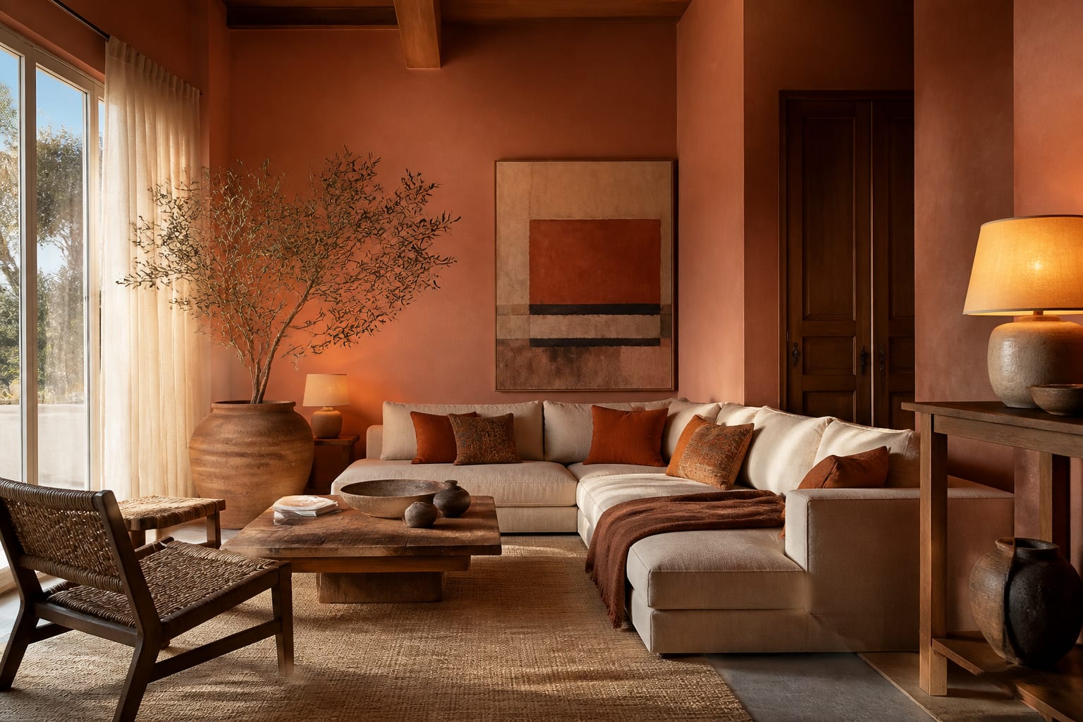
Terracotta is the warmest neutral most people overlook because they picture a dated 1990s sponge-painted kitchen. The real version is nothing like that. Used with restraint, terracotta behaves like a sophisticated earth tone that warms a room the way late-afternoon sun does, and it pairs with everything from cream and olive to deep plum and charcoal. The mistake is treating it as an accent you dab on a single wall. The better move is to commit to the clay family across paint, textiles, and clay objects so the warmth feels intentional and grounded rather than like an afterthought.
What colors actually pair with terracotta?
Terracotta is a warm tone with orange and brown in its DNA, so the pairings that sing are the ones that either echo that earthiness or push gently against it. The safest and most timeless partner is a warm white or soft cream on the trim and ceiling, which lets the clay color glow without competition. From there, olive and sage green are the classic move, since the two colors sit opposite each other in a way that reads natural, like clay pots against foliage. A muted terracotta and olive palette feels grounded in any room with good light.
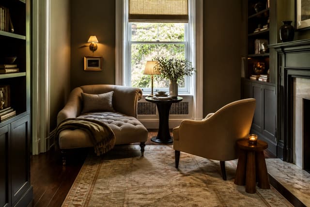
For more drama, reach for the deeper cool tones. Charcoal and near-black give terracotta a modern, gallery-like edge, especially on a fireplace surround or window trim. Deep plum and burgundy share terracotta's red undertone and create a rich, enveloping scheme for a bedroom or dining room. Blush pink and dusty rose, though, are the one pairing to handle carefully, since two warm pinks side by side can read sweet rather than grounded unless you anchor them with plenty of raw wood and cream. Brass and aged bronze are the metals to use, never chrome, since warm metals reinforce the clay warmth. If you are building a cozy reading nook, a terracotta wall behind an olive chair with a brass lamp is a combination that feels intentional from the first glance.
How do you use terracotta without it feeling dated?
The dated reputation comes almost entirely from execution, not from the color. The first fix is finish: skip any faux, sponged, or rag-rolled technique and use a flat, even coat with a 2 to 10 percent matte sheen so the wall reads like smooth fired clay rather than a textured craft project. The second fix is depth. A muddy, orange-heavy terracotta from two decades ago looked cheap; the current clay tones carry more brown and gray, which keeps them sophisticated. Sample three depths, a pale blush-clay, a mid terracotta, and a deep burnt sienna, on 24-inch swatches and judge them under your own evening light.
The third fix is restraint paired with repetition. Terracotta wants to appear in more than one place but not everywhere. Let it own the walls, then echo it in a clay-glaze lamp, a woven rust rug, or a stack of throw cushions, and stop there. Keep the rest of the palette quiet, cream, linen, raw wood, so the warmth has room to breathe. A terracotta-painted alcove or statement ceiling over white walls is a low-commitment way to test the color before you wrap a whole room in it. If the full-strength clay feels like too much on a first attempt, drop down two shades to a putty-terracotta, which gives you the same earthiness at half the intensity and is far easier to live with in a bright south-facing room.
Which rooms suit terracotta best?
Terracotta earns its keep in rooms where warmth is the whole point. A dining room in a deep clay tone turns a meal into an occasion, since the color flatters skin under warm 2700K bulbs and candlelight and makes the table feel intimate. Bedrooms take terracotta well when you keep it soft, a blush-clay behind the bed with cream linens and raw oak feels restful and sun-warmed without tipping into heavy. North-facing rooms that never get direct sun are the best argument for terracotta, since the color injects the warmth those cool spaces lack.
Entryways and hallways, often dim and forgotten, come alive in a mid terracotta because the tone reads inviting the moment you walk in. Kitchens and bathrooms take it well too, where a terracotta lower cabinet or a clay-toned tile floor brings warmth to rooms that often default to cold white and stainless. Living rooms can carry the color too, though there you may prefer to keep the walls a warm white and bring terracotta in through a large rust rug, leather seating, and clay accessories. A window seat upholstered in a rust linen against pale walls gives you the clay warmth in a contained, comfortable dose. Anywhere you want a room to feel like it is holding onto the last hour of daylight, terracotta delivers.
Terracotta color interior ideas to try
- Paint a dining room in a deep burnt-sienna terracotta and pair it with brass sconces and warm 2700K bulbs.
- Use a blush-clay terracotta behind a bed with cream linen and raw oak for a soft, sun-warmed bedroom.
- Wrap a dim entryway in a mid terracotta so the space reads warm and welcoming the moment you step in.
- Layer a rust-toned wool rug over pale floors and add olive-green seating for a grounded, natural palette.
- Paint an alcove or built-in bookcase terracotta against warm-white walls to test the color at low commitment.
- Group clay-glaze pots, a terracotta lamp base, and a woven rust throw so the tone repeats across three materials.
- Pair terracotta walls with charcoal window trim for a modern, gallery-like edge that keeps the warmth from feeling soft.
- Upholster a window seat in rust linen against cream walls for a contained dose of clay warmth.
See it first in Re-Design
Terracotta photographs and samples unpredictably because the tone shifts so much with light, so guessing from a paint chip is a gamble. Upload a photo of your dining room, bedroom, or entryway into Re-Design and re-design it in a pale blush-clay, a mid terracotta, and a deep burnt sienna to see which depth your room's light actually flatters. You can preview the color on all four walls, on a single alcove, or only in the textiles and rug, so you decide how far to take the clay palette before you open a single can of paint.
Frequently Asked Questions
Is terracotta a warm or cool color?
Terracotta is firmly a warm color, built on orange and brown with a red undertone, the same family as fired clay and unglazed pottery. That warmth is exactly why it works so well in north-facing or dim rooms that feel cold, and why warm 2700K to 3000K bulbs deepen it while cool daylight bulbs can flatten it toward pink.
What white goes with terracotta?
Reach for a warm white or soft cream rather than a stark, blue-based white. A cool white fights terracotta's warmth and can make the clay look muddy by contrast. A creamy white on the trim and ceiling lets the terracotta glow and keeps the whole palette feeling sunlit and cohesive.
Does terracotta make a room look smaller?
A deep terracotta is a saturated, advancing color, so it will make a large room feel cozier and more intimate, which is usually the goal. In a genuinely small, dark room, choose a lighter blush-clay or confine the full-strength terracotta to one wall or the ceiling so the space still feels open.
Can terracotta look modern?
Yes. Pair it with clean-lined furniture, charcoal or black trim, and matte finishes rather than faux techniques, and terracotta reads contemporary and earthy. The dated look came from sponged textures and muddy orange tones; today's browner, grayer clay shades sit comfortably in a modern room.