Choppy two-color rooms harmonize when the two colors are tied with a bridge tone (a third color repeating both undertones), the proportion shifts toward one dominant color (60-70%), and accents in metal or wood pull both colors toward a neutral resting point. A two-color room can look clever on the paint card and strangely chopped up once the furniture moves back in. My strong opinion: most failed two-tone rooms do not fail because the colors are ugly; they fail because the room has no clear boss. The wall break, trim line, ceiling color, rug, and furniture are all competing to explain where the room begins and ends. The fix is to make one color lead, make the second color repeat with purpose, and soften the hard borders that are cutting the space into pieces.
How do you fix a two-color paint scheme that looks choppy?
You fix a two-color paint scheme that looks choppy by choosing one dominant color for most of the visual field, repeating the second color in furniture or decor, and using trim, lighting, rugs, and sightlines to connect the two halves of the room. The room needs hierarchy more than it needs another sample pot.
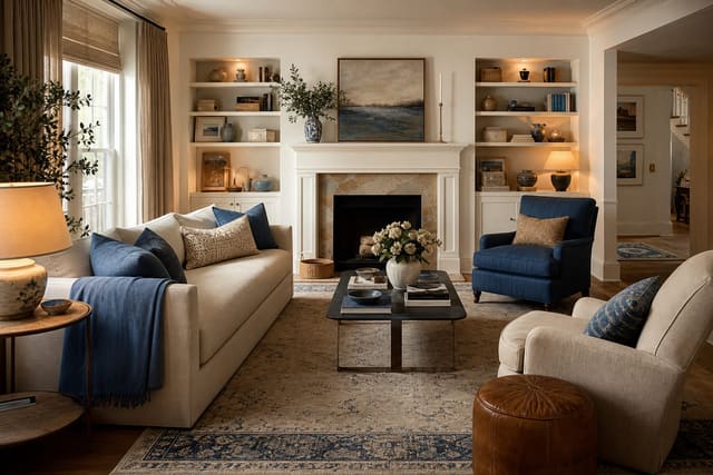
Start with proportion. In most rooms, let one color carry about 70% of the visible envelope and let the second color occupy closer to 20% to 30%. A wall split that gives each color equal power often feels restless, especially when the break line lands at an awkward height behind a sofa, bed, or cabinet.
If the lower half of the wall is dark and the upper half is pale, the darker color needs to appear somewhere else at least three times: a lamp base, a framed print, a pillow, a cabinet, a throw, or a rug line. If the upper color never repeats below eye level, the room reads as two separate rooms stacked on top of each other.
The same rule works in reverse. A pale lower wall with a saturated top can feel top-heavy unless the pale color repeats in curtains, bedding, lampshades, or a large rug. The goal is not perfect matching; it is visual evidence that both colors belong to the same house.
Which color should lead the room?
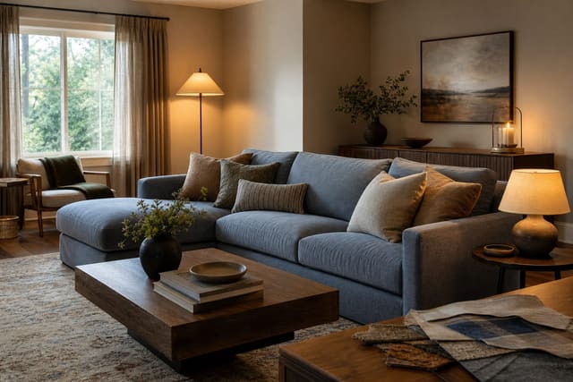
Let the color connected to the largest permanent surfaces lead. Flooring, tile, countertops, built-ins, fireplace stone, a sectional, or a large area rug should outrank the paint idea you liked online. A two-tone wall that ignores orange oak floors, gray carpet, or a pink-beige sofa will always look pasted on.
If one of the two paint colors already agrees with the fixed finishes, make that the dominant shade. For example, a warm cream that flatters honey flooring should cover the main wall field, while muted green, clay, black, or dusty blue can become the accent. If the accent color is the only thing that looks good in the room, it may be better on a door, cabinet, alcove, or lower wainscot than on every second wall.
Undertone is where many two-tone rooms break. A cool gray lower wall under a yellow beige upper wall can make both colors look wrong, even if each one is attractive alone. If the split looks dirty, sour, or oddly cold, read the room through the lens of clashing undertones in the room before blaming the whole concept.
Use sample boards instead of tiny chips. Paint two coats on boards at least 12 by 18 inches, then move them beside the floor, sofa, trim, and window. Check them in morning light, late afternoon light, and with the lamps on. Two-color schemes are unforgiving because each shade is constantly judging the other.
Test this on your own room photo with ReDesign before you choose the final direction; keep the doorway, walls, windows, main furniture, lighting, and awkward fixed features visible so the preview solves the room you actually have.
How do trim, ceilings, and sightlines make the scheme feel connected?
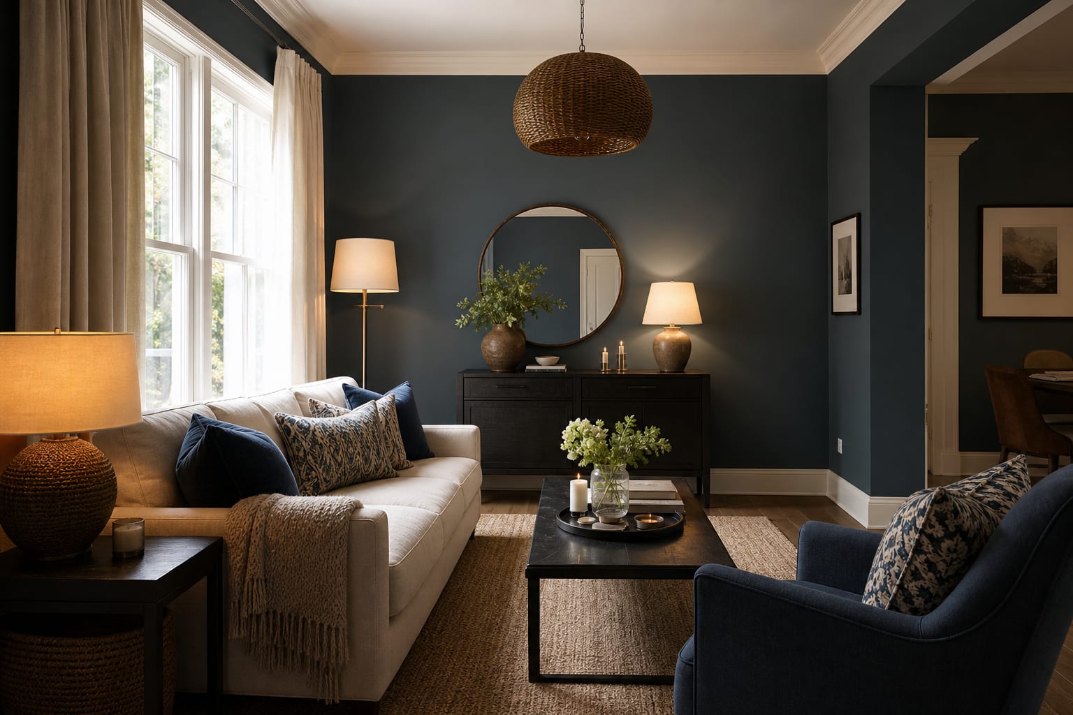
The line between colors is as important as the colors themselves. If the break lands at a random height, the room will feel cut in half no matter how tasteful the palette is. Tie the line to architecture whenever possible: chair rail, wainscot cap, picture molding, cabinet top, tile edge, fireplace mantel, or the bottom of a built-in shelf.
For a horizontal split, avoid placing the line exactly through the middle of the wall unless the room has strong classical trim. A lower third often feels more grounded, while a two-thirds upper field keeps ceilings from feeling pressed down. In an 8-foot room, a chair rail around 32 to 36 inches can work; a line at 48 inches may look like the walls are wearing a belt.
Ceilings need a decision too. A bright white ceiling above two warm wall colors can look harsh, while a muddy ceiling can make the whole room feel heavy. In low rooms, use a softened white, pale plaster, or the lighter wall color on the ceiling. In taller rooms, the darker color can wrap onto the ceiling only when the room has enough lamps, pale textiles, and vertical relief to keep it from feeling capped.
Trim should either calm the transition or sharpen it deliberately. If the room already feels fragmented, paint baseboards, casing, and doors in one consistent finish rather than letting every edge become another stripe. A satin trim finish with matte or eggshell walls gives enough contrast without adding more color noise.
Sightlines matter in open rooms. If the two-color treatment stops at one doorway but the next room shouts a third palette, the break feels accidental. Keep visible neighboring walls quieter, or repeat one of the two colors in the next space through art, upholstery, or a rug border. When the room also feels dim, fix the light before repainting; a stronger plan for fake natural light in any room can make the same two colors look cleaner and less patchy.
Common two-color room mistakes to avoid
- Choosing a perfect 50/50 split usually makes the eye bounce. Two equal paint fields create a visual argument, especially in small bedrooms, apartments, and rooms with low ceilings. Give one color the larger job, then let the second color appear as an accent with repeats at low, middle, and high levels.
- Stopping the accent color at the wall is why two tone walls are not working in many homes. A navy lower wall with no navy in the rug, art, or textiles looks like a half-finished paint experiment. Repeat the accent at least three times within the main view, ideally within 6 to 10 feet of the painted area.
- Ignoring furniture height makes the split line look awkward. If the break runs directly behind the top of a sofa, headboard, console, or TV, it can create a jagged horizon. Raise the line above the furniture, lower it below the main pieces, or add molding so the transition looks architectural instead of accidental.
- Using the wrong white can make the whole scheme feel cheap. Blue-white trim beside cream and terracotta can look sterile; yellow white beside cool sage and gray can look dingy. Compare whites directly in the room before ordering curtains, lampshades, or trim paint.
- Letting mirrors repeat the problem doubles the choppiness. A mirror that reflects the split line, clutter, or a dark corner makes the room feel more broken up. Place mirrors where they catch a window, lamp, pale curtain, or calm wall; the same thinking behind using mirrors to amplify light applies when you are trying to make two colors feel continuous.
How AI design helps you see the fix before repainting
AI design is useful for a choppy two-color room because the problem is spatial, not theoretical. A color pairing that looks balanced in a saved image can fracture your actual room once it meets your sofa height, doorways, window placement, rug size, and ceiling line.
Upload a straight photo of the room from the doorway or back corner. Include the floor, ceiling line, windows, main furniture, the full two-color wall, and at least two adjacent walls. Do not crop out the awkward doorway, the dark corner, or the orange floor; those are often the surfaces explaining why the paint split feels wrong.
Run focused previews. Try one version where the lighter color becomes dominant and the darker color repeats through textiles. Try another where the darker color moves only to built-ins, a door, or the lower third of the wall. Try a third where the colors stay but the trim, rug, curtains, and lighting change. Keep the largest furniture consistent unless you are genuinely replacing it.
Look for the lowest-commitment version that makes the room feel less segmented. If the best preview only works after the sofa, flooring, windows, and cabinets disappear, it is not a paint fix; it is a different room. The useful image shows whether a 9 by 12 rug, 20-inch pillow covers, warmer lampshades, taller curtains, or one repainted wall can solve the split.
What should you change first this weekend?
Start with the border. If the two colors meet at a shaky line, uneven tape edge, or random stopping point, clean that transition before buying accessories. Add a simple chair rail, picture molding, or a straighter paint break if the architecture supports it. If the line is fighting the furniture, repaint either above or below the break so the room has one clearer wall field.
Next, repeat the accent color in real objects. Choose one low repeat, one middle repeat, and one high repeat. That might mean a rug stripe, a pillow, and art; or a painted cabinet, a lampshade, and a throw. Keep the repeats related but not identical, because exact matching can make the room feel stiff.
Then soften the largest edges. Hang curtains 6 to 8 inches above the casing and extend the rod 8 to 12 inches beyond the trim when wall space allows. Let panels finish about 1/2 inch above the floor. Full-height fabric in one of the two wall colors, or in a bridge neutral such as flax, oatmeal, mushroom, or warm white, can stop the wall from looking sliced.
Finally, correct the light. Use bulbs around 2700K to 3000K in living rooms and bedrooms, and choose 90 CRI or higher when possible so the two colors do not turn muddy after sunset. Add one lamp near the darker paint field if that side falls into shadow. A choppy room rarely needs more decoration first; it needs a clearer color hierarchy, cleaner edges, and enough light for the plan to read.
Frequently Asked Questions
Why do my two colors fight?
Two colors at near-equal proportion (50/50) read as a battle; shifting to 60/40 or 70/30 lets the eye rest on one as dominant and the other as accent. Use the room photo to compare the visible layout and fixed constraints before committing, because door swings, windows, outlets, storage reach, circulation, and existing furniture decide whether the idea survives daily use.
What is a bridge tone?
A third color that contains undertones of both — for navy and green, that bridge is often a warm cream or oak wood; for terracotta and teal, a warm putty or walnut works. Keep the preview honest by leaving the problem area visible in the frame, then compare one conservative version against one bolder version before you buy lighting, paint, furniture, or storage.
Should I just repaint one of the two colors?
Often no — the cheaper fix is recovering a piece in the bridge tone or adding bridge-toned soft goods; repaint only after the bridge addition fails to harmonize. Check the result against ordinary movement first: drawer clearance, chair pullout, walkway width, glare, switch access, and sightlines matter more than a perfect catalog angle.
How do metals tie two colors?
Brass warms cool colors, polished chrome cools warm colors, aged bronze neutralizes both; one strong metal repeated across hardware, lighting, and frames gives two colors a common partner. Use the image to narrow priorities and measurements before ordering anything custom; final purchases still need real dimensions, outlet locations, installation limits, and product clearances.
Does AI preview the bridge tone?
Yes — upload the two-color room photo and AI previews bridge tone additions, proportion shifts, and metal accents before any change. If the preview invents architecture or hides the awkward feature you need solved, rerun it with stricter instructions so the result remains tied to your actual room.
Three transformations to try
- Warm cream bridge between navy and green
- Brass accents tying two colors
- 70/30 proportion shift in two-color room