Warm neutral interior design is the most reliably livable aesthetic in residential spaces, and that is not a matter of taste but of how human vision and psychology respond to low-saturation warm tones. Beiges, creams, taupes, and warm whites reduce visual fatigue, make rooms feel larger, and age well as furnishings change over time.
The trap most people fall into is confusing warm neutrals with bland. A great warm neutral room is built on deliberate contrast in material weight and texture — raw plaster against polished stone, chunky linen against sleek leather, pale walls against a dark walnut floor. The palette is restrained; everything else is not.
Building a Warm Neutral Foundation With Paint and Plaster
The most important decision in a warm neutral room is the wall treatment, because it sets the ambient undertone for everything that follows. Standard paint in a warm beige is the obvious starting point, but textured plaster — either Venetian or a simple lime wash — adds a depth that flat paint simply cannot replicate. Plaster creates micro-shadows across the surface that make the wall appear to glow softly rather than reflect flatly.
For paint selection, stay within a color temperature range of LRV 60 to LRV 78 for walls. Below LRV 60, warm neutrals can start to read as tan or brown rather than neutral, which shrinks the apparent size of the room. Above LRV 78, you risk losing the warmth and drifting toward a cool white. Trim should always be lighter than walls in this palette — a pure soft white at LRV 85 or above keeps woodwork crisp without introducing cool contrast.
Pair wall color selection with your confirmed light source. A room with north-facing windows will cool even the warmest beige significantly, which means you may need to push the undertone further into yellow or orange to maintain perceived warmth. South-facing rooms can use purer, more neutral beiges because the warm daylight does the tonal work for you.
See also our guide to Accent Wall Ideas for more on warm neutral interior design.
Warm Neutral Furniture and Soft Furnishing Ideas
The sofa is the single largest warm-neutral decision after the walls, and linen in a natural, undyed tone remains the gold standard. Undyed linen carries visible fiber variation — cream warp against beige weft — that gives it an organic depth no solid-dyed fabric can match. A sofa in natural linen paired with a wool throw in warm oatmeal creates an immediate sense of layered comfort that reads as expensive without being expensive.
Rug selection should follow the 60/30/10 logic: use the rug to either anchor with the darkest warm neutral in the room or to lift with the lightest. A jute or sisal rug at a mid-tone acts as a visual floor plane that grounds the furniture without competing with the walls. For larger rooms over 200 sq ft, a wool flatweave in a warm ivory with a subtle geometric woven texture adds pattern without introducing color.
Curtains in a warm neutral room should be floor-length and hung 6 in to 12 in above the window frame to maximize apparent ceiling height. Linen or cotton-linen blends in warm white or soft oat work in nearly every warm neutral context. Avoid blackout linings in these rooms if possible — the way natural light filters through sheer linen panels is one of the defining pleasures of this aesthetic.
For a related angle on warm neutral interior design, read Forest Green Interior Design Ideas.
Warm Neutral Accent and Material Ideas
The accent material palette in a warm neutral room should include at minimum one raw natural material, one warm metal, and one organic handmade element. Raw travertine, unlacquered brass, and hand-thrown ceramic are perhaps the most cited combination in warm neutral design right now, and there is good reason for that — travertine's cream and rust veining carries warmth in its literal geology, brass picks up and amplifies the golden undertones in the surrounding palette, and ceramic introduces slight irregularity that prevents the room from feeling too composed.
Wood selection is equally critical. Pale oak is the most versatile warm neutral wood because its yellow-pink undertone cooperates with both cream and greige palettes. Walnut reads as a deep accent rather than a mid-tone material, which makes it useful for anchoring in a pale room. Avoid grey-washed or cool-toned woods in a warm neutral scheme — they introduce cool contrast that the palette cannot absorb without looking like a mistake.
Plant material is an often-underestimated warm neutral tool. The amber-green of dried pampas, the warm brown of bare branch stems, and the creamy white of dried bunny tail grasses all sit within the warm neutral spectrum. Live plants with large warm-green leaves — monstera, fiddle-leaf fig — work as long as they are potted in warm neutral ceramic or plaster rather than cool grey or white containers.
Warm Neutral Ideas by Room Type
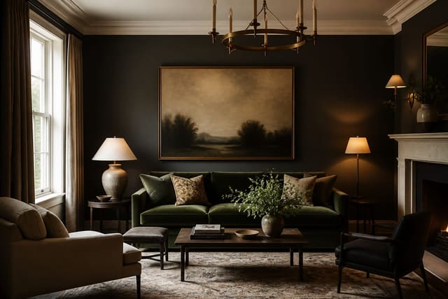
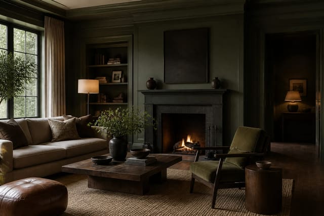
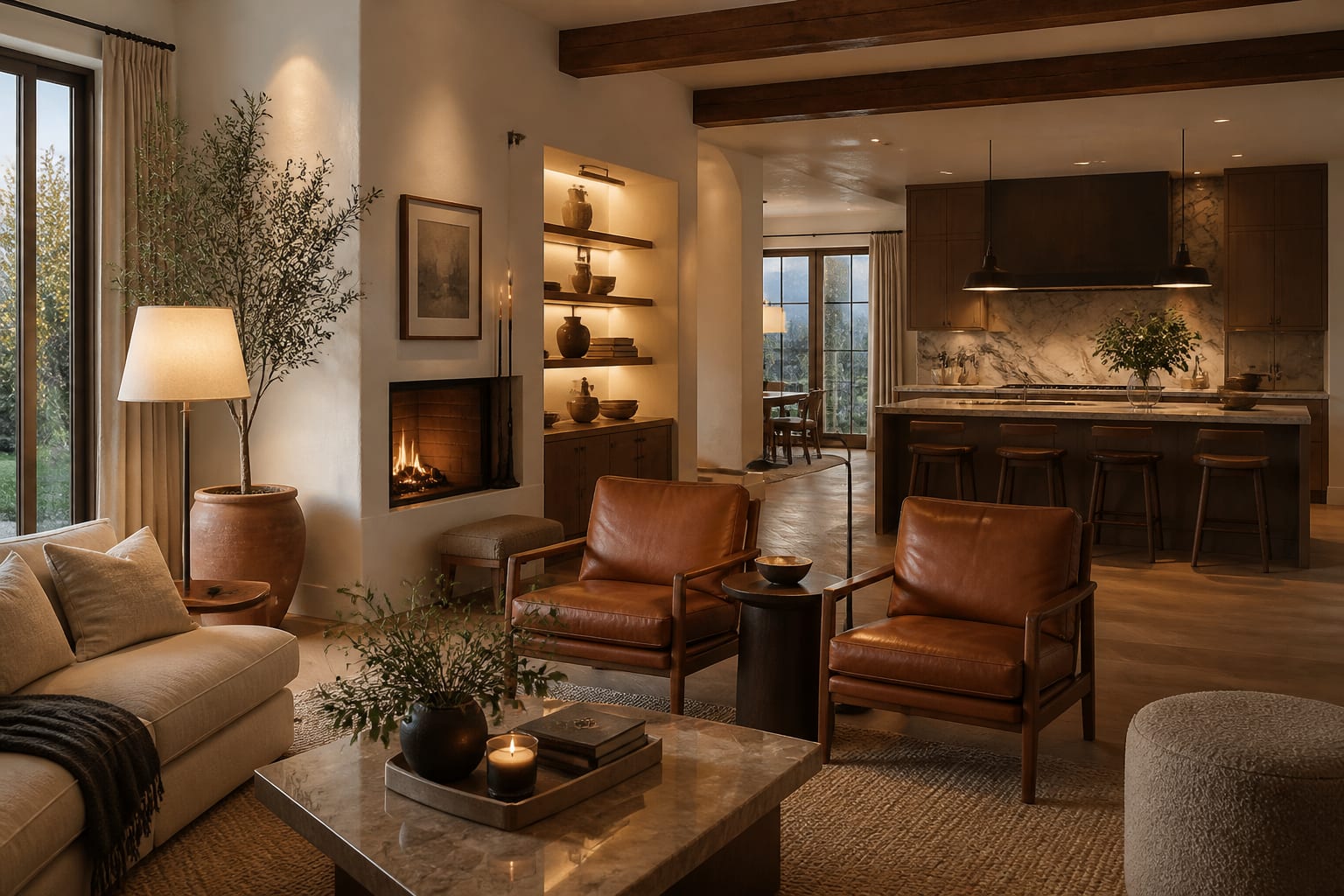
In living rooms, the priority is layered seating comfort in warm neutral fabrics with a clear focal wall — either a fireplace surround in travertine or limewash plaster in a slightly deeper warm tone than the adjacent walls. The contrast between the focal wall and the lighter surround walls creates depth without introducing color.
In bedrooms, warm neutrals benefit from a linen-upholstered bed frame in a tone slightly lighter than the wall color, which softens the visual separation between the two planes and makes the room feel hushed and restful. Bedside lighting at 2700K on dimmers is essential — the warm glow of a linen shade over a small ceramic lamp base is a signature warm neutral detail worth prioritizing.
In kitchens, warm neutrals translate to shaker or slab cabinets in warm white or greige, paired with honed travertine or warm cream quartz countertops and aged brass or unlacquered bronze hardware. Avoid polished chrome or stainless in a warm neutral kitchen — the cool metallic temperature reads as a mistake rather than a contrast. Matte black is the one exception, as its warm dark tone can anchor a pale warm neutral kitchen effectively.
- Layer undyed linen, raw bouclé, and natural jute to build tactile warmth without adding hue variety.
- Hang curtains 8 in above the frame and let them pool 1 in on the floor to maximize the sense of height.
- Use unlacquered brass hardware rather than polished; it ages into a warmer, more organic tone over time.
- Introduce a single espresso or deep walnut piece to anchor the palette and prevent everything from floating.
- Choose travertine or warm-veined marble for hard surfaces — their natural cream and rust tones deepen the palette.
- Keep art in warm tones or black and white; saturated color art breaks the palette faster than any other element.
- Add dried botanicals like pampas grass or bunny tail in cream-tan tones as low-cost warm neutral accents.
Bring the look home with Re-Design
Re-Design lets you preview any warm neutral interior design scheme in your actual room before you buy a thing. Just upload a photo and the AI populates the space with your chosen palette — swapping wall tones, rug textures, and soft furnishings in real time so you can see whether the layered beiges work together or collapse into sameness. It takes the guesswork out of committing to a tonal palette that lives and dies by its material relationships.
Frequently Asked Questions
What is the difference between warm neutrals and beige?
Beige is a single color; warm neutrals are a family of colors that includes cream, sand, taupe, greige, warm white, and terracotta-adjacent tones. A warm neutral room uses several of these tones together, layered by value and texture. Relying on a single beige throughout is actually one of the most common warm neutral mistakes.
Do warm neutrals work in rooms without much natural light?
They can, but they require more deliberate lighting strategy. In low-light rooms, push the paint undertone further toward yellow-orange to compensate for the blue cast of limited daylight, and use bulbs at 2700K on every circuit. Mirrors placed to reflect any available window light also help dramatically, as warm neutrals show their best quality in reflected natural light.
What accent colors work with warm neutrals?
Warm neutrals pair best with tones that share the same warm undertone: burnt orange, dusty terracotta, olive green, or muted rust. These are analogous accents that extend the warmth rather than contrasting against it. If you want true contrast, deep charcoal or soft black reads as a sophisticated anchor color that grounds the palette without introducing an alien hue.