Wabi-sabi is the most forgiving design philosophy you can bring into a home. Rooted in Japanese aesthetics, it finds beauty in things that are worn, asymmetrical, and quietly aging rather than glossy and new. Instead of chasing a flawless showroom finish, you learn to value a chipped ceramic bowl, a linen throw that wrinkles, and a wall that holds the marks of time. The result is a space that feels calm, honest, and deeply personal. This guide explains where the idea comes from and how to apply it without making expensive mistakes.
The Philosophy Behind Wabi-Sabi
Wabi-sabi grew out of Japanese tea culture, where humble, irregular utensils were prized over ornate ones. The term joins two ideas: wabi, a kind of rustic simplicity and quiet solitude, and sabi, the grace that comes with age and wear. Together they describe a worldview that accepts impermanence and finds calm in it. A cracked teacup repaired with gold, a beam darkened by decades of use, a glaze that pooled unevenly during firing, all of these are seen as more beautiful precisely because they are imperfect. When you translate this into interior design, you stop hiding flaws and start letting materials speak honestly. A concrete floor with hairline cracks, a wooden table with visible knots, and plaster that shows a hand-troweled texture all become assets rather than problems. The philosophy asks you to slow down, notice small things, and resist the urge to constantly upgrade or perfect. That mindset, more than any single object, is what makes a room genuinely wabi-sabi rather than a staged imitation of it. It is less a checklist of furniture and more a quiet way of seeing the things you already live with.
See also our guide to Wabi Sabi VS Japandi for more on what is wabi sabi design.
Materials, Color, and Light
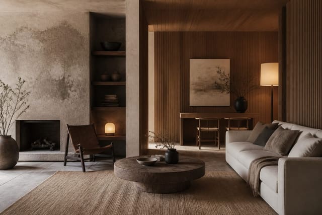
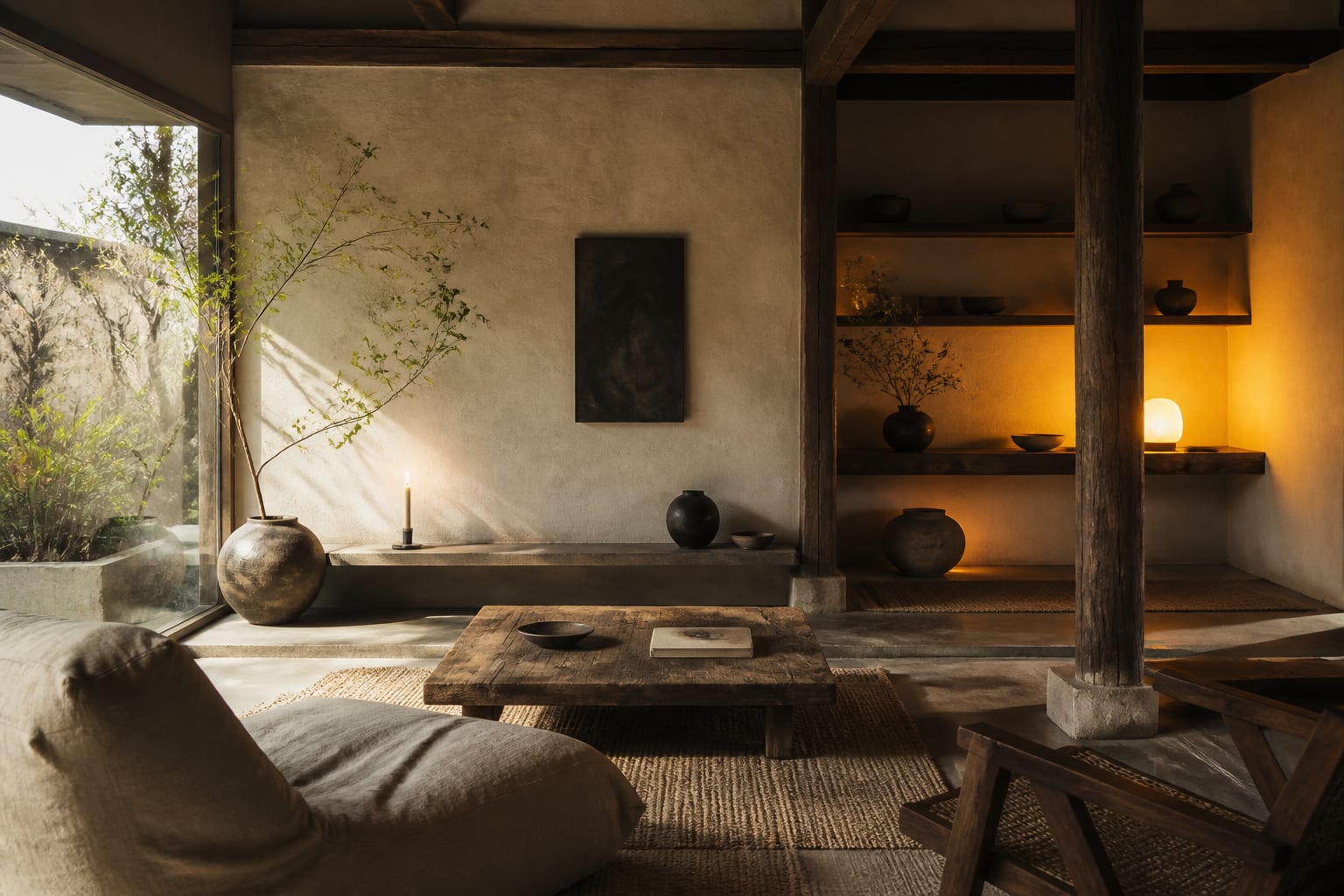
The wabi-sabi palette stays close to the earth, leaning on warm whites, oatmeal, clay, charcoal, and faded greens. Keep contrast low so the eye relaxes, and avoid sharp blacks or saturated brights that pull focus. Materials should feel tactile and unrefined: raw linen, undyed cotton, unglazed pottery, hand-thrown ceramics, aged oak, and rough stone. Texture does the work that bold color would in other styles. Lighting matters as much as material choice. Aim for warm bulbs around 2700K, which cast a soft amber glow rather than the clinical blue of cooler temperatures. Layer several low-output sources, such as a paper lantern, a small table lamp, and a candle, instead of one bright ceiling fixture. Natural daylight, filtered through linen or a simple shade, deepens the mood and lets surface textures cast gentle shadows. Try keeping at least 40 percent of your wall and shelf space empty so the materials you do choose have room to breathe. The combination of muted color, honest texture, and warm dim light is what gives these rooms their unmistakable stillness.
For a related angle on what is wabi sabi design, read How AI Search Cites Interior Design.
Bringing Wabi-Sabi Into Your Home
Start small and let the look build over time, since wabi-sabi resists being bought all at once. Choose one anchor piece, perhaps a hand-thrown vase or a reclaimed wood bench, and arrange the room around it. Mix old and new so nothing feels staged: a contemporary sofa paired with a worn vintage stool reads as collected rather than catalog-ordered. Favor handmade objects, and accept that two bowls from the same potter will never match exactly. Bring in living elements like a single branch, a bowl of seasonal fruit, or a modest potted plant, all of which change and age in front of you. Keep surfaces mostly clear, displaying three or four meaningful objects instead of a dozen. When something breaks, consider repairing it visibly rather than replacing it, honoring the kintsugi tradition of mending with care. Budget realistically; a thoughtful wabi-sabi room can come together for under $2,500 if you shop secondhand and prioritize a few quality handmade pieces. The goal is a space that looks like it grew naturally, not one assembled in a weekend.
Common Mistakes to Avoid
The biggest error is treating wabi-sabi as an excuse for clutter or neglect. Imperfection is intentional, not careless, so a messy room is not automatically wabi-sabi. Another frequent slip is buying brand-new items distressed to look old; mass-produced faux-aging reads as fake and undermines the whole idea. Many people also overcorrect on color, layering so many beige tones that the space feels flat and lifeless instead of serene. Without variation in texture and a few darker accents, a fully neutral room loses its depth. Lighting is another common stumble: bright, cool overhead fixtures flatten texture and erase the soft shadows the style depends on. Finally, resist the temptation to fill every surface. A shelf crammed with 20 objects, even handmade ones, cancels the negative space that makes the look feel calm. Spend on the few things that will age beautifully and live with empty space elsewhere. If you keep your palette restrained, your materials honest, your lighting warm, and your surfaces mostly clear, the room will feel authentic rather than like a costume version of the philosophy.
Here are the common mistakes to avoid: - Treating wabi-sabi as an excuse for genuine clutter - Buying new items artificially distressed to fake age - Layering so many beige tones the room feels flat - Using bright cool overhead light that flattens texture - Filling every shelf and surface with too many objects - Matching everything perfectly instead of mixing old and new
Bring the look home with Re-Design
Curious how wabi-sabi would settle into your own living room or hallway? Upload a photo of the space to Re-Design and the app reimagines it with muted clay tones, raw oak, unglazed ceramics, and the warm low light this style depends on. You can compare honest, lived-in arrangements before buying a single handmade piece, which makes it easy to test the look against your real walls, windows, and furniture.
Frequently Asked Questions
What is wabi-sabi design?
Wabi-sabi is a Japanese aesthetic that finds beauty in imperfection, age, and natural decay. Rooms favor handmade objects, weathered wood, and unglazed pottery over polished perfection. A cracked bowl or a faded linen curtain becomes a feature rather than a flaw. The look stays quiet, uncluttered, and grounded in muted earth tones drawn from soil, stone, and bark.
Which materials suit a wabi-sabi interior?
Choose materials that show their origin and wear gracefully over time. Rough-sawn timber, hand-thrown ceramics, raw linen, clay plaster, and aged stone all carry visible texture and slight irregularity. Avoid high-gloss plastics, chrome, and machine-perfect finishes. A reclaimed oak table with knots and saw marks reads more honestly than a flawless lacquered surface, which is exactly the point.
What colors define a wabi-sabi palette?
The palette stays muted and pulled directly from nature. Think warm greys, clay browns, oatmeal, moss green, charcoal, and chalky off-white. These restrained tones let texture and shadow carry the visual interest instead of bright contrast. Avoid saturated primaries or cool synthetic hues. Layering several close earth shades creates depth while keeping the whole space calm and cohesive.
How does wabi-sabi differ from minimalism?
Minimalism chases clean lines, empty space, and flawless surfaces. Wabi-sabi welcomes the rough, the chipped, and the asymmetric. Both reduce clutter, yet wabi-sabi keeps meaningful, weathered objects that tell a story rather than stripping everything bare. Where minimalism feels precise and cool, wabi-sabi feels warm, lived-in, and forgiving of marks that come from genuine daily use.