AI eat-in kitchen design previews the table size, banquette versus chairs, lighting separation, and traffic path on one uploaded photo so seating fits without crowding prep work. My firm take: the dining zone should not be treated as leftover space after the cabinets and island get everything they want. AI can design a kitchen and dining combo from one photo when that image shows the cooking edge, eating area, ceiling line, windows, floor, and the main route through the room. The goal is a preview that tells you where the zones should separate, where they should match, and which purchases will make the daily path easier.
What has to be visible in one kitchen-diner photo?
A useful ai kitchen dining room design starts with a photo that shows both jobs of the room: cooking and sitting down to eat. If the camera only captures the table, the tool cannot judge how the island, counters, pantry door, stools, and refrigerator path affect the dining area. If the camera only captures the kitchen, the table becomes an afterthought again.
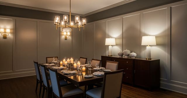
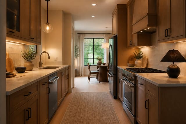
Stand in the widest corner or just outside the entry to the combined space. Include the island or peninsula, the table wall, the ceiling fixtures, the floor line, at least one window, and any opening to a living room, hallway, patio, or mudroom. A kitchen-diner is mostly about relationships: the edge of the island to the chair backs, the chandelier to the table center, the buffet to the walkway, and the cabinet color to the dining furniture.
Do not clear the room into a fake showroom. Remove dishes, bags, and loose mail, but leave the real furniture in place so the proportions stay honest. A prompt such as “keep the white cabinets, oak floor, black window frames, island size, and exterior door; redesign this kitchen dining combo with a calmer table zone, better pendants, warm chairs, storage for serving pieces, and a clear path from fridge to table” gives the AI a real puzzle. If you need more table-specific thinking before you prompt, compare your room with AI dining room design ideas for real table zones so the eating area gets its own logic instead of borrowing whatever the kitchen leaves behind.
The decision that separates one big room from two useful zones
The hardest choice is not style; it is the border between the kitchen and the dining area. In a good kitchen-diner, the border is felt through clearance, lighting, rug edge, furniture backs, and material shifts. It should not require a wall, but it does need discipline.
Start with circulation. Leave about 36 inches for a basic walking route between the island and dining chairs, and aim for 42 inches where someone will cook while another person pulls out a chair. If the table sits directly behind stools, measure from the island counter edge to the back of the dining chair when it is occupied, not when it is tucked in. That is where many pretty kitchen-diner plans collapse.
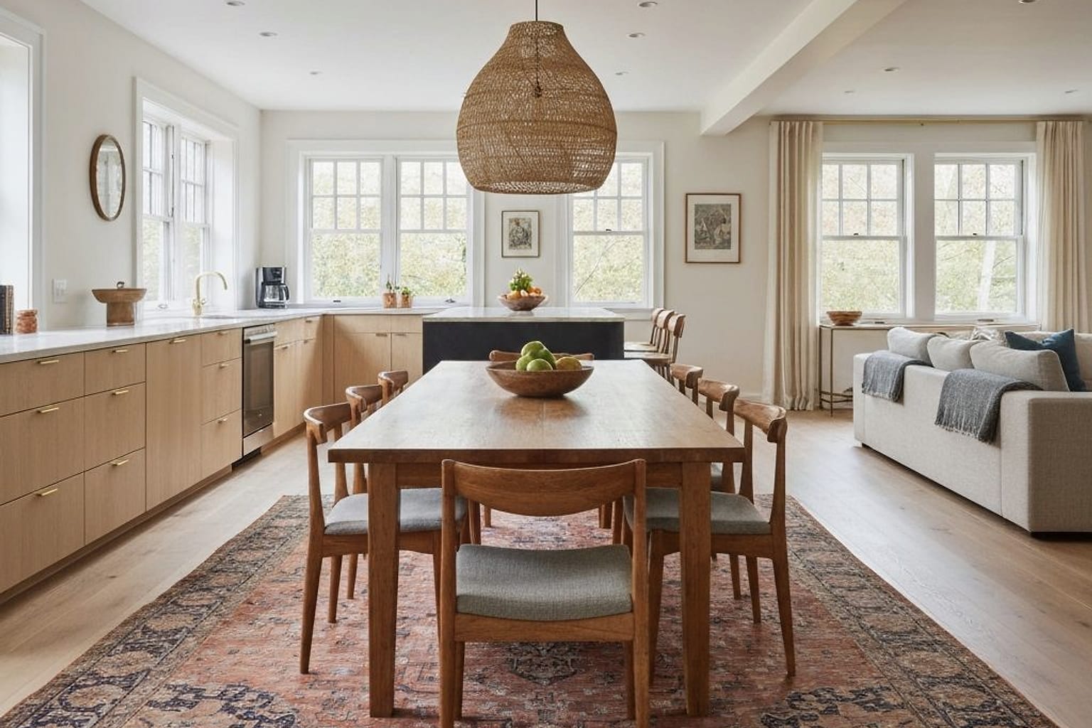
Table shape is the next lever. A 42 inch round table can work beautifully in a square pocket or near a bay window. A 48 inch round table feels more generous but needs more breathing room around the chairs. In a long galley-style kitchen-diner, a narrow rectangular or oval table may preserve the route better than a round pedestal. Chairs matter too: armless dining chairs around 18 to 20 inches wide are easier in tight combos than upholstered chairs with 25 inch arms.
The island should not automatically become the dining room’s rival. If you already have four stools at the island, the table can be quieter: slimmer chairs, a simpler light, and a rug that defines without shouting. If the island is only for prep, the table can carry more visual weight through a deeper wood tone, stronger pendant, or built-in bench.
Test this on your own room photo with ReDesign before you choose the final layout; keep the room structure, daylight, ceiling line, and main path visible so the preview solves the space you actually have.
What changes in a believable kitchen-diner before and after?
A convincing kitchen-diner before and after usually fixes the visual hierarchy before it fixes the finishes. The before may have good cabinets, a decent table, and attractive stools, but the room still feels unresolved because every piece is trying to be equally important. The after gives the kitchen edge a job, the dining zone a job, and the walkway enough space to breathe.
Lighting is the fastest way to make the two zones read correctly. Island pendants usually sit about 30 to 36 inches above the counter, while a dining pendant should hang about 30 to 36 inches above the tabletop. Those heights are similar, but the fixtures should not be twins unless the room is extremely simple. Try related shapes instead: slim linear pendants over the island and a softer drum, lantern, or globe over the table.
Use warm 2700K to 3000K bulbs so food, wood, stone, and upholstery do not look cold at night. If the kitchen has bright task lighting, add a dimmer or softer dining source so dinner does not feel like it is happening under prep lights. A kitchen-diner needs utility at 6 p.m. and atmosphere at 8 p.m.; the same harsh ceiling plan rarely serves both.
Rugs are optional but powerful. Under a dining table, a rug should extend roughly 24 inches beyond the table on each side so chairs stay on it when pulled back. For a 72 by 36 inch table, that often means an 8 by 10 rug at minimum and sometimes a 9 by 12 if the room can spare it. If the rug blocks the kitchen path, skip it and create the dining zone with lighting, art, and a stronger table finish instead.
Storage turns the combo from styled to usable. A sideboard 16 to 20 inches deep can hold linens, serving bowls, candles, homework supplies, and chargers without stealing the walkway. If the kitchen has open shelving, keep the dining storage more closed; one room does not need every object on display.
Common kitchen-diner AI mistakes to avoid
The first mistake is trusting a preview that widens the aisle. A generated image may make the table, stools, and island coexist by quietly stretching the floor. Before you love the scene, check the island-to-table clearance, chair pullout, pantry door swing, and the route from refrigerator to sink to table.
The second mistake is matching the kitchen and dining furniture too tightly. White cabinets, white chairs, white table, white pendants, and pale flooring can make the whole room feel washed out. Repeat one or two finishes, then add contrast: oak chairs with painted cabinets, black pendants with black chair legs, or a walnut table against a lighter kitchen.
The third mistake is treating island stools as decoration. Stools with high backs, thick arms, or heavy upholstery can block the sightline into the dining area. In many kitchen-diners, low-back or backless stools keep the kitchen edge quieter so the dining table can feel like a destination.
The fourth mistake is asking for “modern farmhouse,” “cozy,” or “luxury” without naming the conflict. Better prompts mention the actual decision: table too close to island, chandelier not centered, no storage for serving pieces, children doing homework at the table, or a rental kitchen with cabinets that cannot change. For broader tool selection, use the best AI tool for kitchen design as a filter, then judge every output against your exact combo room.
The fifth mistake is ignoring the floor color. The same cream cabinet, oak chair, or black pendant can shift completely beside orange oak, gray vinyl plank, dark tile, or checkerboard flooring. A kitchen-diner has fewer walls to hide a mismatch, so the floor tone deserves more respect than a small sample gives it.
Use AI design to preview your kitchen-diner before you commit
Use AI design as a rehearsal for the kitchen-diner choices that are annoying or expensive to reverse: table shape, island stool style, pendant size, dining rug, cabinet color, wall tone, sideboard depth, and whether the two zones need more contrast. The upload-photo loop works because it forces every idea into your actual sightline instead of a showroom corner.
Run the first set wide. Ask for a warm modern kitchen-diner, a classic painted-cabinet version, a colorful dining nook, a minimal apartment combo, and a family-friendly layout with closed storage. Do not choose the prettiest screenshot first. Choose the version where the path from stove to table makes sense, the chairs have room, and the table does not look stranded.
In the second set, keep the best layout and vary only the big decisions. If several versions improve when the dining light gets larger or the stools get quieter, that is useful evidence.
Renters should test reversible moves first: plug-in sconces, washable rugs, freestanding sideboards, slipcovered chairs, peel-and-stick backsplash where allowed, table lamps on a buffet, and better stools. Owners can explore cabinet repainting, hardwired pendants, banquettes, widened openings, built-in storage, or moving a ceiling box, but the image should lead to measurements and quotes. If you need more starting directions for the kitchen side, pull prompts from AI kitchen design ideas for real homes and then make each idea prove itself beside the dining table.
The winning kitchen-diner preview is not the most dramatic one. It is the one where someone can cook, another person can sit, a chair can pull out, the lights make sense together, and the two zones finally stop competing for the same square foot.
For the broader upload workflow, use the AI design complete guide as the parent checklist, then return to this room-specific pass for scale, light, and layout choices.
Frequently Asked Questions
Can AI redesign an eat-in kitchen from one photo?
Yes — upload a corner photo showing the dining nook and adjacent counter run; the AI tests table shape, seating type, lighting, and rug while preserving cabinets, window, and appliance positions. Treat the preview as a scale and circulation test, not a shopping command, and keep the room openings, ceiling line, daylight, and fixed storage visible in the uploaded photo.
Round or rectangular table for an eat-in kitchen?
A 36–42 inch round table fits four comfortably in 7x7 ft of clear floor; a 60x36 inch rectangle suits longer nooks but needs a 36 inch chair-pullout clearance at one end. Compare the result against ordinary use: door swing, chair pullout, walkway width, storage reach, evening light, and the view from the doorway matter more than a perfect catalog angle.
Should an eat-in kitchen use a banquette?
Yes for narrow nooks — a banquette returns 8–12 inches of floor compared with chairs and sleeves storage under the seat; skip it when the table needs to be pulled away from the wall for big meals. Run one conservative version and one bolder version, then choose the concept that still works with the existing windows, trim, floor color, and furniture you are likely to keep.
How do I light an eat-in kitchen table separately from the prep zone?
Hang one pendant 30–34 inches above the table on a dedicated dimmer; keep the prep zone on cool task light so the dining nook stays warm while you cook. Use the image to narrow measurements and priorities before ordering anything custom; the final purchase still needs real dimensions, outlet locations, and product clearances.
Does a rug belong under an eat-in kitchen table?
A low-pile washable rug 24 inches wider than the table on each side handles spills and noise; skip wool, jute, or anything that resists vacuuming. If the preview invents architecture or hides the awkward feature you need solved, rerun it with stricter instructions so the result remains tied to your actual room.
Ready to see this on your own room? Open Re-Design and run the preview before you buy, paint, drill, or move furniture.
Three transformations to try