Picking exterior paint from a tiny chip is a bad way to make a very public decision. My firm opinion: the roof and masonry get a vote before your favorite color does. A house color has to work at curb distance, in harsh daylight, beside concrete, under gutters, and against plants that may change by season. AI exterior paint color ideas help when they let you test those relationships on the actual facade before a painter starts masking windows.
Can AI suggest exterior paint colors from a house photo?
Yes, AI can suggest exterior paint colors from your house photo by showing how siding, trim, shutters, the front door, and fixed materials might look in different palettes. The useful part is not that the image is perfect; the useful part is seeing the whole elevation at once instead of judging a swatch against one square foot of siding.
A good AI house color picker should keep the roof, brick, stone, gutters, windows, garage door, porch columns, and driveway visible. Those surfaces are the limits of the palette. A cool gray body color may look sharp in a generated image and still turn wrong beside orange brick or a warm tan roof. If the project includes more than paint, compare the paint direction with a broader AI exterior house design from a photo so the color, lighting, landscaping, and entry details work together.
The palette decision that makes or breaks the house
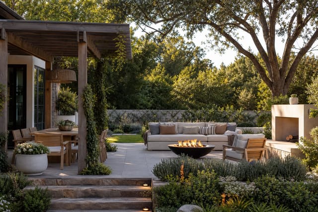
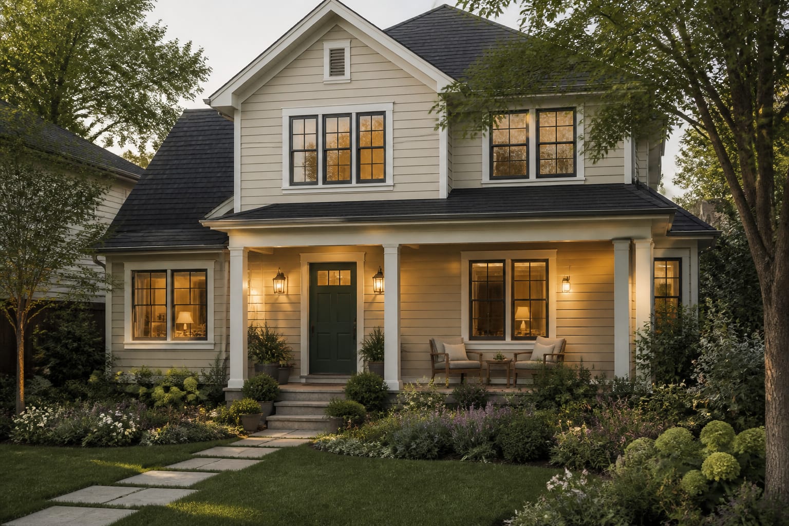
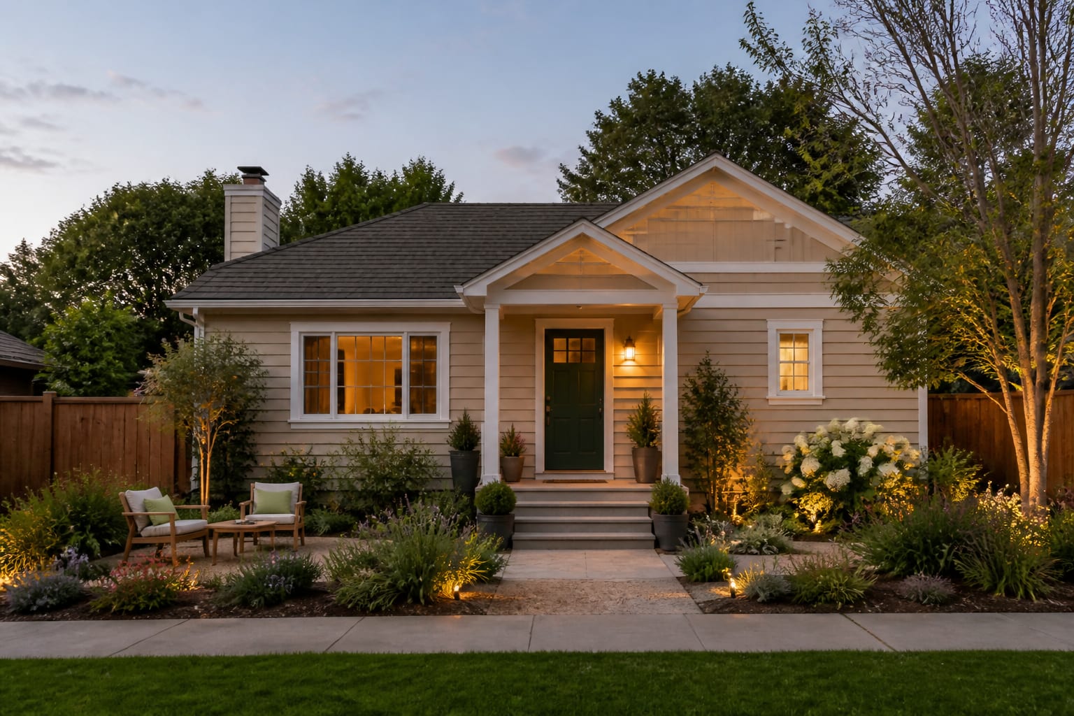
Exterior paint works when the palette has hierarchy. The body color is the field, the trim is the outline, the front door is the focal point, and masonry is the fixed anchor that refuses to be ignored. When every surface gets the same visual weight, the house looks flat. When the contrast is too sharp, the trim starts shouting at the roof.
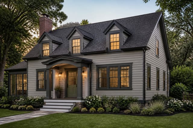
Start with the roof because it usually covers the largest fixed plane. A charcoal roof can support crisp white trim, deep green shutters, black accents, or warm greige siding. A brown or weathered tan roof often prefers cream, olive, mushroom, taupe, or muted clay rather than blue-gray. Red or orange brick usually gets along better with warm whites, bronze, olive, putty, and softened black than with icy white or cool charcoal.
Trim should clarify the architecture from the curb. If window trim disappears, the facade can look tired even after new paint. If the trim is too bright against warm masonry, it can make brick look dirty. The front door can carry more personality, but it should still answer something already on the house: roof depth, brick warmth, metal finish, porch tile, or nearby planting.
Which exterior paint ideas should you preview first?
Do not start by asking for the trendiest house color. Start with controlled tests that reveal which part of the exterior is actually making the house feel wrong.
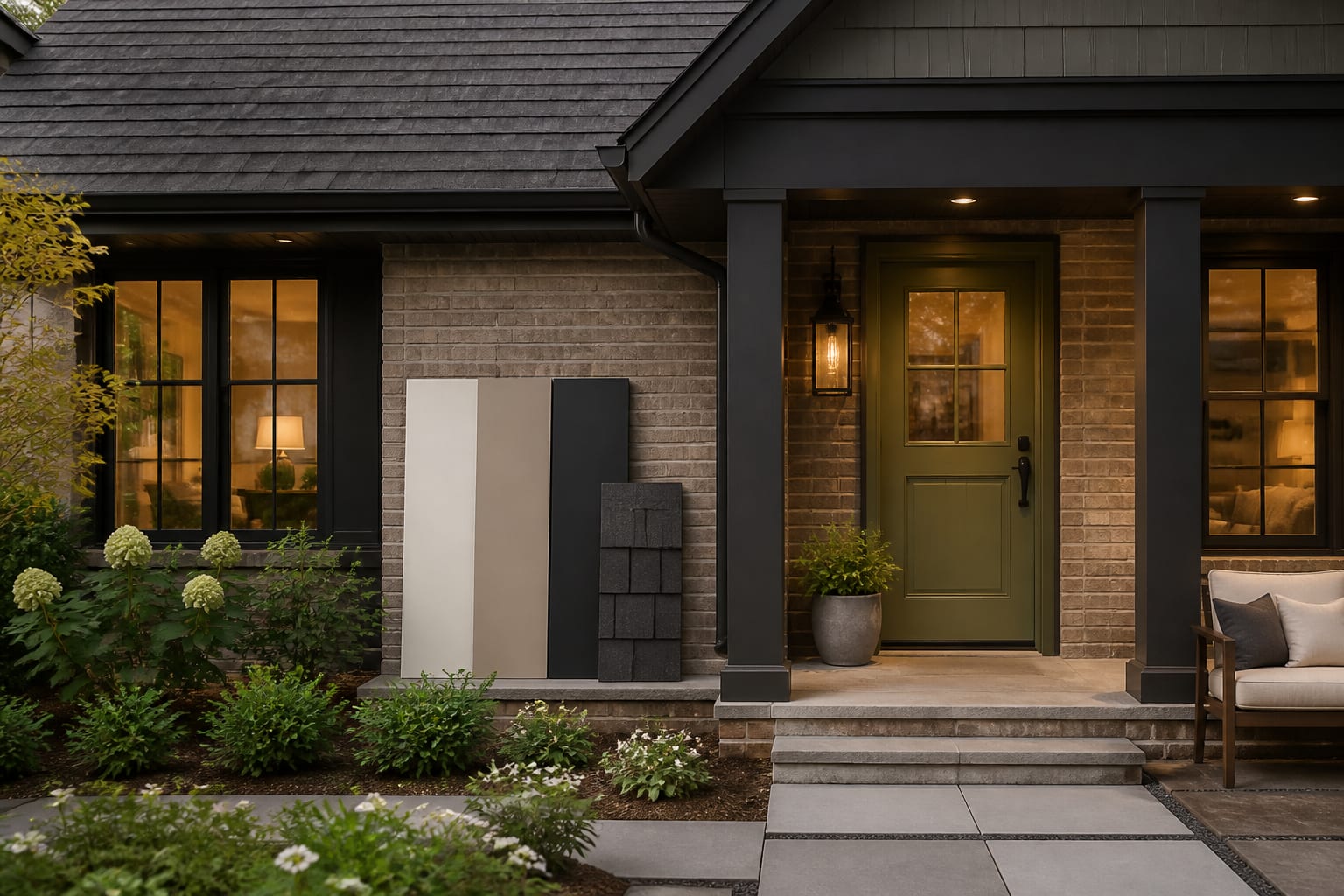
- Preview warm white, greige, and putty body colors against the roof, because the safest exterior neutrals still shift in full sun. Use sample boards at least 18 by 24 inches and move them from the garage side to the shaded entry before choosing.
- Test trim contrast in two strengths, because windows and fascia need definition without looking outlined in marker. A soft white, muted bronze, deep olive, or charcoal trim can make a plain facade read cleaner from 30 to 50 feet away.
- Compare front door colors after the body color settles, because the door should be a focal point rather than a disconnected accent. Deep green, oxblood, navy, black-brown, or warm clay can work if it relates to the roof, brick, hardware, or planting.
- Preview garage door color carefully, because a bright garage door can become the accidental focal point. In many houses, the garage looks better when it sits close to the body color or one step deeper, while the front door gets the stronger contrast.
- Test shutter removal as seriously as shutter repainting, because fake or undersized shutters weaken a facade. If shutters stay, they should look wide enough to cover the window if closed, even when they are decorative.
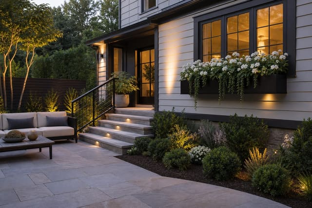
- Add one landscape-color preview, because paint changes beside green leaves, mulch, gravel, and concrete. Medium shrubs around 24 to 36 inches high can soften a new palette, while tiny foundation plants can make fresh paint feel unfinished.
A plain house may need a facade correction before color can carry it. If the AI preview keeps relying on thicker porch posts, a different garage treatment, or stronger entry framing, use a dedicated house facade redesign workflow before blaming the paint.
Use AI design to preview your exterior paint before you commit
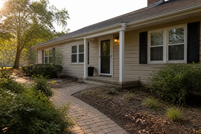
Use AI design to preview exterior paint by uploading a straight daylight photo from the curb or driveway, not a dramatic angled shot from the garden bed. The first image should show the full front elevation, roof edge, garage, porch, walkway, driveway, gutters, downspouts, existing lights, and any brick or stone that will stay.
Run the first pass with only body and trim colors changing. Run the second pass with the same body color and different door, shutter, garage, and hardware colors. Run the third pass with the paint direction held steady while you test lights, house numbers, planters, and window boxes. That slower sequence is less flashy, but it tells you which choice actually improved the house.
If window boxes suit the architecture, treat them as part of the color plan rather than decoration thrown on at the end. The box should sit close to the window width, hold enough soil for healthy plants, and use foliage or flowers that relate to the door, trim, or masonry; these window box ideas that fit the architecture are worth checking before adding boxes to every window.
After saving a strong preview, write the real-world checklist beside it: body color, trim color, door color, garage color, shutter plan, roof undertone, masonry undertone, sample board size, fixture finish, house number height, planter diameter, and any HOA or local restrictions. AI can shorten the guessing stage, but paint still needs to be seen on the actual house.
Common exterior paint color mistakes
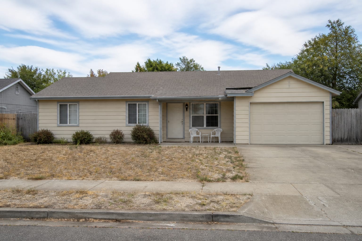
Exterior color mistakes are painful because they are visible from the street and expensive to repaint. The problem is usually not boldness; it is choosing one color without respecting the rest of the elevation.
- Choosing a white from an interior paint photo fails because exterior light is stronger and less forgiving. Test warm white, cream, and soft greige outside beside the roof, brick, stone, gutters, and concrete before approving gallons.
- Painting the body, trim, and garage with equal contrast fails because the eye loses the front door. Give the entry the clearest signal with a stronger door color, readable house numbers around 4 to 6 inches tall on smaller setbacks, and lighting scaled to the door.
- Ignoring light fixture size fails after repainting because fresh contrast makes tiny lanterns look even smaller. A side lantern often feels better at roughly one quarter to one third of the door height, adjusted for porch scale and mounting space.
- Copying a black-and-white palette fails when the roof or brick is warm. Black trim can look crisp on the right house, but beside orange brick, tan stone, or brown shingles, a black-brown, bronze, olive, or deep green may look more integrated.
- Trusting the AI after image without samples fails because screens smooth undertones. Put large sample boards on the north, south, and west sides of the house if those elevations are visible, then check them in morning light, afternoon glare, and shade.
Before you buy paint, make the palette prove itself from three places: the curb, the driveway, and the front door. Stand far enough away that trim thickness, garage color, and roof undertone read together. The winning exterior paint idea is not the prettiest swatch; it is the one that makes the existing roof, windows, masonry, walkway, and planting look like they were always meant to share one house.