Cement tile is the one material I steer people toward when a room feels flat and safe. I think it earns its keep precisely because it is bold, handmade, and unrepeatable, which is everything a printed porcelain look-alike is not.
What is cement tile and how do I use it? Cement tile, often called encaustic tile, is made by hand-pouring pigmented cement into a metal mold and pressing it under hydraulic force, so the pattern is solid color all the way through rather than printed on top. You use it as a concentrated dose of pattern, most often on a floor, a backsplash, a stair riser, or a single accent zone, and you let plainer materials do the rest of the work around it. Because the color runs deep into the body, the design wears in instead of wearing off.
That through-body construction is the whole reason cement tile feels different from a printed look-alike. A digitally printed porcelain copies the motif onto a glaze that can chip and reveal a plain biscuit underneath, while a genuine encaustic tile carries the pattern down through its full depth. The hand-poured process also leaves tiny variations from tile to tile, and that slight imperfection is exactly what gives a finished floor its warmth instead of a flat, machine-printed sameness.
Where cement tile actually belongs
The smartest use of cement tile is as a single focused gesture. A kitchen floor in a graphic black-and-white pattern anchors an otherwise plain white room, a powder room floor turns a tiny space into the most memorable one in the house, and a stair riser run adds rhythm where nobody expects it. Backsplashes work too, though I lean toward keeping the pattern below eye level so it grounds the room rather than shouting at it. A laundry room or mudroom is an underrated spot for it as well, since those small utility rooms can take a hit of personality without the pattern ever competing with furniture or art.
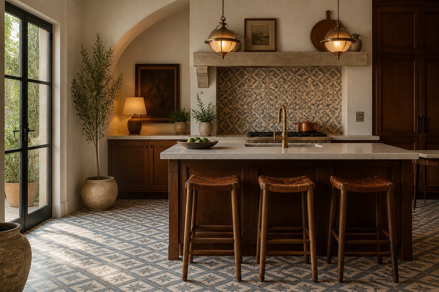
The Mediterranean and Moroccan roots of the material are worth leaning into, because the saturated blues, ochres, and terracottas were designed for warm light and lime-washed walls. If you are building a room around that mood, the pattern logic pairs naturally with the broader palette I describe in Spanish colonial interior ideas. The tile carries the personality, so the surrounding finishes can stay restrained.
One thing to know is that cement tile is not a great fit for every spot. Outdoors in a freeze-thaw climate it can crack, and in a heavy-sun window zone the pigments can shift over many years, so it lives happiest indoors and underfoot. It also needs a flat, fully cured substrate, because the tiles are thicker and heavier than ceramic, around 5/8 inch, and they do not flex. Given that weight and thickness, plan transitions to adjoining floors early so you do not end up with an awkward step at a doorway.
A standard cement tile is roughly 8 inches square and 5/8 inch thick, and most patterned runs cost $15 to $25 per square foot before you factor in setting and sealing.
Patterns, scale, and color discipline
Cement tile patterns come in two broad families: the small repeating geometric grid that reads almost like texture from across the room, and the larger multi-tile medallion where four or sixteen tiles assemble into one rug-like motif. Small rooms usually do better with the tighter repeat, while a generous floor can carry a sprawling medallion without feeling cramped. Lay a dry run of the actual tiles before setting them, because these patterns shift dramatically depending on orientation.
Color is where most projects go sideways. Pull two colors from the tile and repeat them in the room's textiles or cabinetry, and the whole scheme snaps together. A common impulse is to choose the busiest, most colorful pattern in the catalog, but the patterns that age best tend to be two-tone or three-tone with a calm ground color and one accent. For a softer handmade-meets-glossy contrast, cement pattern on the floor against a wall of zellige tile gives you depth without two competing patterns fighting for attention.
Scale also depends on viewing distance. A foyer or hallway is seen mostly from above and from a distance, so it can carry a large medallion that would feel overwhelming in a powder room you stand inches from. When in doubt, size the motif down rather than up; an undersized pattern reads as deliberate texture, while an oversized one in a small room reads as a single chopped-off fragment.
Sealing, durability, and living with it
This is the part people skip and regret. Cement tile is genuinely porous, so it absorbs water, oil, and grout pigment until it is sealed. The correct sequence is to seal the raw tiles before grouting, grout carefully with a color that will not stain the field, then apply a penetrating sealer again afterward, with a refresh every one to two years in wet or high-traffic areas. Skip that and a dropped splash of olive oil leaves a permanent shadow.
Durability over decades is excellent because the pattern is solid through the body, which is why you still see hundred-year-old cement floors in Europe with the design intact. The surface does develop a soft, worn matte over years of foot traffic, and most people find that aging flattering rather than shabby. For a warmer, stonier companion underfoot in adjoining rooms, a honed travertine surface keeps the same old-world feel while giving your eyes a rest from pattern.
Day-to-day cleaning is simple once the tile is sealed: a pH-neutral cleaner and a damp mop, never anything acidic or harsh, because strong cleaners strip the sealer and can dull the colors. Avoid steam mops, which drive moisture into the cement, and wipe oily spills promptly even on a sealed floor. Done right, a cement floor asks very little of you after install, and the small upfront discipline around sealing buys decades of low-fuss life. That trade, a careful start for a long quiet middle, is the whole bargain with this material, and it is one I take gladly for a floor with this much character.
Common mistakes to avoid
The single most common mistake is treating cement tile like porcelain and grouting it before sealing, which lets the grout pigment soak into the pores and dull the colors permanently. A second common mistake is over-distributing the pattern; putting it on the floor, the walls, and the backsplash at once cancels the drama and leaves the room feeling restless rather than rich.
Keep these checks in mind:
- Seal before grouting, always, and choose a grout color that flatters rather than fights the pattern.
- Order 15 to 20 percent overage, since handmade lots are hard to match later.
- Confine pattern to one plane per room so it stays a feature, not noise.
- Acclimate and dry-lay the tiles first, because color and size vary batch to batch.
Use AI design to preview cement tile before you commit
Pattern is the hardest thing to judge from a single loose tile, because one tile shows you the motif but not what forty of them do to a whole floor. With Re-Design you upload a photo of your kitchen or bathroom and re-render the floor or backsplash in a specific encaustic pattern, so you can see the full repeat, the scale, and how the colors play against your existing cabinets and walls.
That preview is where the scale-discipline decisions get easy. Upload your space, try a tight geometric repeat against a sprawling medallion, then test the same pattern at floor level versus backsplash level to find where it stops feeling busy. Seeing the pattern multiplied across the real room tells you far more than any showroom sample board, and it costs you nothing but a photo.