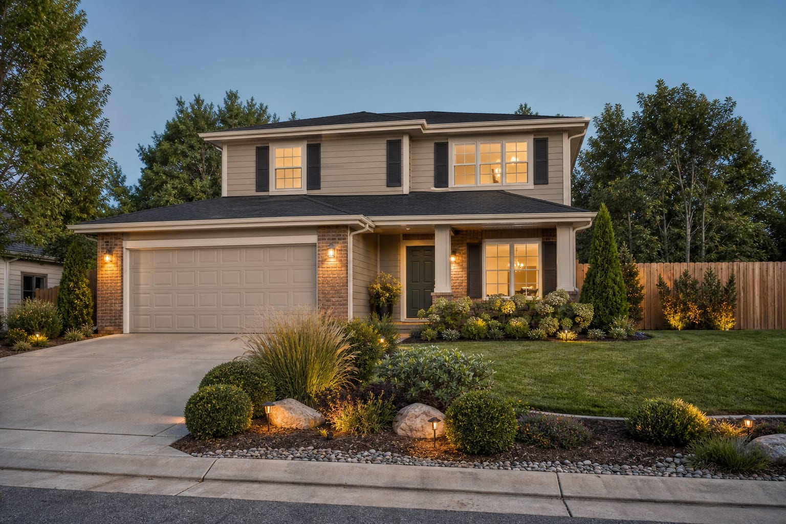
Exterior house colors read cohesive when the body, trim, and accent (door/shutter) follow a 60-30-10 proportion, all three colors share the same warm or cool undertone family, and the body color sits at least 2-3 values lighter than the trim to maintain contrast that reads at distance — the most common mistake is choosing a trim color lighter than the body, which reads as a paint mistake rather than a design decision. A dated exterior is usually not a bad-house problem; it is a bad hierarchy problem. Choose exterior house colors by starting with fixed materials, then picking a main siding color, a trim color, and one accent that works with the roof, masonry, driveway, and landscape. My strong opinion: the front door should almost never be the first decision, because it is the jewelry, not the outfit. Get the big surfaces calm first, then let the accent carry the personality.
What fixed materials decide before paint does
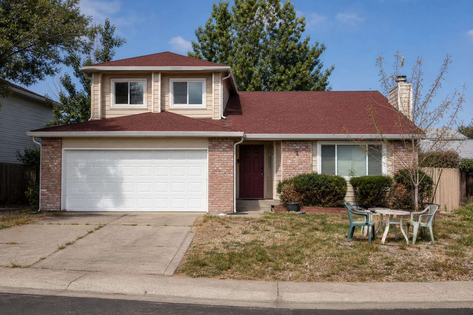
Exterior paint is not chosen in a vacuum; it negotiates with everything bolted, mortared, poured, or planted around the house. The roof is the loudest fixed material on many homes, especially from the street. A black or charcoal roof can handle cooler whites, slate blues, deep greens, and crisp taupes, while a brown roof usually wants cream, olive, mushroom, tan, or warm greige. Red brick pulls many “safe” grays purple, so test grays against the brick at the same time, not one week later.
- For house exterior color ideas, protect a 30 to 36 inch route through the exterior before you choose furniture, planting, lighting, or surface upgrades.
- Let house exterior color ideas repeat one visual cue three times, such as a metal finish, planter shape, paving joint, or trim color that ties the scene together.
- Use the first permanent upgrade to solve the core layout problem before buying accessories. In house exterior color ideas, accessories should support the plan instead of covering for weak planning.
- Look at the driveway and walkway, too. A cool concrete drive, blue-gray pavers, or granite steps can make yellow beige siding look tired. Warm limestone, red pavers, or tan aggregate can make stark white siding feel disconnected. If you have stone veneer, choose one color from the stone’s middle range rather than copying its lightest or darkest fleck; that keeps the house from looking striped.
Trim width changes the decision. A house with 6-inch fascia, chunky porch posts, and deep window casings can carry higher contrast because the trim reads intentional. A house with skinny aluminum trim or flat builder-grade surrounds often looks better with only a 10-to-20 LRV point difference between siding and trim. That softer contrast hides awkward details instead of spotlighting them.
Which siding, trim, and accent combinations actually work
The best siding and trim color combinations have a clear role for each surface. Siding should set the temperature of the house, trim should sharpen or soften the architecture, and the accent should reward the walk from the curb to the door. If your exterior has multiple siding types, such as lap siding with shingles in a gable, stay within the same color family and shift one step lighter or darker rather than introducing a new hue.
| House condition | Strong color direction | Why it works | |---|---|---| | Red brick with dark roof | Warm white trim, mushroom siding, deep green door | The green cools the brick without fighting its warmth. | | Low ranch with shallow roofline | Soft taupe siding, near-matching trim, charcoal door | Low contrast makes the long facade feel calmer and less sliced up. | | White farmhouse exterior | Creamy white siding, black or bronze accents, stained wood door | Warm white avoids glare, while dark hardware gives the simple shape structure. | | Coastal or lake house | Weathered blue-gray siding, soft white trim, navy or coral door | Blue-gray echoes water and sky without turning the facade into a theme. |
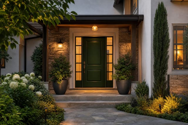
For accents, do not scatter color across every small piece. Shutters, railings, garage doors, and the front door should not all compete. If the door is the hero, let shutters or railings sit quiet in charcoal, bronze, or the trim color. If you want bolder entry energy, look at front door color ideas after the body-and-trim palette is stable.
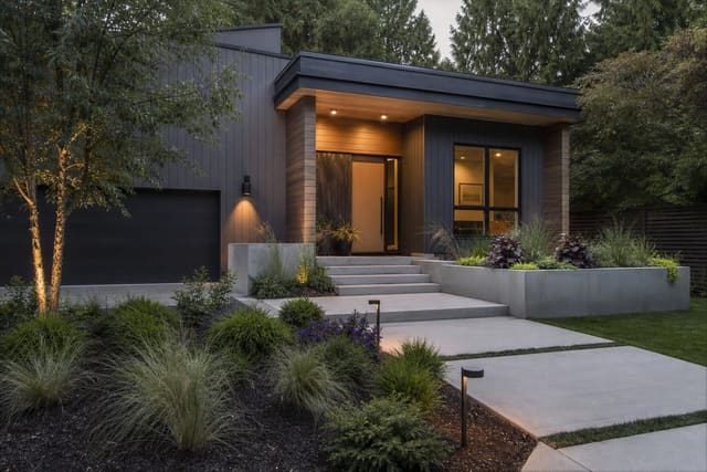
A modern exterior can go darker than most homeowners expect. Deep charcoal, soft black, olive-black, or espresso siding works when there is enough texture, glass, and landscape to keep the facade from becoming a flat block. The safer route is not always white; many contemporary homes look sharper with restrained dark siding and warm wood, a move explored more in modern house exterior ideas.
Test this on your own photo with ReDesign before you choose the final outdoor direction; keep the house edge, horizon line, hardscape, planting beds, and main path visible so the preview solves the space you actually have.
Exterior color ideas with specs you can copy
- Pair warm greige siding with creamy white trim and a black-green front door. Use this on red-brick or brown-roof homes where pure white looks too sharp; keep the trim around 6 inches wide where possible so the cream reads deliberate instead of dingy.
- Try soft white siding, pale stone trim, and a stained wood door on a cottage or farmhouse. Choose a white with a warm undertone, then use a semi-transparent stain on the door so the entry adds depth without introducing another paint color.
- Use sage green siding with off-white trim and bronze hardware for a house surrounded by mature planting. Sage works best when the landscape already has evergreen shrubs, grasses, or trees, and bronze keeps the palette softer than black.
- Put charcoal siding with warm wood, bone trim, and low amber exterior lighting on a modern facade. Keep sconces around 2700K so the dark paint does not turn cold at night, and repeat the wood at the door, soffit, or porch ceiling.
- Choose blue-gray siding, bright white trim, and a red-orange door for a coastal, lake, or cloudy-climate house. Test the blue-gray on the north side first, because shaded walls can make the color read cooler and heavier than the paint chip suggests.
- Paint the garage door the body color when the garage dominates the front elevation. If the garage takes up more than one-third of the facade, matching it to the siding reduces visual bulk and lets the entry path become the focal point.
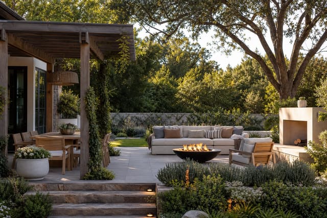
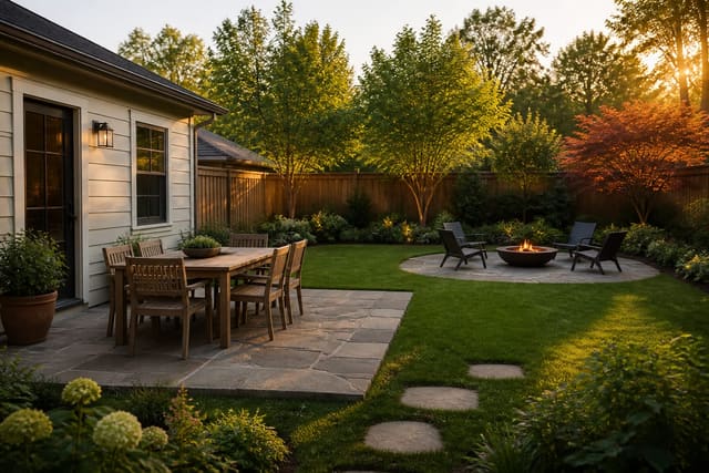
Landscape is part of the palette, not an afterthought. Dark siding needs contrast from pale grasses, boxwood, hydrangea, limestone gravel, or light concrete. Pale siding needs depth from evergreen shrubs, dark mulch, iron planters, or a richer front door. If the color change is happening alongside a patio or entry refresh, coordinate hardscape undertones early; the same warm gray paver can look calm with mushroom siding and muddy beside blue-gray paint. The same thinking applies to outdoor rooms, so borrow material logic from patio design ideas when the facade and yard are seen together.
Common exterior color mistakes to avoid
The first mistake is choosing paint indoors under warm bulbs. A color that looks soft in a kitchen can bleach out on a south-facing wall or turn flat on a shaded north wall. Test samples outside, vertically, beside the actual trim, roofline, masonry, and landscaping.
The second mistake is using bright white because it feels “clean.” On many exteriors, especially with beige stone, red brick, or cream vinyl windows, bright white trim looks disconnected. A softer white, bone, linen, or warm off-white often gives the house a cleaner result because it belongs to the fixed materials.
The third mistake is making shutters decorative when they are architecturally wrong. If shutters are too narrow to appear as if they could cover the window, painting them high contrast only advertises the problem. Match them to the siding, remove them, or use them only where the window proportions can support them.
The fourth mistake is forgetting the garage door. A front-facing garage painted bright white can overpower the door, porch, and landscaping. Unless the garage has beautiful carriage details, paint it the body color or a slightly lighter version of the siding.
The fifth mistake is chasing a trendy dark exterior without enough relief. Dark siding needs visible texture, window depth, planting contrast, and a readable path to the entry. Add a 36-inch minimum walkway, layered shrubs at different heights, and a lighter porch ceiling or door surround so the facade does not flatten.
Use AI to preview your exterior before you commit
AI is useful here because exterior color choices are hard to imagine from a paint fan deck. Upload a straight-on photo of the house, then test three disciplined palettes: one light, one mid-tone, and one dark. Keep the roof, brick, driveway, and windows visually unchanged in each preview so you are judging paint, not a fantasy renovation.
The best prompts are specific about surfaces. Ask for “warm greige lap siding, creamy white trim, charcoal shutters, deep green front door, existing red brick retained, same roof color,” then compare it with a cooler or darker version. If a preview makes the roof look wrong, that is the warning sign to respect. If the palette still looks good with the same camera angle, same planting, and same garage door, it is much closer to a real exterior decision.
Frequently Asked Questions
How many colors should I use on a house exterior?
Three: body (60%), trim (30%), and accent — door, shutters, or front step (10%); four is acceptable on Victorian or Craftsman homes with a belly band or additional architectural band; two is the cleanest on modern homes. Use the outdoor photo to compare the visible layout and fixed constraints before committing, because slope, shade, drainage, doors, utilities, and traffic paths decide whether the idea survives daily use.
How do I choose exterior paint colors that won't fade?
Deep-tone colors (navy, forest green, dark red) fade faster than light neutrals; use 100% acrylic exterior paint rated for 15-year fade resistance, and avoid south-facing deep colors that receive the most UV exposure. Keep the preview honest by leaving the problem area visible in the frame, then compare one conservative version against one bolder version before you buy plants, materials, or furniture.
Should exterior trim be lighter or darker than the body?
Trim lighter than the body is the most common choice and makes the house read crisper; trim darker than the body works well on contemporary homes; matching body and trim reads flat and obscures architectural detail. Check the result against ordinary movement first: chair pullout, walkway width, gate swing, glare, storage reach, and evening light matter more than a perfect catalog angle.
What exterior colors make a house look larger?
Light body colors (off-white, pale gray, warm greige) and trim in the same family make a house recede and read larger; dark body colors make the house read smaller but more dramatic and grounded. Use the image to narrow priorities and measurements before ordering anything custom; final purchases still need real dimensions, code checks, utility locations, and product clearances.
How do I test exterior paint colors?
Apply 12in × 24in swatches to multiple orientations of the house (north and south-facing walls) and observe them at three times of day over a full day; the correct color must read well in morning shadow, afternoon direct sun, and overcast light. If the preview invents architecture or hides the awkward feature you need solved, rerun it with stricter instructions so the result remains tied to your actual outdoor space.
Three transformations to try
- Warm greige body with white trim and navy door
- White body with black trim and green accent
- Dark gray body with lighter trim and brass fixtures