A front door color reads intentional when it comes from the same undertone family as the house body color — warm house body needs a warm door (red, yellow-based black, terra cotta), cool house body needs a cool door (navy, forest green, gray-toned black) — and is one to two values darker than the trim to anchor the entry rather than compete with it. The best color for a front door is the one that creates deliberate contrast with the house while repeating something already outside: trim, roof, brick, stone, shutters, planters, or planting. A timid front door is a missed opportunity, especially on houses with flat siding, builder-grade hardware, or a porch that disappears from the street. My opinion is firm: if the door is visible from the curb, it should carry more confidence than the mailbox and less drama than the whole facade. These front door color ideas will help you choose a paint color that looks intentional in real daylight, not just good on a tiny swatch.
What is the best front door color for your house?
The best color for a front door is a high-contrast shade that suits the architecture and connects to at least one existing exterior element. That answer matters more than any universal “best front door color,” because a tomato red door that looks charming on white clapboard can look chaotic against orange brick. Start by naming the house color honestly: warm white, cool gray, beige vinyl, red brick, charcoal, sage, cream stucco, cedar, or painted black. Then choose a door color that either deepens that palette or gives it one controlled jolt.
- For front door color ideas, protect a 30 to 36 inch route through the exterior before you choose furniture, planting, lighting, or surface upgrades.
- Let front door color ideas repeat one visual cue three times, such as a metal finish, planter shape, paving joint, or trim color that ties the scene together.
- Use the first permanent upgrade to solve the core layout problem before buying accessories. In front door color ideas, accessories should support the plan instead of covering for weak planning.
- For white or cream siding, the door can carry a saturated color without looking loud. Deep green, oxblood, navy, black, warm clay, and glossy yellow all have enough contrast to define the entry. For red brick, avoid clean primary red unless the brick is muted and brownish; try forest green, black, deep teal, aubergine, or a warm putty that lets the masonry stay dominant. For gray houses, the safest colors are not always the best ones. Charcoal on gray can disappear, while plum, moss, rusty orange, or blue-black gives the entry more presence.
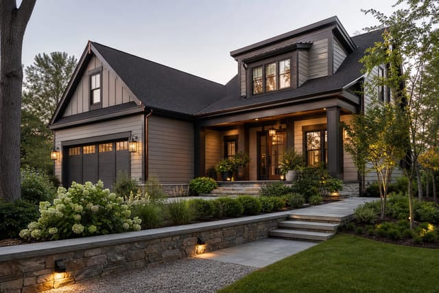
If your exterior is already dark, the door needs either depth or brightness. A black door on a black house may look sophisticated up close but vanish from the street, so consider bronze, dark olive, burgundy, or a stained wood tone if the architecture can handle warmth. When the facade itself needs broader help, coordinate the door with bigger moves from whole-house exterior color ideas instead of treating the entry like an isolated paint project.
The color decisions that make curb appeal look intentional
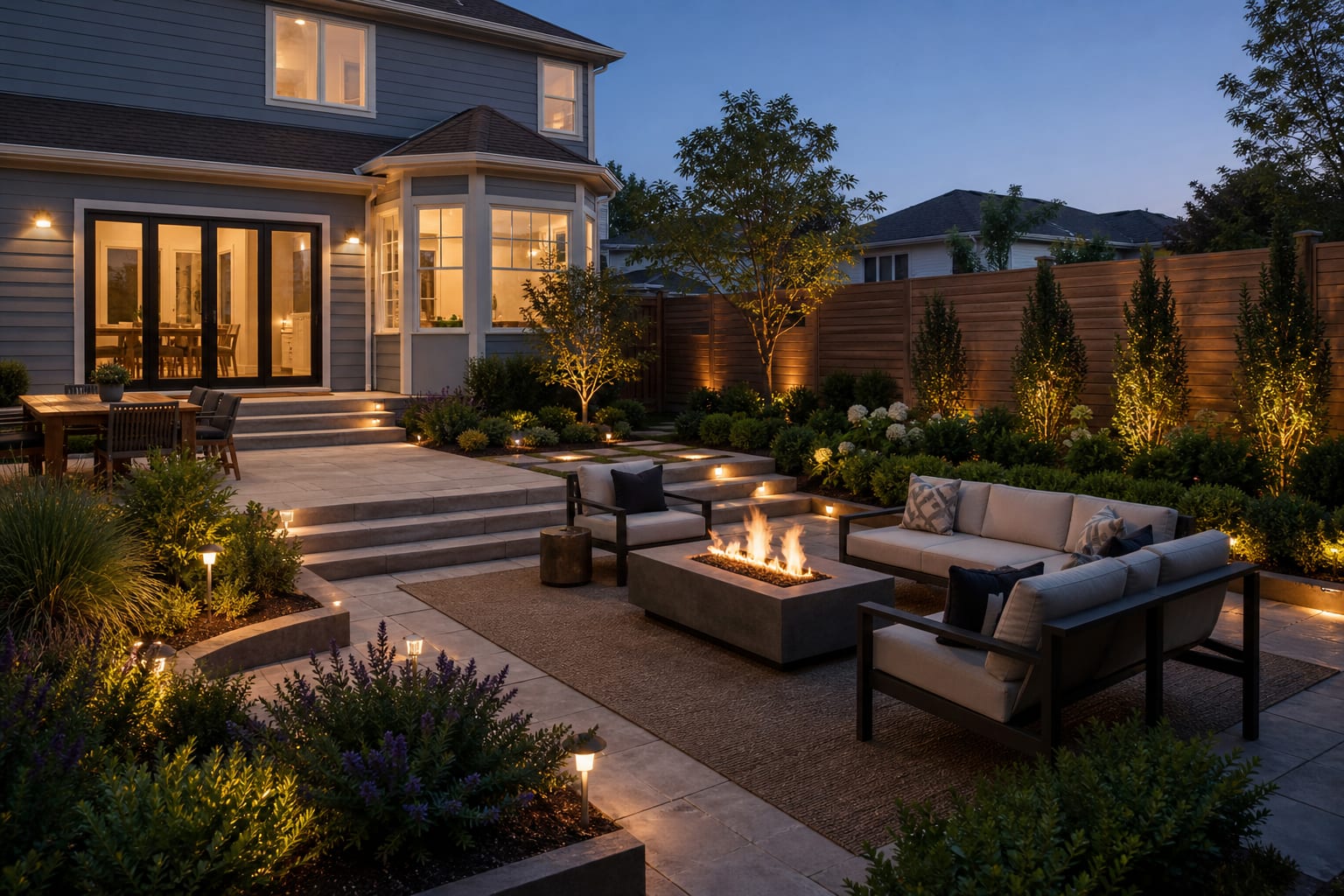
Front door color is not chosen on the door; it is chosen in relation to the entire entry sequence. Stand at the curb, the driveway, and the porch step. If the door disappears in one of those views, the color is too close to the siding, the lighting is weak, or the surrounding trim is stealing the focal point.
Contrast is the first decision. A pale house usually wants a deeper door, while a dark house often needs a door with warmth, gloss, or a slightly different undertone. For most entries, keep the surrounding trim calmer than the door unless the architecture has historic casing worth emphasizing. If the casing, sidelights, shutters, railings, and door all fight for attention, the entry starts to look busy rather than welcoming.
Undertone is the second decision. Cream siding likes soft black, olive, terracotta, and muted teal more than icy blue. Cool gray siding accepts navy, plum, crisp black, and blue-green more easily than mustard or coral. Tan vinyl can look flat with beige doors, so use dark green, espresso, brick red, or smoky blue to give it backbone. If you have stone veneer, pull from the darkest fleck in the stone rather than the lightest one; the door will feel grounded instead of washed out.
Scale is the third decision. A tiny cottage door can handle a cheerful color because the surface area is modest. A double-height modern entry in saturated red can look like a commercial sign. On contemporary houses, especially the restrained facades shown in many modern house exterior ideas, color often works best when it is deep, mineral, and architectural: black-green, rust, bronze, graphite blue, or warm walnut stain.
Test this on your own photo with ReDesign before you choose the final outdoor direction; keep the house edge, horizon line, hardscape, planting beds, and main path visible so the preview solves the space you actually have.
Front door color ideas that actually work outside
- Paint the door deep olive when the house has cream siding, tan brick, cedar, or warm stone. Olive has the seriousness of black without the harshness, and it looks especially good with brass, aged bronze, or black hardware; test a 12" x 18" sample beside the trim so the green does not turn muddy in shade.
- Use blue-black instead of plain navy on gray, white, or pale blue houses. A near-black navy gives the door depth from 30 feet away, while brighter navy can feel nautical when the house has no coastal cues; pair it with a 2700K porch bulb so the color does not go cold at night.
- Choose oxblood or burgundy for brick houses that need richness rather than another red note. The trick is to go darker and browner than the brick, then keep the wreath, mat, and planters restrained so the door reads refined rather than holiday-themed.
- Try warm clay or muted terracotta on stucco, desert modern homes, and cream cottages. This color family looks best when it repeats roof tile, pavers, or planters, and it needs a clean surrounding trim line of about 3" to 5" so the edge does not blur into similar siding.
- Go glossy black when the architecture is symmetrical and the door itself is in good condition. Black shows dents, brush marks, pollen, and fingerprints, so prep matters: sand rough spots, prime bare patches, and use a high-quality exterior enamel in satin or semi-gloss rather than a flat wall paint.
- Use a saturated yellow only when the rest of the facade is disciplined. Yellow doors can be fantastic on charcoal, white, or soft gray houses, but keep the undertone golden or ochre rather than lemon if the porch gets strong sun for 6 or more hours a day.
- Choose a smoky teal when you want color without cuteness. Teal bridges blue and green, which makes it useful near gray stone, white siding, black lights, and mixed planting; it is also a strong option for a small porch that connects visually to patio design ideas with blue-green cushions or glazed planters.
Common front door color mistakes to avoid
- Picking the color from an indoor paint chip is the most common failure. Exterior light is stronger, glossier paint reflects more, and nearby brick or greenery can shift the color, so test the paint vertically on the door or a large board for at least a full day of changing light.
- Matching the door too closely to the siding makes the entry vanish. If the house is beige and the door is slightly darker beige, the curb reads as one flat wall; choose a deeper brown-black, green, red-brown, or blue-gray so the door has a job.
- Ignoring the hardware can ruin a strong color. Brushed nickel may look thin on a deep green door, while unlacquered brass can warm up black, burgundy, navy, and clay; if replacement hardware is not in the budget, choose a paint color that flatters the existing metal.
- Painting a damaged door in high gloss makes every imperfection louder. Fill dents, sand peeling edges, caulk cracked trim, and prime glossy old paint before the finish coat, because a bold color cannot hide a tired surface.
- Adding too many accent colors around the entry weakens the door. If the door is teal, the mat does not also need orange, the planters do not need cobalt, and the wreath does not need five artificial flower colors; let one strong paint decision carry the porch.
Use AI to preview your front door before you paint
AI previewing is useful for front doors because paint changes the whole curb view, not just a rectangle of color. Upload a straight photo from the sidewalk or driveway, then ask for versions that keep the siding, roof, trim, porch, and landscaping the same while changing only the door color. Compare one dark option, one warm option, and one colorful option before you buy a quart.
Keep the prompt practical. Ask for “deep olive satin front door with existing beige siding and black planters,” not a fantasy renovation with new windows and stone steps. If the preview only looks good after the porch lights, railings, and landscaping change, the color may be carrying more work than paint can realistically do. The most useful image is the one that shows whether the door reads from the curb, works with the hardware, and still looks like it belongs to your actual house.
Frequently Asked Questions
What front door color adds the most curb appeal?
Deep navy, forest green, and true black are the three highest-curb-appeal choices because they read as intentional, work with almost all house colors, and photograph well in all lighting conditions. Use the outdoor photo to compare the visible layout and fixed constraints before committing, because slope, shade, drainage, doors, utilities, and traffic paths decide whether the idea survives daily use.
Should the front door match the shutters?
Not necessarily — the door and shutters can match, tone-on-tone differ by two values, or contrast intentionally (black shutters with a red door on a white house); avoid the only wrong choice, which is using different, uncoordinated colors that have no relationship. Keep the preview honest by leaving the problem area visible in the frame, then compare one conservative version against one bolder version before you buy plants, materials, or furniture.
What sheen level is best for a front door?
Semi-gloss or full gloss on the door reads richer and is easier to wipe clean than satin or eggshell; use the same sheen level on the door frame and trim to unify the entry. Check the result against ordinary movement first: chair pullout, walkway width, gate swing, glare, storage reach, and evening light matter more than a perfect catalog angle.
How many test colors should I try on a front door?
Test 2-3 large 12in × 12in samples on the door and observe at three times — morning sun, afternoon shadow, and dusk with the porch light on; the correct color must read well in all three conditions. Use the image to narrow priorities and measurements before ordering anything custom; final purchases still need real dimensions, code checks, utility locations, and product clearances.
Can I paint a fiberglass or steel door?
Yes — clean with TSP substitute, sand lightly to scuff the factory finish, apply a bonding primer, then two coats of an exterior alkyd or water-borne enamel; the finish will last 5-8 years before recoating. If the preview invents architecture or hides the awkward feature you need solved, rerun it with stricter instructions so the result remains tied to your actual outdoor space.
Three transformations to try
- Deep navy door on white colonial
- Forest green door with black hardware
- Matte black door with warm stone facade