The best colors for a maximalist home are bold, layered, and connected by a clear logic: jewel tones, earthy saturated tones, or bright dopamine colors can all work. The trick is not using every color equally; one dominant color should appear across at least 60% of the room’s visual field, with secondary and accent shades layered on top.
Start with one dominant colour, not five
Maximalism is often mistaken for “more of everything.” In practice, the most successful maximalist rooms usually have one colour doing most of the visual work. That dominant shade might appear on the walls, a large sofa, built-in shelving, curtains, or a large patterned rug.
A useful structure is the 60-30-10 colour breakdown:
- 60% dominant colour: walls, large furniture, curtains, or a large rug
- 30% secondary colour: upholstery, wallpaper pattern, cabinetry, bedding, or accent chairs
- 10% accent colour: art, cushions, lamps, vases, books, and decorative objects
This does not need to be mathematically exact. Think of it as a way to stop every shade from competing at the same volume. If emerald green is your 60%, then sapphire velvet, burgundy cushions, brass lamps, and patterned art can all feel layered rather than random.
The binding principle is simple: one colour should appear in at least 60% of the room’s visual field. That repeated colour gives the eye a home base. Without it, even beautiful pieces can feel like they are all shouting at once.
A neutral anchor matters too. Even in the boldest maximalist scheme, include one true neutral such as black, warm white, natural wood, aged brass, stone, or woven fibre. The neutral does not make the room less maximalist; it gives the stronger colours a place to breathe.
For room-specific inspiration, see Maximalist Living Room Ideas, where the same colour logic can be applied to sofas, rugs, artwork, and shelving.
Choose a palette logic: analogous, complementary, or triadic
Colour wheel theory is a useful starting point, though real rooms are more complex than flat colour diagrams. Materials, daylight, texture, pattern scale, and finish all affect how colours behave. Still, three classic relationships can help you build a maximalist color palette that feels intentional.
Analogous palettes use three colours that sit next to each other on the colour wheel. Yellow, orange, and red are one example. Blue, blue-green, and green are another. Because the colours are neighbours, analogous schemes tend to feel harmonious, even when the shades are saturated. This is a good route if you want a bold room that still feels enveloping and cohesive.
Complementary palettes use colours opposite each other on the wheel, such as blue and orange. These schemes feel more dynamic because the contrast is stronger. In a maximalist room, complementary colour works well when one shade clearly dominates and the opposite shade appears as a punchy accent. A deep blue room with burnt orange chairs is easier to live with than a room where both colours fight for equal space.
Triadic palettes use three colours spaced evenly around the wheel, such as red, yellow, and blue. They feel bold and balanced, but they need discipline. Choose one colour as the lead, soften or deepen the other two, and repeat each shade in more than one place.
A practical way to test the logic:
- Pick your dominant colour first.
- Choose whether the room should feel harmonious, dramatic, or playful.
- Use analogous colours for harmony, complementary contrast for drama, or triadic colour for a lively balance.
- Repeat every major colour at least twice in the room.
- Add a neutral anchor before adding another accent.
If you are still defining the overall style, start with What Is Maximalism? before choosing the palette.
Match saturation: jewel, earth, or dopamine palettes
The easiest way to stop a maximalist palette from feeling chaotic is to match the saturation level. Colours harmonise when they share a similar intensity, even if their hues are different.
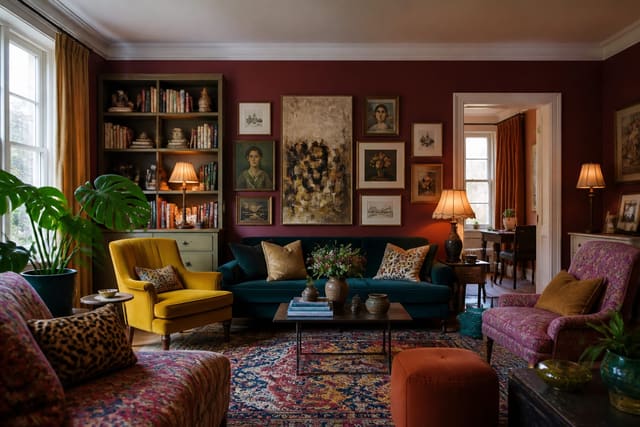
Jewel tone maximalism is the most classic version. Think emerald, sapphire, ruby, burgundy, and amethyst. These shades are high-saturation and usually medium-to-dark in value, which is why they feel rich rather than sugary. As a rough technical guide, jewel tones often sit around 60–100% saturation and 20–40% lightness in HSL terms. Treat those numbers as a helpful range, not a rulebook; fabric, paint finish, and lighting will change the result.
Jewel tones work beautifully with black, dark wood, antique mirror, aged brass, and warm white. A room might use emerald walls, a sapphire sofa, burgundy cushions, amethyst art, and brass lighting. The colours differ, but the shared depth and saturation create unity.
Earth tone maximalism is less opulent and more grounded. The palette includes burnt orange, terracotta, ochre, deep brown, olive, clay, and forest green. Instead of glossy richness, the effect is warm, textured, and collected. Earth tones often sit around 20–50% saturation and 30–60% lightness in HSL terms. Again, use this as guidance rather than a prescription.
This palette works especially well with natural materials: walnut, oak, rattan, leather, linen, stone, and aged metals. Pattern can be generous here, but the room stays calm because the colours feel sun-baked and organic.
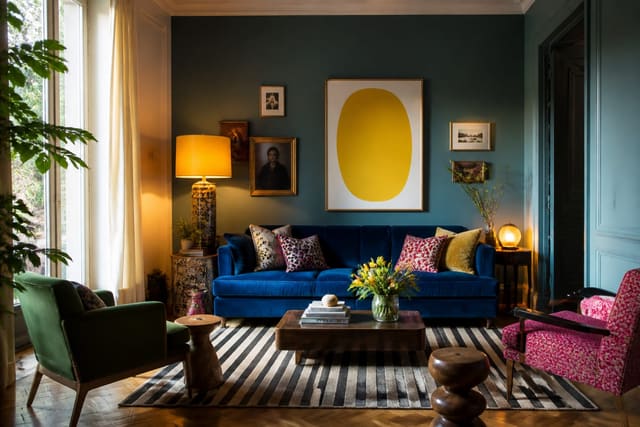
Dopamine maximalism is the brightest and most energetic option. It uses colours such as bright yellow, coral, teal, electric blue, hot pink, and sometimes lime or lilac. These are high-saturation shades, so they need more visual rest than the other palettes. White walls, pale floors, chrome, clear acrylic, black outlines, or simple natural wood can stop the room from feeling overloaded.
A dopamine palette is especially effective when the brights are concentrated: a yellow sofa, coral art, teal shelving, and hot pink cushions against a white or warm neutral background. For more playful colour ideas, see Dopamine Decor Ideas.
The key is to choose one family and commit. A jewel tone room can include many colours because they share depth. An earth tone room can layer heavily because the undertones feel related. A dopamine room can handle intense contrast when there is enough white or neutral space around it.
Bring the look home with Re-Design
Before repainting walls or buying a velvet sofa, test the palette in your actual room. With Re-Design, you can upload a room photo and see it reimagined in a maximalist colour scheme, whether you want jewel tones, earthy maximalism, or a bright dopamine look. This is especially useful because colour wheel theory is clean on paper, but real rooms have shadows, flooring, windows, and furniture that change how every shade feels.
Frequently Asked Questions
What colors work for a maximalist home?
Jewel tones, earth tones, and dopamine brights all work in a maximalist home. The best choices are emerald, sapphire, burgundy, amethyst, terracotta, ochre, forest green, bright yellow, coral, teal, electric blue, and hot pink. Use one dominant colour across about 60% of the room and add a neutral anchor for balance.
How many colours should be in a maximalist room?
Most maximalist rooms can handle three to five main colours, plus a neutral. The number matters less than the structure. If one colour dominates, a second supports it, and accents are repeated intentionally, the room can feel bold without feeling chaotic.
What is the safest maximalist palette to start with?
Jewel tones are often the easiest starting point because they naturally harmonise through shared saturation and depth. Emerald, sapphire, burgundy, and amethyst can be mixed across walls, upholstery, art, and accessories while still feeling cohesive.
Can maximalism use neutral colours?
Yes. A neutral anchor is essential in many maximalist interiors. Black, warm white, natural wood, stone, aged brass, or woven textures give the eye a rest point and make saturated colours look more deliberate.
Is the 60-30-10 rule required?
No, but it is a helpful guide. Real rooms rarely divide colour perfectly. Use the rule to make sure one colour leads, one colour supports, and the brightest accents stay controlled.