A blank living room wall is not asking for one lonely print centered over the sofa. My opinion: a maximalist gallery wall should look collected, not like a frame aisle exploded in your house. The best picture wall ideas start with a strong organizing rule, then let color, size, subject, and frame finish get a little unruly inside that rule. If your wall feels bare, awkward, or too safe for the rest of the room, this is how to build a display with nerve and control.
How do I create a gallery wall that feels maximalist, not random?
To create a gallery wall, choose one anchor piece, map the arrangement on the floor or with paper templates, keep frame spacing consistent at about 2 in–3", hang the center of the overall grouping near 57 in–60 in from the floor, and repeat at least one color, material, or subject so the display feels intentional. That answer sounds controlled because control is what lets maximalism breathe.
Start with the wall’s job. Over a sofa, the gallery should usually span about two-thirds to three-quarters of the furniture width. On a blank hallway wall, it can run longer and looser, but the center line still needs discipline. Around a television, the art has to balance a black rectangle instead of pretending it is not there. If the living room already has saturated upholstery, patterned rugs, and shelves, study the scale logic in maximalist living room ideas that use strong anchors before you add twenty more small rectangles.
The layout decision that makes every frame easier
The most important decision is whether your gallery wall is a grid, a salon wall, or an edge-led composition. A grid is strict: same frame size, same spacing, same orientation. A salon wall is looser: mixed sizes, mixed subjects, and a shape that grows from the center. An edge-led composition feels maximalist but tidy because one side, top, or bottom aligns with furniture or architecture.
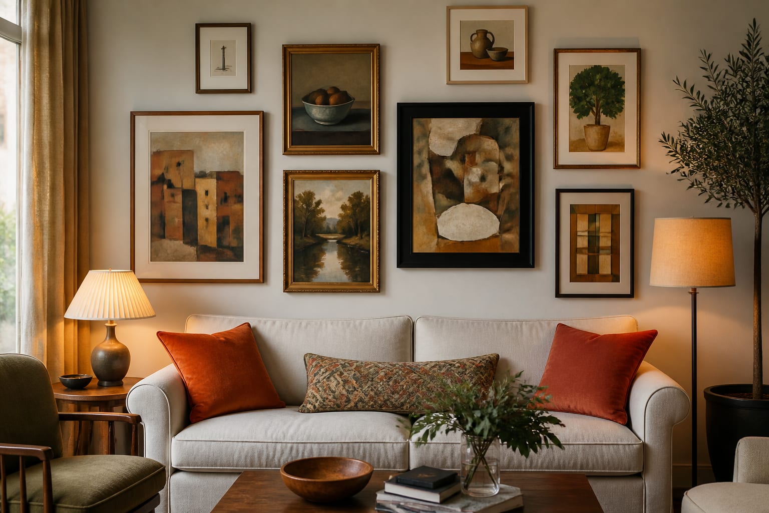
For a maximalist living room, I usually prefer the salon wall with one controlled edge. It lets you use odd finds, vintage portraits, children’s art, textiles, small mirrors, and photographs without creating visual mush. Over a sofa, align the lower row roughly 6 in–8 in above the sofa back, then let the top line climb unevenly. On a tall stair wall, let the bottom edge follow the stair angle while the upper edge gets more irregular.
Make the first piece the boss. It might be a large oil-style landscape, a bold abstract, a textile in a shadow box, or a dramatic photograph. Place it slightly off center if you want movement, but do not bury it in the middle of twenty similar pieces. A maximalist gallery wall needs hierarchy: one piece leads, three to five medium pieces support it, and the smallest frames add rhythm.
Which gallery wall ideas actually fill a blank living room wall?
Use ideas that change the wall at room scale, not tiny tweaks that only matter up close. A maximalist gallery wall should read from the doorway and reward a closer look once someone sits down.
- Build around a 24 in x 36 in or 30 in x 40 in anchor artwork because a blank living room wall needs weight before charm; place it first, then tuck 8 in x 10", 11 in x 14", and 16 in x 20 in frames around it for movement.
- Mix art types instead of only changing frame color because subject variety gives maximalism depth; combine a portrait, landscape, abstract, textile fragment, family photograph, small mirror, and one sculptural wall object no deeper than about 3".
- Repeat one frame finish at least three times because repetition keeps the display from looking thrifted by accident; black, warm wood, aged brass, or painted cream can become the thread that ties mismatched pieces together.
- Use a color echo from the room because art should speak to the sofa, rug, lampshades, or curtains; if your room has rust and olive, let those tones return in at least three artworks or mats.
- Let one piece break the rectangle because a plate, small sconce, oval frame, fan, or textile softens the grid of frames; keep it near the middle third so it looks integrated rather than tacked on at the edge.
- Add picture lights or nearby lamps if the wall goes flat after sunset because maximalist art needs shadow and glow; a warm 2700k bulb is usually kinder to old paper, brass frames, and saturated paint than a cool ceiling light.
- Use the television wall carefully because a black screen already has visual force; balance it with darker frames, larger art, and asymmetry rather than a halo of tiny prints that makes the TV look even heavier.
If your living room has weak daylight, the color of the art will change more than you expect. North-facing rooms can make cream mats look gray and deep greens feel colder, so borrow the lighting and color cautions from north-facing living room color and lighting advice before you commit to dark paint behind the wall.
Common gallery wall mistakes that make the wall look chaotic
Gallery walls usually fail before the first nail because the plan is too polite or too vague. The wall needs a point of view, and it also needs measurements.
- Hanging every frame too high makes the display float away from the furniture; treat the group as one artwork and keep its center near 57 in–60 in from the floor, or start 6 in–8 in above the sofa if the grouping is furniture-led.
- Buying too many identical small frames makes the wall look nervous; choose fewer larger pieces first, then use small frames as punctuation rather than the whole sentence.
- Mixing every frame finish with no repetition creates visual static; repeat one finish three times, then allow two or three other finishes to appear as accents.
- Ignoring mat color can make good art look unrelated; white, cream, linen, black, and colored mats all change the mood, so keep mat tones consistent if the art itself is already varied.
- Forgetting the light makes the wall die at night; use table lamps, floor lamps, sconces, or picture lights so the art has layers of brightness instead of one overhead glare.
The other common mistake is treating the gallery wall as storage for every sentimental object. Keep the personal pieces, but edit for scale and contrast. A tiny vacation sketch may belong beside a larger landscape, not trapped in a crowded cluster of other tiny memories.
Use AI to preview your gallery wall before you hang anything
A maximalist gallery wall is exactly the kind of project that benefits from seeing the whole composition before the holes go in. Upload a straight-on photo of the living room wall to Re-Design and test different gallery directions against your actual sofa, trim, wall color, window light, and floor tone.
Ask for specific versions. Try one with a large central artwork and mixed frames, one with a denser salon wall from sofa to ceiling, and one with darker frames that help balance a television or fireplace. Keep the camera position steady and the furniture scale honest so the preview answers the real question: does this wall feel bold, balanced, and possible in your room?
This is also where lighting decisions become obvious. A gallery wall over a dim corner chair may need a floor lamp before it needs more art. A long blank wall may need two pools of light instead of one central fixture. If the room already relies on a single ceiling light, read how to layer lighting in a living room before deciding the gallery wall is the problem.
What makes the finished wall feel collected?
The finished wall should look as if it grew through taste, not panic. Use a mix of old and new frames, but keep the hardware clean, the glass wiped, and the hanging lines deliberate. Crooked maximalism is not charming; it is just unfinished.
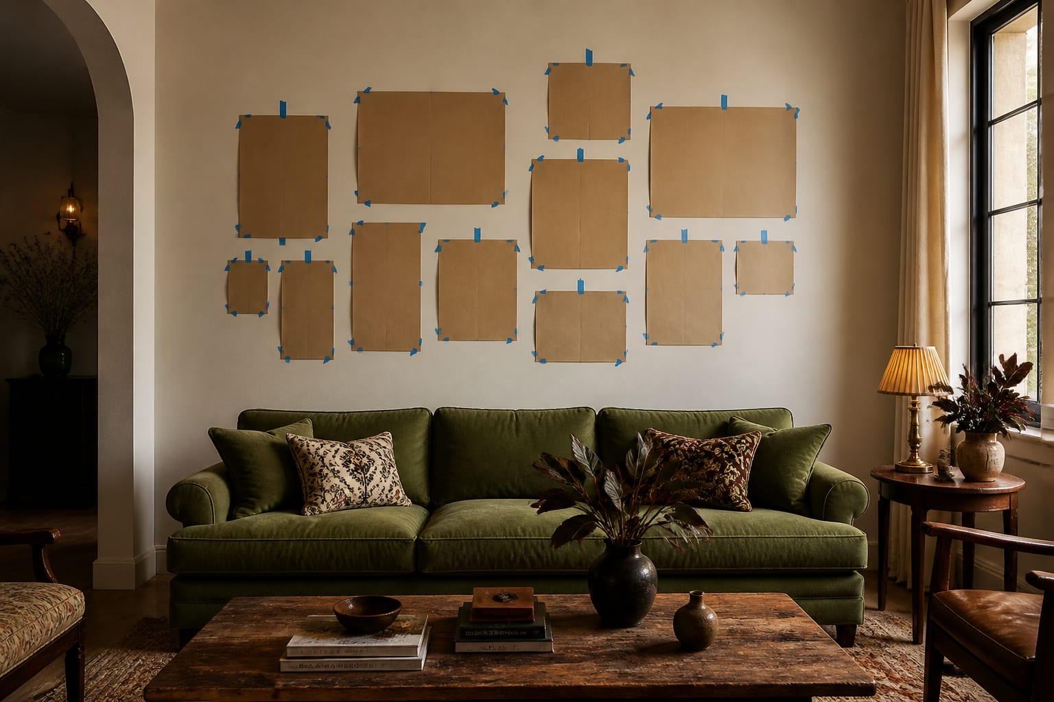
Before you hang, trace each frame on kraft paper, mark the hanger position on the template, and tape the layout to the wall. Step back to the room entrance, the main sofa seat, and the side chair. If one corner looks thin, add a medium piece rather than three tiny ones. If the whole wall looks heavy, remove the darkest or busiest frame and let the arrangement breathe.
A strong maximalist gallery wall has contrast in size, subject, and texture, but it also has manners. It leaves room for lampshades, curtain rods, door swings, and real heads leaning back on the sofa. It gives the living room a story without making every inch shout at the same volume.