Getting the Mediterranean color palette right is mostly about restraint, not boldness. The most common misstep is reaching for loud, saturated hues when the real magic lives in soft, sunbaked tones that look gently faded by years of bright light. A true coastal palette pulls directly from the landscape, the chalky white of village walls, the clay of rooftops, the silver-green of olive groves, and the deep blue of the sea. This guide walks you through building that palette layer by layer and flags the mistakes that quietly drain the warmth out of an otherwise promising room.
Start With Sunbaked Neutrals as Your Base
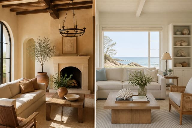
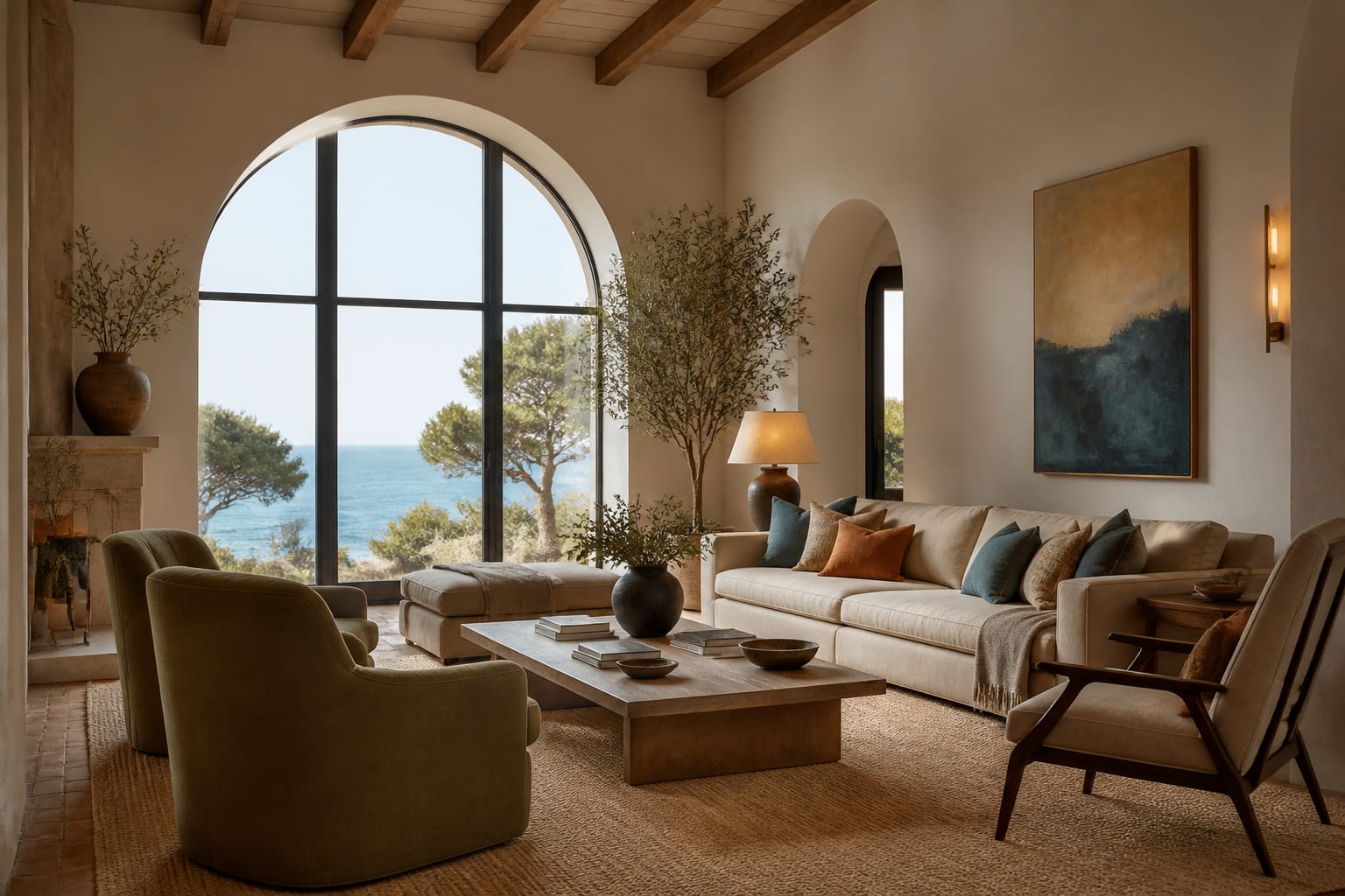
Before any color enters the room, settle your neutral foundation, because it carries the largest visual weight. Aim to fill about 60% of the space with warm, sandy off-whites, soft putty, and pale stone tones applied to walls, ceilings, and major furniture. These are not crisp, cool whites; they should feel slightly creamy, as if warmed by afternoon light. A lime-wash or plaster finish in a shade like warm bone or oatmeal gives subtle depth that flat paint cannot, shifting gently across the surface as daylight moves. This generous neutral envelope does the quiet work of making every later accent look intentional and harmonious. A common error is choosing a base white with blue or gray undertones, which instantly chills the room and fights the warmth you want. Test large swatches on multiple walls and observe them at morning and evening, since a tone that looks perfect at noon can turn dingy under warm bulbs. Keep your base finishes matte. When the foundation reads soft, warm, and sunlit, you have built the canvas that lets terracotta, olive, and blue accents sing rather than clash.
See also our guide to Desert Modern Interior Design for more on mediterranean color palette.
Add Earthy Accents Pulled From Nature
With a warm neutral base in place, layer in the colors that give the palette its identity, and take each one straight from the Mediterranean landscape. Terracotta and burnt sienna echo clay roof tiles and pottery, ochre and mustard recall dry summer hillsides, and olive, sage, and eucalyptus green reference the region's trees and herbs. Sea and sky contribute dusty blues, from soft denim to deeper teal, while occasional charcoal or rust adds grounding weight. The discipline here is sourcing: when every accent shares that sun-faded, natural quality, even unexpected pairings look effortless together. Distribute these colors in supporting roles, on textiles, ceramics, a painted door, or a single upholstered chair, rather than across whole walls. A reliable approach keeps secondary colors to around 30% of the room and reserves the boldest accent for the final 10%. Avoid pure, primary versions of these hues; a fire-engine red or electric blue reads as costume rather than coastal. Instead, mute and dusty everything slightly. When your accents all look as though they have been softened by strong sunlight, the palette gains the cohesive, lived-in warmth that defines authentic Mediterranean rooms.
For a related angle on mediterranean color palette, read Mediterranean VS Coastal.
Mind Finishes, Undertones, and Light
Color in a Mediterranean palette is only half the story; finish and undertone decide whether it actually convinces. Reach for matte, chalky, and slightly textured surfaces wherever possible, since high gloss reflects light in a way that reads modern and synthetic. Lime wash, clay plaster, unglazed terracotta, and oiled wood all scatter light softly and reinforce the handmade feeling. Watch undertones with care, because a terracotta that leans too pink or an olive that turns acidic can throw the whole scheme off balance. Pair warm-undertone accents with your warm neutral base so nothing feels disconnected. Lighting matters just as much as paint: cool LED bulbs around 4000K or higher will sap the warmth from even a perfect palette, so choose warm bulbs in the 2700K range to flatter the colors. Natural light is your best ally, so position key pieces where they catch the sun. Test finishes alongside color, not after, since a swatch can look entirely different in matte versus satin. When finish, undertone, and light all pull in the same warm direction, your chosen colors finally deliver the sunbaked glow you pictured.
Avoid the Mistakes That Flatten the Look
Even a well-chosen palette can fall flat when a few familiar errors creep in, so it pays to know them. The biggest is oversaturation: cramming a room with bright, pure color overwhelms the eye and erases the gentle, weathered quality the style depends on. Closely related is ignoring proportion, where accent colors spread so widely that no calm neutral remains to rest against. Many people also forget contrast in texture, assuming color alone carries the room; without rough plaster, woven fiber, and aged wood, even correct hues look thin and flat. Another trap is mixing in cool grays or stark modern whites that quietly chill everything around them. Finally, beware the matchy showroom set, where every accent is the exact same terracotta or blue, which strips away the collected, evolved feeling true Mediterranean spaces have. The fix for each is the same impulse, restraint and variety: dial saturation down, keep bold color to small doses, vary your textures, banish cool undertones, and let accent shades differ slightly from one another. Sidestep these pitfalls and your palette will read as a sunlit coastal home rather than a flat imitation of one.
Here are the common mistakes to avoid: - Choosing a base white with cool blue or gray undertones - Oversaturating the room with bright, pure accent colors - Lighting the space with cool bulbs above 4000K - Relying on color alone without varied natural textures - Matching every accent to the exact same terracotta shade - Using glossy finishes that read modern instead of rustic
Bring the look home with Re-Design
Unsure which Mediterranean colors will actually work on your walls and furniture? Upload a photo of your room to Re-Design and preview a sunbaked palette of creamy neutrals, terracotta, olive green, and dusty sea blue mapped onto your real space. You can compare warm base tones, test accent shades in different proportions, and check undertones against your lighting before buying a single can of paint, taking the guesswork out of a warm, coastal scheme.
Frequently Asked Questions
What colors make up a Mediterranean palette?
The foundation rests on warm neutrals: chalky white, sand, and soft ochre. Against these, terracotta and burnt sienna supply earthy heat, while olive and sage green echo the landscape. Deep cobalt and sea blue add coastal punctuation. Touches of mustard yellow and clay pink round things out, keeping the overall scheme sunbaked, grounded, and pleasantly faded.
How do I balance bold blues with warm earth tones?
Let warm neutrals dominate roughly seventy percent of the room, then introduce terracotta and olive as secondary players. Reserve cobalt or sea blue for accents like cushions, ceramic tiles, or a painted door. This ratio keeps the blue feeling intentional rather than overwhelming. Repeat each accent color in at least two spots so the eye reads it as deliberate.
Are bright white walls right for this palette?
Pure brilliant white can feel clinical here. Reach instead for a warm, slightly creamy off-white or a lime-washed sand tone that softens under sunlight. These muted bases let terracotta floors and colored textiles glow without competition. They also recall the sun-bleached plaster of coastal villages, grounding the palette in its origins rather than a sleek contemporary read.
How do I introduce the palette without repainting?
Swap in textiles first: ochre throws, olive cushions, and a kilim rug shift the mood quickly. Add ceramic vases in cobalt and terracotta along shelves. Group potted herbs for living green tones. Hung copper or brass pieces lend metallic warmth. These layered accessories carry the scheme convincingly while leaving your existing wall color completely untouched.