A patio color scheme reads cohesive when you anchor the hardscape with one neutral, lift it with one earth tone (terracotta, sage, navy), add one accent across cushions and planters, and repeat each color in at least two places — neutrals dominate, accents repeat, and patterns stay to one piece per zone. A mismatched patio usually does not need more decor; it needs a stricter color story. My opinion: outdoor palettes should be built from the permanent materials first, not from the throw pillow you liked online at midnight. Sun, concrete, brick, greenery, umbrellas, cushions, and planters all compete harder outside than they do in a living room. The fix is to choose fewer colors, repeat them deliberately, and let texture do more of the work.
Field Checklist
- For patio color scheme ideas, keep the main walking line through the patio at about 36 inches clear before adding decorative layers.
- Let patio color scheme ideas start with 3 dominant finishes, then repeat the calmest one where the eye needs a pause.
- Use a patio color scheme ideas spacing rule of roughly 24 inches between repeated accents so the design reads connected, not scattered.
Start with the surfaces you cannot easily change
A patio color scheme feels coherent when the pavers, house exterior, fence, and furniture appear to belong to the same climate and architecture. Begin by standing at the door and naming the fixed colors in plain words: warm beige tile, cool gray concrete, red brick, taupe stucco, black metal railing, cedar fence. Do not call everything “neutral,” because warm neutrals and cool neutrals fight each other when sunlight gets harsh.
If the floor is busy, the furniture should calm down. Patterned encaustic tile, variegated stone, or mixed brick needs solid cushions and fewer accent colors. If the floor is quiet, such as large-format porcelain or smooth concrete, you have more room for striped cushions, graphic planters, or a bolder umbrella. For patios where the paving is still undecided, the most useful color move is choosing the hardscape first; these porcelain tile patio ideas for outdoor floors show how much the floor temperature controls the rest of the palette.
A practical test: bring home samples or swatches and view them outside at 10 a.m., 2 p.m., and dusk. Warm beige can turn yellow in afternoon sun, cool gray can look blue beside grass, and black metal can dominate a small patio faster than expected. Keep furniture frames within one metal family when possible; mixing black, bronze, chrome, and white aluminum in a 10 by 12 foot zone usually looks accidental.
Test this on your own photo with ReDesign before you choose the final outdoor direction; keep the house edge, horizon line, hardscape, planting beds, and main path visible so the preview solves the space you actually have.
The palette decision that fixes most mismatched patios
The decision that fixes most patio color problems is whether the palette is warm, cool, or high-contrast. Once that decision is made, shopping becomes much less chaotic.
| Palette direction | Best fixed surfaces | Strong color moves | Watch out for | |---|---|---|---| | Warm natural | Beige pavers, brick, cedar, tan stucco | Cream cushions, rust pots, olive planting, teak or acacia | Too many orange tones can look dusty instead of relaxed | | Cool coastal | Gray stone, white siding, pale concrete | Slate cushions, blue-gray umbrella, white planters, silver foliage | Bright navy and pure white can feel harsh in full sun | | Garden dark | Charcoal pavers, black trim, deep fencing | Graphite frames, moss green cushions, cream flowers, aged metal | Dark seating can become hot on south- or west-facing patios | | Desert soft | Decomposed granite, stucco, pale stone | Sand fabric, clay planters, sage plants, woven shades | Too much beige needs texture or it will look flat |
The desert-soft palette works especially well when the ground plane is gravel or compacted fines. If that is your direction, study decomposed granite patio ideas for warm yards before picking cushions, because tan aggregate makes cool blue furniture look sharper than it did in the store.
Patio color combinations that actually work outside
Good patio color combinations respect sunlight, dirt, pollen, and the fact that plants are already part of the palette. These are reliable starting points, not rules to copy blindly.
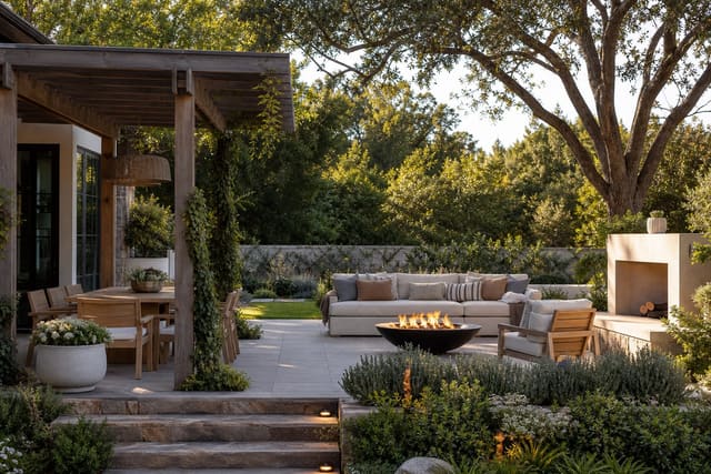
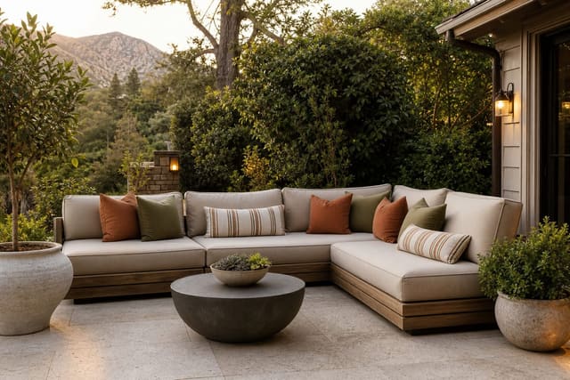
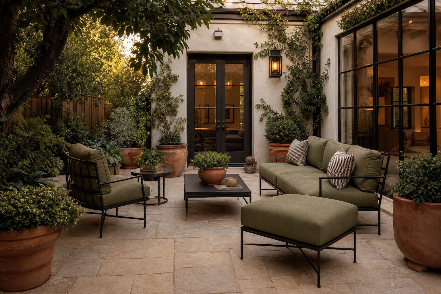
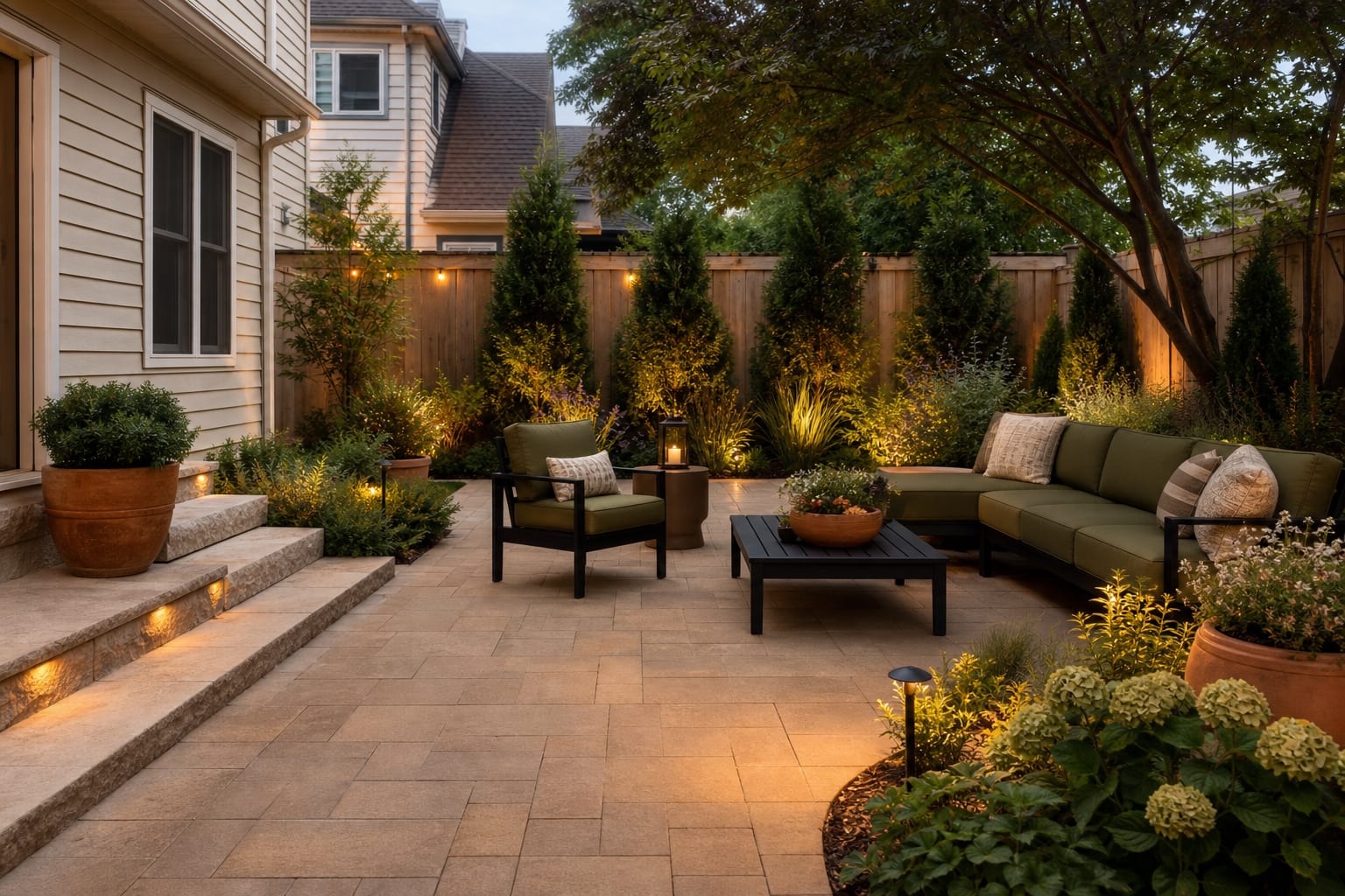
- Pair cream, olive, black, and terracotta when the house has warm siding, brick, or beige pavers. Keep the cream on washable cushion covers, use olive on larger fabric pieces, choose black for furniture frames, and repeat terracotta in pots at least 14 to 20 inches wide so the accent has enough visual weight.
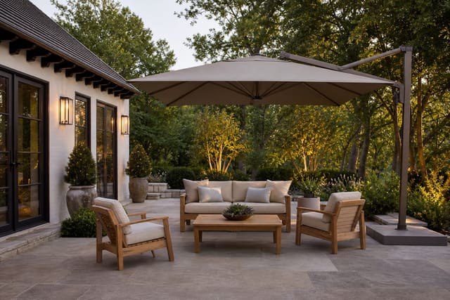
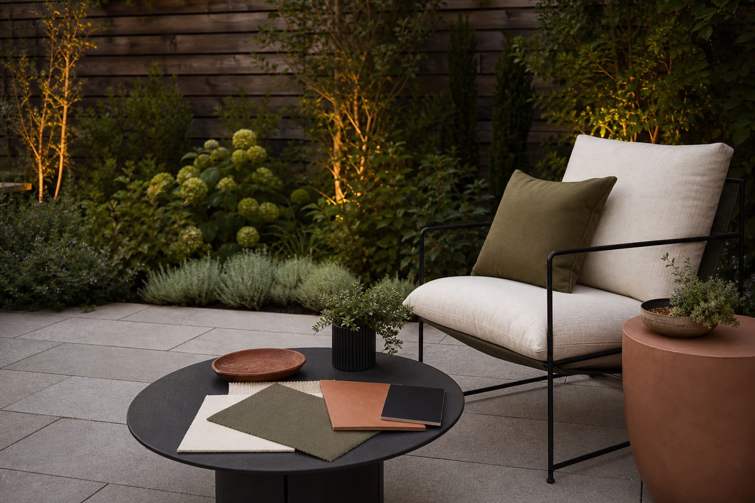
- Use charcoal, teak, ivory, and rosemary green for a modern patio that still feels livable. Charcoal should sit on metal frames or an outdoor rug, teak should appear on arms or a table, ivory should be slightly warm rather than paper white, and rosemary green can come from cushions, herbs, or clipped shrubs.
- Try sand, clay, sage, and bone for a dry-climate patio with gravel or stucco. This palette needs texture: woven shades, ribbed planters, nubby outdoor fabric, and grasses 18 to 36 inches tall keep the soft colors from becoming bland.
- Choose slate blue, warm white, weathered gray, and pale yellow if the patio is shaded and cool-toned. Keep yellow to the 10 percent accent position, such as napkins, small pots, or seasonal flowers, because a full yellow cushion set can overpower gray stone.
- Build a black, white, cedar, and deep green scheme when the architecture is crisp. Soften the contrast with wood or wicker, and avoid placing pure white upholstery directly under trees unless the covers are removable and washable.
- Use brick red, cream, aged bronze, and lavender for older homes with red masonry. Lavender or catmint gives the red brick a cooler companion, while aged bronze hardware looks gentler than shiny black on traditional facades.
If the patio includes an outdoor kitchen, the color scheme has to absorb appliances, counters, and cabinetry too. The smartest outdoor kitchen layout ideas for patios keep stainless steel from becoming the only cool tone by repeating gray, black, or stone elsewhere in the seating zone.
Common patio color mistakes to avoid
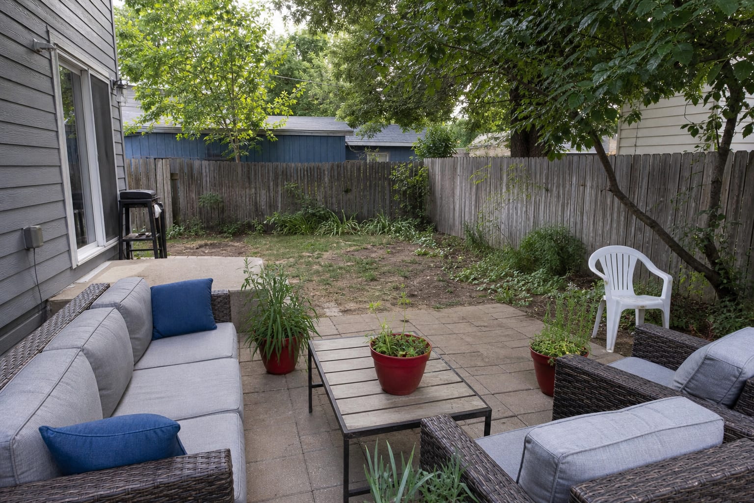
Buying cushions first is the mistake that starts most mismatched patios. Cushions are tempting because they are easy, but a 5 inch thick seat cushion cannot overrule 250 square feet of warm pavers, a cedar fence, and a red brick wall. Choose the ground and architecture palette first, then let fabric support it.
Using too many small accent colors makes the patio feel like a clearance aisle. One blue pot, two red pillows, a yellow umbrella, pink flowers, and a striped rug may all be cheerful separately, but together they scatter the eye. Pick one main accent and one minor accent, then repeat each with discipline.
Ignoring plant color is another common miss. Green is not a neutral outside; it has temperature, texture, and mass. Blue-green agave, yellow-green hosta, dark boxwood, and silver lavender all change how cushions read, so choose fabrics beside the actual planting bed when possible.
Choosing outdoor rugs that are too small can break the palette even when the colors are right. For a lounge group, the rug should usually be large enough for at least the front legs of the sofa and chairs to sit on it, often 8 by 10 feet for a standard seating arrangement. A 5 by 7 rug floating under a coffee table makes the color look like an island.
Forgetting night color creates patios that look good only in daylight. Use warm white outdoor bulbs around 2700K, shield glare from eye level, and make sure the cushion, pot, and wall colors still relate after sunset. A black-and-white patio with cold lighting can feel stark; the same patio with warm light and wood can feel inviting.
Use AI design to preview your patio palette before you commit
AI previewing helps with patio color because outdoor samples rarely tell the whole truth on their own. Upload a straight photo of the patio in Re-Design, then test one palette change at a time: olive cushions instead of gray, terracotta pots instead of blue, a striped umbrella instead of solid canvas, or black frames instead of mixed metal.
Take the photo from standing height and include the floor, furniture, house wall, fence, and planting. If glare is a major issue, photograph the patio during the bright part of the day rather than at golden hour, because flattering light can hide the contrast problem you actually need to solve. For a covered patio, include the ceiling or pergola, since shade changes how saturated a cushion or rug will appear.
The best preview is not the flashiest rendering. It is the version where the fixed surfaces, furniture, pots, and plants finally seem to be having the same conversation. Once you see that, the shopping list gets shorter: fewer colors, better scale, and accents that repeat instead of arguing.

Frequently Asked Questions
How many colors should a patio palette have?
Three — one hardscape neutral, one earth tone, one accent — applied in a roughly 60-30-10 ratio across surfaces, soft goods, and planters. Use the outdoor photo to compare the visible layout and fixed constraints before committing, because slope, shade, drainage, doors, utilities, and traffic paths decide whether the idea survives daily use.
What patio color goes with everything?
Charcoal gray and warm white anchor any earth-tone or jewel-tone accent; terracotta, sage, and navy each work with both — pick the accent to your house exterior, not in isolation. Keep the preview honest by leaving the problem area visible in the frame, then compare one conservative version against one bolder version before you buy plants, materials, or furniture.
Should patio cushions match the house siding?
Pull from the house palette rather than match it — siding-color cushions disappear; complementary or analogous tones lift the patio without competing with the architecture. Check the result against ordinary movement first: chair pullout, walkway width, gate swing, glare, storage reach, and evening light matter more than a perfect catalog angle.
Can I use bold colors on a patio?
Yes when bold reads in one piece per zone — a single accent cushion fabric, planter pot, or pillow palette — bold across every surface flattens and dates quickly. Use the image to narrow priorities and measurements before ordering anything custom; final purchases still need real dimensions, code checks, utility locations, and product clearances.
How do I keep a small patio from feeling busy?
Lock the hardscape and furniture to two tonal neutrals, allow only one pattern in the cushions, and repeat the accent across three small touches (planter pot + lantern + pillow) — small spaces tolerate less variation than big ones. If the preview invents architecture or hides the awkward feature you need solved, rerun it with stricter instructions so the result remains tied to your actual outdoor space.
Three transformations to try